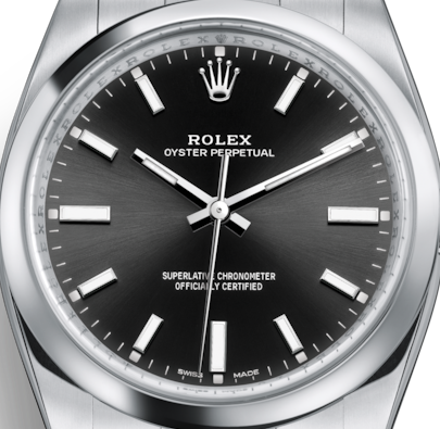
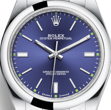
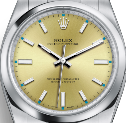
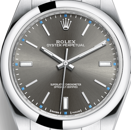
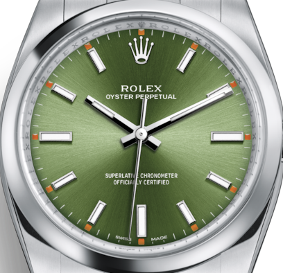
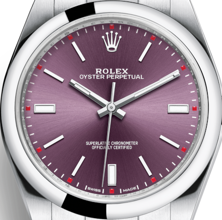
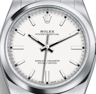
Next design study, that is closer to ‘copyrighted’ original.
No numbers, simpler layout, … as per watch series.
New design:
Update: New mesh-gradient background (except White watchface)
Rolex Perpetual (no date), 7 colours …


Black:
Blue:
Champagne:
Dark: (dark rhodium)
Green: (olive green)
Red: (grape red)
White:
3 Likes
I had one of my older designs flagged and removed by Rolex even though it didn’t actually contain any copyrighted material and I created all of the elements…I wonder where the line is in terms of ‘inspiration’ vs ‘replication’? Since then I’ve tried to ignore existing designs when making mine (which is pretty hard to do). Either way, these look great, well done 
Thanks. I’ve tried to only design ‘inspired by’ rather than exactly copy …
There are a number of elements that I have deliberately changed, omitted, or ‘re-interpreted’.
Yes I know  I definitely wouldn’t call it a copy. I’m just interested as to why mine got removed and where the line is
I’m not sure,
I do have a background in copyright law (and patents, trademarks, brands, etc. ,. from my time spent in R&D ‘research and development’), as defined in Common Law (Aust., NZ, Canada, UK, etc.), and EU or other variants.
But, the US ‘DCMA’ Copyright Act is an angry beast of a thing … It’s all about the level of concern and actions of the ‘aggrieved’ copyright holder. What I have adhered to would be no issue under DCMA, but that may not stop someone issuing a ‘take down’ notice.
hi im new to this posted my first first watch but it seems basic how do i get all the other stuff to create really funky analog watches like youres ? thank you
There are three distinct elements:
-
The watchface itself (look & feel): what style, colours, overly complicated vs. very simple, and original vs. homage/copy. Including: analogue vs. digital, vs. surreal, etc.
-
Technical elements: what to include, rotation (smooth/step), mathmatical/algorithms, exact centre/proportions/rotation, etc.
-
Colour and Shading: single layer, overlays, shading. transparency, colour matching (contrasting vs. conflicting), saturation, and elements dimension (what to skip, or enlarge).
Basically, you have to start … then focus on a particular elements … and figure out how to do it.
Check out ‘Watchface Design’ section of this forum.
ie, Reference design: analog clock S01 6-60-30 (which has inspection enabled)
