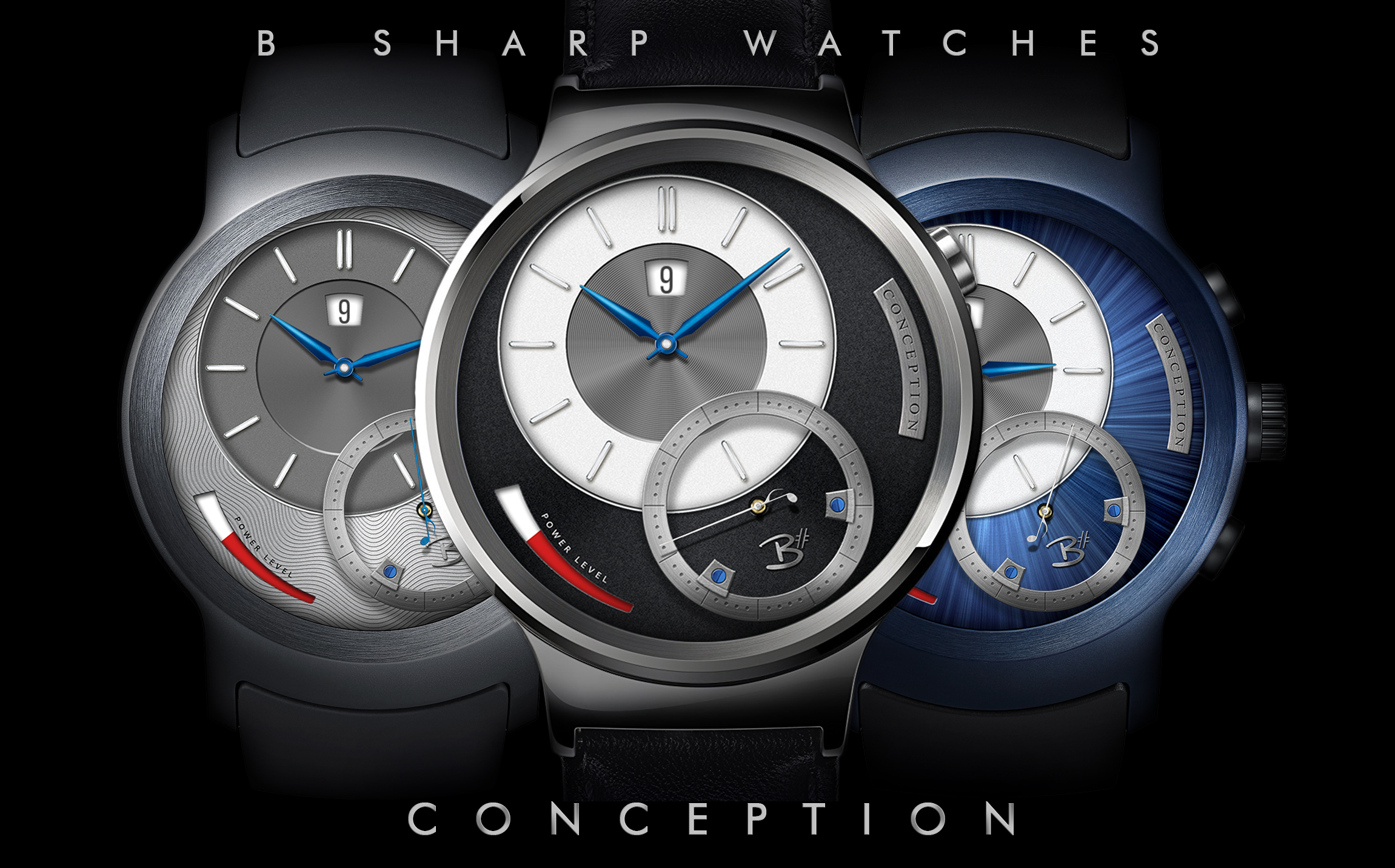
Here is another B Sharp design I’ve ported over to Facer. But for this one I created a new look exclusive to this Facer release. The original version on the Watchmaker platform has 3 color/texture themes and includes a selectable Hybrid Mode to display smart watch info. For this only-on-Facer version I created a silver starburst texture for the base dial and made a new seconds hand and some subtle tweaks to the clock dial. There is also a battery saving dim mode that darkens the face and overlays a digital time sub dial. I will also publish a version without the dim mode.
If I can reach the requisite thresholds required by Facer to sell faces here I would love to be able to offer the full version of this and other B Sharp watches. Until then, please enjoy this free version which still showcases the meticulously detailed characteristics unique to B Sharp watch faces!
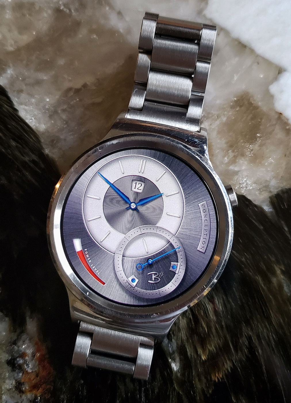
I love this design. It reminds me of a mix between an A. Lange & Sohne and an Arnold & Son. Keep revising this design as it is a hit (for me at least). The major thing I would change was is the battery reserve indicator, as I don’t understand why it goes from completely red, back to white to indicate that it’s empty. I would instead just have it simplified to white–>red.
Thanks @WilliamS ! I am very influenced by contemporary mechanical watch making, including the two brands you mention, even more so some of the small independent makers. They are really pushing the boundaries of what can be achieved mechanically which in turn opens up new design possibilities. The concept of my “brand” is to create designs that look like realistic mechanical analog watches, which means also trying to adhere to what is realistically mechanically possible.
This design is actually one I made more than a year ago for the Watchmaker Premium platform. For this version I just redid the cosmetics to make a unique look exclusive to this Facer version.
I can’t remember my entire thought process over the battery indicator, but I know I experimented with a couple of different ideas and concluded this was how I wanted it. To me the size gradient is more specifically an indicator than the color, but I also feel it’s more intuitive to see the higher contrast red as the indication of remaining power. But that’s one of those details that could go either way