I’m always a fan of retrograde hands. This is #11 in my Inspiration series. I haven’t published #10 yet, but it was mostly completed before I began this one so I kept the numbers out of order. Variations of this will probably be coming too.
2 Likes
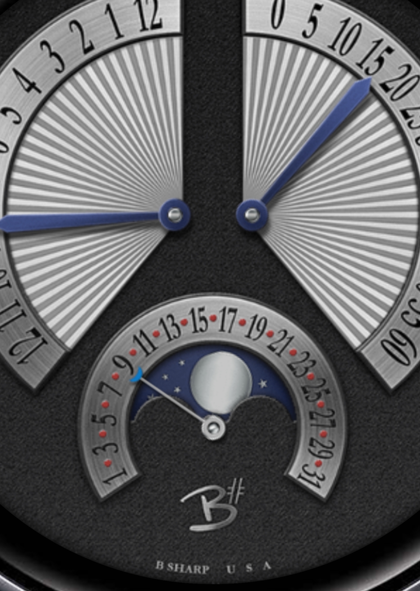
I love all the different textures! The date wheel kind of seems illegible on my computer screen, but that may be only me. Other than that, I like it.
Thanks @WilliamS ! Can you tell me what aspect of the date is hard to read? Size, clarity, contrast? I have to admit that in general one of the principles I stick to with all my usual B Sharp designs is to adjust typical proportions to maximise readability on the watch screen. But… This series I’m kind of just throwing a bunch of ideas out there to get content on Facer while aiming for designer invite. Some of these I’ll develop more thoroughly if I should get there. But I’m really focusing more on these designs as mechanical watch layouts for now, so I’m not adhering to that principle as I normally would.
That said, if this is displaying properly it should be readable, so I’m curious what is making it illegible for you.
…also I just discovered I can zoom previews if I use Chrome to read this forum, and I can upload pics. Two things I can’t do from the Facer app itself.
blue version with Geneva stripes
I found that the somewhat lack of contrast on the sides of the date wheel blended into the black numbers. The blue end of the date hand also blends into the background. I would make the stainless background of the date wheel the same color as the retrograde displays (brighter). I would also make the end of the date hand the same color as the reddish dots so that it doesn’t blend in. Hope you find that helpful. Keep up the good work! I wish I was in your position; I’ve always wanted to have a place in the Facer partnership!
thanks for the info and feedback! I adjusted the shading a little bit on the brushed metal surface of the date dial to increase the contrast. It’s always a balancing act trying to get realistic lighting without sacrificing function. Usually I go for fairly neutral lighting since it’s static that makes more sense anyway. But If it’s too bland you lose character and detail… like I said… balancing act! 
btw… I have no position in the Facer partnership either… but I’m trying.
1 Like