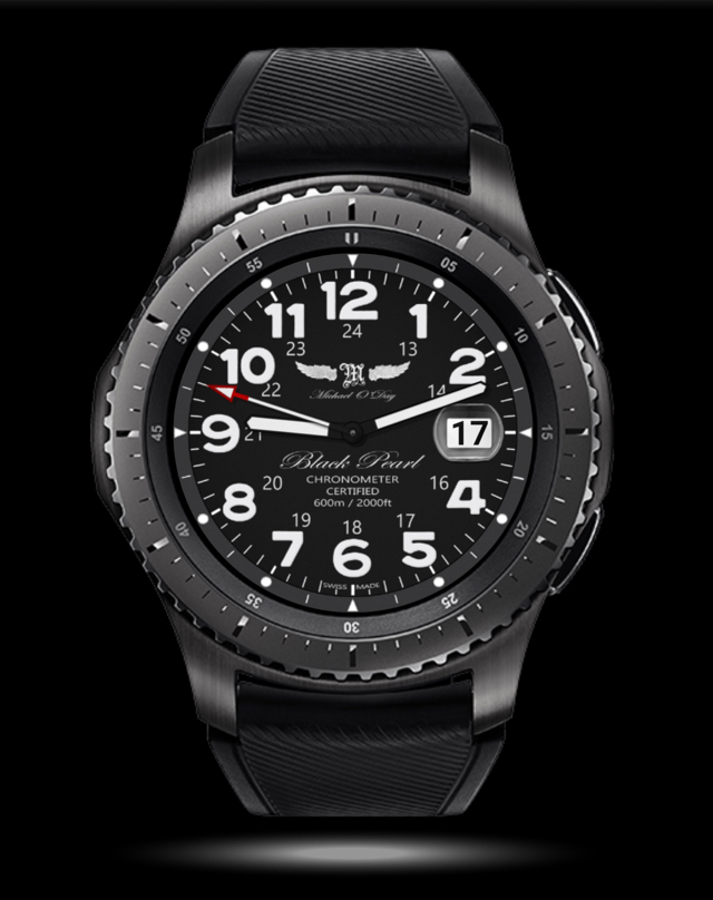
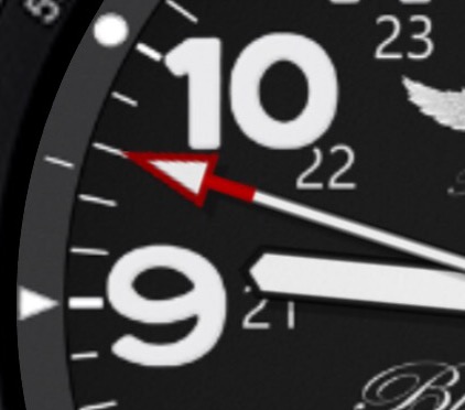
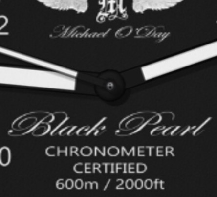
I went back to the original design files and reprocessed/rerendered the background watchface to enhance the clarity of the text, symbols and other features. I also tried to follow @GAUSS 's advice by attempting to create a set of more realistic hands.
I decided that, whilst I like the new hands and I think they suit a dress watch, it would be better if the hands were larger to better align with the Dive Watch theme - that is, easy to see in the depths with water dripping down your mask and a big shark coming up behind you
Thank you for the feedback - I find that I am sometimes too close to what I am doing to be able to see with dispationate eyes so I greatly appreciate the views of those who see with fresh eyes.