https://www.facer.io/watchface/3zKWeFfGOx
For some reason it is difficult to sync in my watch. Anyone has the same problem with this design?
https://www.facer.io/watchface/3zKWeFfGOx
For some reason it is difficult to sync in my watch. Anyone has the same problem with this design?
Not much longer than my usual designs. Then again, I use a lot of animations. So lots of elements from all the images. How many are you running at a time, 30+?
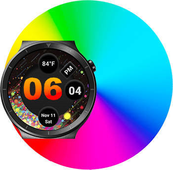
One note is the preview doesn’t show the hour number. Displays fine once sync’d.
If you need some help with optimizing then I could help you, but you’ll have to enable inspection mode.
thanks for noticing the preview, I got at least 30 layers few animations and images.
Hello Mellin thank you looking for solution actually for the preview. It is open for inspection now, thank you for your help in advance.
Sorry, but Iyou still don’t see the inspection mode enabled…
I tried to tick the inspection but got bugged possibly, doesn’t allow still. Anyway, I managed to fix the preview already. Thank you for all your help.
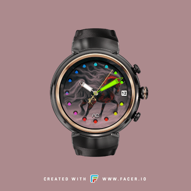
nice @angelodefensor looks good. I see you have become one with open aperture holes for numerals - well done young Skywalker. Takes up a… lot… of… layers… right?
So this is the exact problem I had with many of my aperture watches. Your eye is focused on the those sliding black circle strips animation and it’s hard to see the hour numbers at a quick glance. You have to really stop what you’re doing and take a moment to see what the hour is. I have two suggestions:
significantly brighten the colors behind the moving circle strips. Right now looks like blue, green yellow underneath. Maybe switch to yellow, orange, red - or anything that substantially raises the contrast between the colors below and your charcoal-colored number plate.
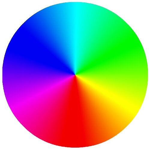
The other thing I do a lot is to add a rotating rainbow color wheel. You’ll need one off the 'net with a smooth color transition like this one: https://color-wheel-artist.com/thrive/wp-content/uploads/2017/02/Additive-Color-Wheel.jpg
It doesn’t matter how big the wheel is, smaller is good because it uses less memory, you can resize it in the Creator. Then mount the wheel as a layer all the way down at the bottom of your layer stack. Cut a hole in every layer back up to the top so the color displays through all the way up from the bottom. Resize the color wheel huge (like 800x800) and offset the X and Y so the center is “off-screen” somewhere (like X=450, Y=450). This way the colors pass casually and in one direction - you can’t really tell that it’s a rotating disk. Rotating at seconds speed #DWFSS# is a little slow - 2 or 3 times seconds (#DWFSS# * 3) is better.
Lastly, go easy on the drop shadow inside each numeral “hole” image. That also kills the contrast if it is too dark.
This is exactly the technique on my Runner’s Edge watch.
HTH,
John
John, I really love your works. I will check again when I get home and change the drop down shadows and will try different bright colours on my background. Thank you for your suggestions.
I am using animations for my background layers, might change it to a colour wheel.