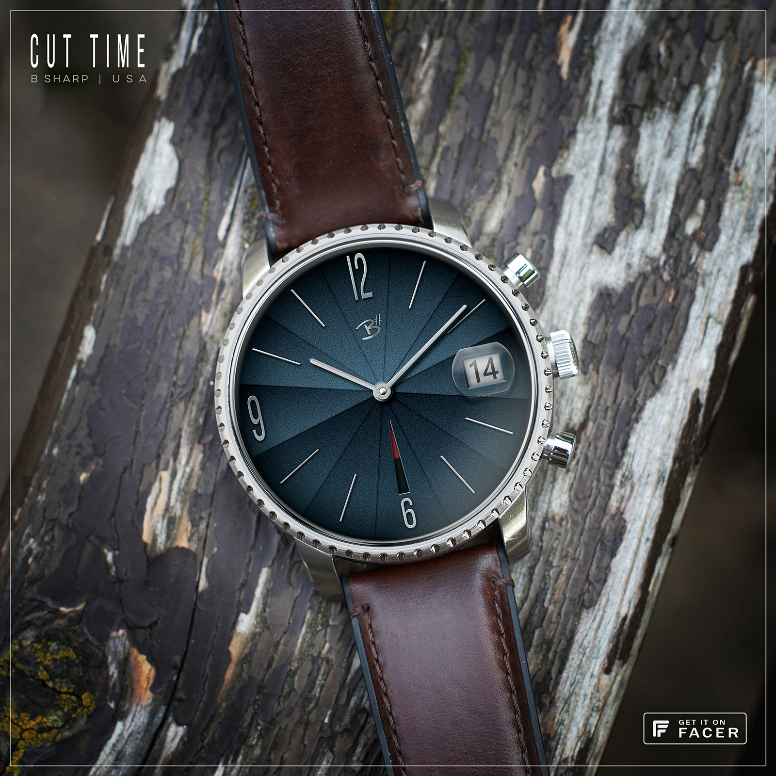
This design was originally one of my “One Hour Series” faces. But I always thought it needed a date, and I like the cyclops sometimes too :). So I revisited it for an upgrade. I have to say, blue is always a favorite of mine but there are infinite hues, sometimes one shows better than another. I got lucky with this one, it is really striking on the watch screen. It’s like the guy from the Men’s Warehouse commercials used to say… “you’re gonna love the way (you watch) looks, I guarantee it!”
Follow B Sharp here on Facer to never miss a new release! And on Instagram because that’s where all the great watch pictures are  https://www.instagram.com/bsharpwatches
3 Likes
Black edition published !
1 Like
In the black edition, I like it even better.
It’s a Winner Winner! To add the hallowed suffix, ‘Chicken Dinner’ to the mix, the cyclops would match the dial angles toward ‘3’…creating a unique asset belonging only to B# collection…
Top work mate! R
@lucky.andrei , @rarest glad you guys like the black, thanks! Personally I still favor the blue  .
.
@richard2 you mean pie shaped magnifier? I very briefly considered it but that was going to be more pimped out than I wanted. Also, does a magnifying glass need to be round or oval to do it’s thing?
1 Like
Yup, if you don’t, I will. BTW, that little puppy is in the top 100 free. Good work!
Strip down the mix… make more of the more, make less of the clutter
Have at it my friend! Glass effects are always a fun challenge in PS, but I don’t foresee myself making a pie shaped magnifier
google translate didn’t help me with this one. 

1 Like
Was a music reference. Apologies for the ambiguity. Forgive me, sometimes I wander off into a world of metaphor and analogy and forget to take people with me… my bad.