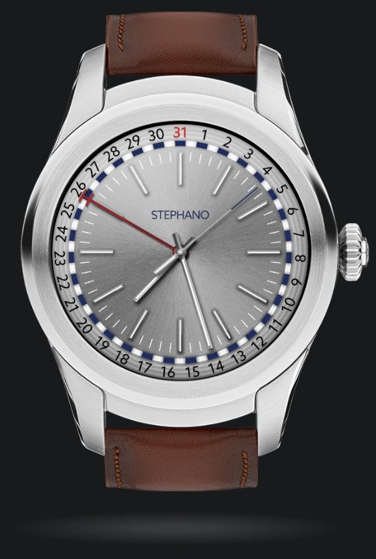
Hey everyone, I just wanted to get some feedback on my latest watch. Any comments are helpful! The date hand doubles as a day-night indicator.
4 Likes
I’ll help you a little 
I am a small specialist, but it seems to me that the hand indicating the date (red) is confusing and unnecessary. Also, the outer ring is overloaded with elements, perhaps the watch face will be installed on another watch model with the numbers already present on them or something else 
2 Likes
Love it! Nice!
1 Like
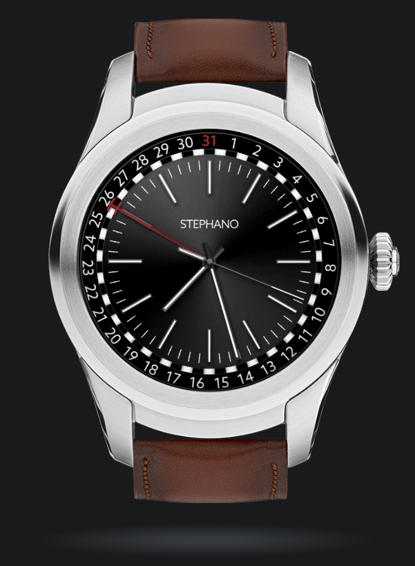
Hey Will, Fantastic start! Speaking as an experienced ‘Ad Man’ (and not a watch designer, in which I’ll admit I’m an amateur), I’d suggest you already know that the ‘Winner’ is the AOD version. So make this the face, then dupe and alter the luminosity of the ‘white’ elements for AOD to around 15-18% at most. AOD eats battery power…
Great start! If your work gets better and better, you’ll have a portfolio of work to admire.
Cheers R
1 Like
- Does the date hand move continuously or jump to the next day @ 24:00? I’d suggest the latter. Then shorten the date hand a bit, put a circle on the end so it surrounds the current date, and use a brighter color so it’s easier to see.
- Make 31 the same color as all the other day numbers
- Reverse the colors of the major tic marks, and make the minor tic marks the same dark color.
- Use a different color (like black) for the second hand. Or maybe red for second hand and black for date hand. Or let user pick a color for each hand independently.
- Add small text window for 3 char. month name and for battery %.
I like it the way it is. The silver would look good on the H1 but any other watch body I’d prefer the black version. My feeling about watch faces is sometimes just let it go “as is” instead of tweaking forever trying to get “the one”. It’s not like the level of commitment you would need if this were for a kickstarter project of a real watch. Here we can just say, this looks nice, and still come back later to change or spin-off if inspiration strikes.
This is nice as it is, good balance and detail. It’s true that the outer date ring will not be a great fit for some watch bodies, but who cares, you can always just make another variation later.
2 small suggestions though: the date hand doesn’t appear to perfectly align with the numbers. I’d fix that. And also I’d consider highlighting 1 instead of 31. I suppose that’s subjective, but I feel I can think of a lot of references where I’ve seen 1 highlighted but not any for 31.
Thanks Richard, I do love the AOD version. I’ll take your advice and I’ll make another version with the face being dark for both modes.
Thank you Kvansant, the stainless steel texture is thanks to you! About the date hand, it doubles as a day-night indicator (Blue=Night White=Day). I will say it may be confusing at first.
ah cool! That’s a neat idea but maybe slightly impractical? The smaller something is the more precise it may need to be to be readable. Definitely a bit confusing, and is the day/night aspect so small that the potential confusion outweighs the possible usefulness? It’s such a cool idea though.