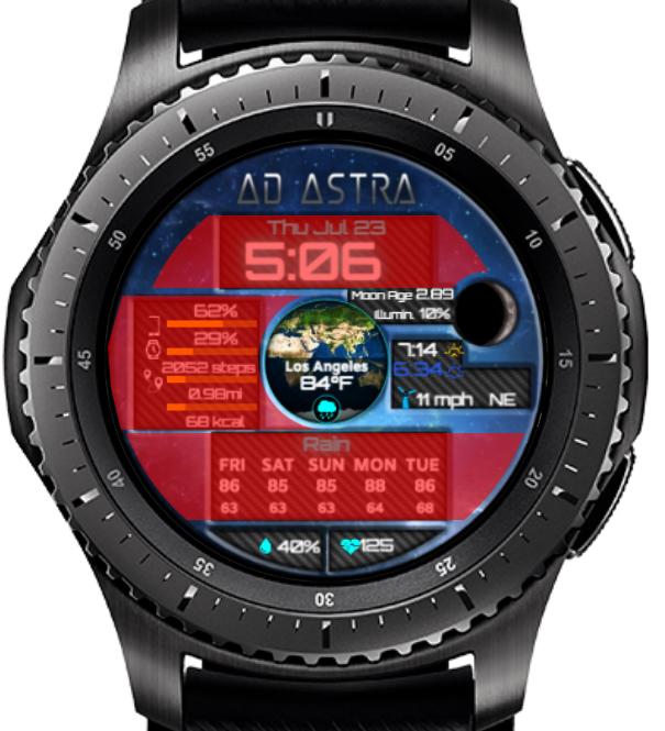
This is an update to an existing face I’ve been working on for a bit. I designed it to give me some quick gee-whiz info for stargazing such as temp, wind speed/direction, and humidity. It also gives me the moon’s age and illumination.
I am not sure how I feel about the layout - whether it looks good or needs some kind of better organizing.
See how you have the bottom 2 areas that curve with the face border? I think you need to do more of that with the rest of the panels. Those two seem to fit nicely, but the others look like you’re trying to put a square peg in a round hole lol!
I would round the edges and all of course, this is just to give you an idea, but this might also give you more space for your data and maybe even let you make some parts a little bigger.
Yea no problem, of course this is just my opinion, and the face looks good as it is, but maybe it gives you a different way to look at it. Maybe even try removing a panel here or there and just have the info against the background, like maybe for the time at the top. Good luck, and let us see when you’re done!
I went in and opened it up, rounded the edges more to contour to the round shape of the watch. I need to spread the 5 day forecast data out now to fill in the negative space. Need some ideas for the left and right of the time. Was thinking maybe some gears? I want to maintain a space-esque feel.
so I have now added gears to the top corners to fill in some blank space. Curious as to what I should put in the two lower areas I highlighted. I feel more gears would make the already-busy face just too busy.
why do you feel like you need to fill that space? Just as in music, where we say what you don’t play is as important as what you do play, space is your friend! I think it looks fine as is, the space allows your eyes to zero in on the info in that panel. I’m not sure if you can do it here since there’s no room to grow up/down in that panel, but the other option with space is to enlarge type to make it more readable. Your eyes may be better than mine, but I’m certain I would not be able to read those temperatures in the 5 day forecast. Not to single your face out, that’s an issue for me with a lot of info-loaded faces.