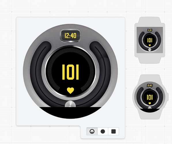
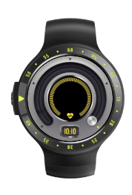
Probably in the top 3 of the most complicated faces I’ve worked on. Been working on this for the past few weeks. Should be going live soon:
Cool design. What would you say was the hardest part to figure out or took the longest?
- figuring out the rotational timing expression.
- masking of the individual elements
- testing; temperature, step count and Heart rate
I could see how that could be a struggle. Well done though, I think it all came together well.
what would you say helped you in figuring the rotational timing expression? trial and error?
Looks good though.
It took mixing and matching various expressions. There is an expression that is used for “scrolling text”, http://community.facer.io/t/scrolling-text-across-watchface/9326/2 with @Mellin help. I used this as a basis to create a ‘count’ of sorts. Basically the floor expression creates a simple number from wake that counts (up to 5, in my example). Then repeats every 5 seconds. My goal was to cycle through each element within a five second count. That gives you ample opportunity to read the values. The time is always visible at the bottom, and the dim side included also the data again in a static format.
Repeating pattern expression:
((floor(#DWE#))-((floor(#DWE#/5))*5))
The next part was adding in the condition to only be visible during a specific period. Adding in a simple if “x = y, then” was easy.
Repeat, when XX:
$((floor(#DWE#))-((floor(#DWE#/5))*5))=0?100:0$
The next part was a little more tricky for the rotating elements. Since each value is different I need to both set estimate min and max values for how I wanted the dials to look. Then I also needed to know the start and end angles for the dials. With the overall degrees of motion in mind (I think it is around 240 degrees from lock to lock), I could then multiply the value by the appropriate ratio:
Example of 1/2 mask for Watch Power Level:
(33+((#BLN#)*2.96))
Since the dial was larger than 180 degrees, it also required the use of multiple masks. So masks needed to appear or disappear if the rotation took it further than one of the lock positions. In this case I have the standard repeat conditional with an additional conditional for limited movement.
Repeat plus limiter:
$((floor(#DWE#))-((floor(#DWE#/5))*5))=0&&#BLN#<40=1?100:0$
This one ended up being the pain in the @$$ because testing levels isn’t straight forward in the creator. Power levels for Watch Battery do start off at 100% at 12:00am, then move proportionally to 0% at 11:59pm. Phone battery is a linear movement as well, but it starts around 38%, discharges, and then starts over at 100% at 8:00am. The goofy thing is it never gets to 0%, it end at 4%. Step count also moves linearly, but is limited to 2878 at the end of a day. Testing this to a goal of 12000 or 15000 steps per day is tougher. Current Temp is also difficult since it always shows 84F. This value doesn’t move and there is no direct way to change C to F unless you change your computer settings. Heart Rate is similar to the Weather Data. It repeats a set of predefined values, but it is random in nature.
Each of these elements had to be tested through the anticipate ranges with each of their respective masks to get the right effect. So I had to manually input a value in the test range in place of each tag. Generally I tested each element in around 6-10 places on the range. Add in 3-4 masks for each element and this meant I needed to manually change values around 20 times for each position.
All in all it came out pretty good. I did make some compromises. In the beginning I wanted there to be an animation of the dial knob to slide from point to point. Since I wasn’t making a full circle, this became too much of struggle to figure out. In the end I left it with a simple ‘jump’ movement:
(-135+(((floor(#DWE#))-((floor(#DWE#/5))*5))*67.5))
One other thing I compromised with was the overall rotation of the design. I liked the dial being on top with the time at the bottom. This minimized the time as the focal point. The only issue is that if you have a “flat tire” watch like the Motorola, the time is mostly covered during wake. I did ensure the dim side has no obstructions. I played around with rotating it, but it never looked right in my mind.

Big thanks to @Mellin, @Tomas, @Ben, @szandor, @GAUSS for helping get this off the ground:
and @GRR, @jmorga106 for input on the flat tire.
@Facer_Official
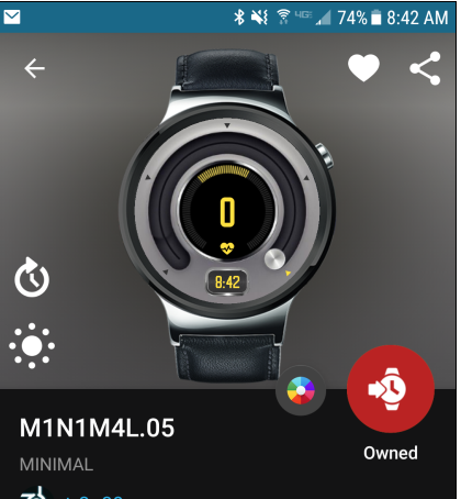
I get some weird actions when looking at the “display” face in the creator and on the app.
In Creator:

The main image is in position ‘4’ with the heart rate, but no heart rate value is shown.
On the app (detail view):

the HR value is 0 so it kind of breaks masks I have set. My anticipated range was 40 - 200.