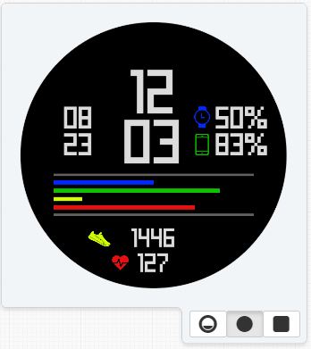
Here is a fairly simple and dark themed watch face. The colored bars on the face indicate watch battery, steps, heart rate, and phone battery. These are all also shown with text/numbers. The date is on the left of the time. It takes some inspiration from the watch face seen on the amazfit bip watch, but much more has been added. I am going to come out with a light themed version of this watch face in the future. I hope ya’ll like it!
3 Likes
I like the minimal feel. It’s a bit the power bars are a bit confusing though. Because there are no symbols there’s no way of us knowing which bar/% is which on first look without your explanation. If I were to make a suggestion, put a symbol by the percentages indicating which percent is phone and which is watch. Color code them accordingly like you did with the foot and heart/bars. Then the user can quickly make sense of it all and it will stay on theme. What do you think?
Thanks for the suggestion @syntaxracing, I appreciate the comment and I have changed the watch face to make it a little less confusing. Thanks for liking it!
Absolutely, it looks great and easily readable. How do you feel about the changes?
I really like the changes. I was actually getting a little confused myself while wearing this watch face before I put the symbols beside the percentages.
A couple of other things you could do to help would be to place a darker bar underneath each of the active bars. This will help give an indication of where the maximums are. One other change I would consider is rearranging the bars to match the icon/percentage layout. For instance from top to bottom you have blue, green, yellow, then red; but the bars are blue, yellow, red, then green.
Agreed. I think that would really pull the watch together. I like the minimal nature of your watch faces. Well done!
1 Like
Thank you for the help guys! I don’t want it to get too cluttered though and put a darker bar underneath every one of the active ones since they all go to the same size anyways. What would you think if I just put two bars, one underneath and one at the top of all the active bars like this?
2 Likes
I think @eradicator09 had great suggestions and you implemented them well. Great work but most importantly, I’m glad you are happy with the changes!
1 Like