Please have a look at this WIP and let me know what you think.
Thanks
3 Likes
Hi,
I think it is nice face. I would suggest to separate the changing info texts and fixed text font and “unify” it for each category. I mean time is changing and uses LCD font, I would use LCD, or another digitized font, for another infos like steps etc. Also don’t forget to add covering arc around it to hide the battery squares for the square watch users.
I like the battery windows. Check the size of those battery squares. I think they could be 50px high instead 55 to fit in the window.
2 Likes
Thank you for your excellent review. Your advice will serve well. Rarely if ever used lcd font before but now that I did I much perfer it. Been trying to come up with new battery gauges for a while, thought I would give it try and see how it looked. If using only one battery, or if far enough apart, I wanted to rotate battery mask into place instead of shutter it against it’s natural shape but came out ok.
Thanks again😎
2 Likes
My favorite for small LCD/LED text is Open 24 Display ST font. You can find it here: Open 24 Display ST Font | dafont.com For the time display font I have found that DS Digi and DS Digi Bold work nicely when you are dafont.com you can search for all its variants. I have the italic versions also but don’t seem to use them very often.
1 Like
Thanks for the info. Always good to know a good link and can’t have to many fonts… Or dials, or hands, or…![]()
1 Like
@mrantisocialguy . I went to dafont and downloaded both of your suggestions. I like them both, but not sure how you set up the persistent BG with the DS Digi seeing how the 11 fits into one ‘seven segment’? Not a big deal not to have the BG as I like the font enough to skip it, (never really used it before anyway, but trying to ship up my shape if you know what I mean). Here is where I was getting fonts from for the most part. I like having new resources, thanks for that. 2341 Modern Fonts - 1001 Free Fonts
1 Like
I don’t like that Open24 display font, because it has glyphs that do not match the 7 segments.
I like the two integrated LCD fonts in Facer (Patopian and minisystem), but they do not contain some glyphs. If you like, check this dot matrix font.
4 Likes
I just use a text element with 88:88 at 10% opacity. DS Digi puts the one in the exact center of the digit space and honestly, I don’t worry about it. No one other than us would ever notice that anyway. The reason I like that for time display is it keeps the spacing true to a “normal” display, BUT you can always right justify each number and then the 1 will always display to the right side of the digit space. I just don’t bother doing that because I’m not that concerned about it.
1 Like
Very cool. Now I have something new to play with, custom fonts ![]()
2 Likes
@mrantisocialguy . True that. We only see that stuff on editor anyway. I drive myself crazy in Affinity and pdn to line and shadow things that will never render on watchface. Got to feed the monster!
1 Like
There comes a point in time, where you just have to kick the OCD to the curb and go with practicality instead. ![]()
2 Likes
Thanks guys,
I published as above and a free version of it.
Thanks again ![]()
2 Likes
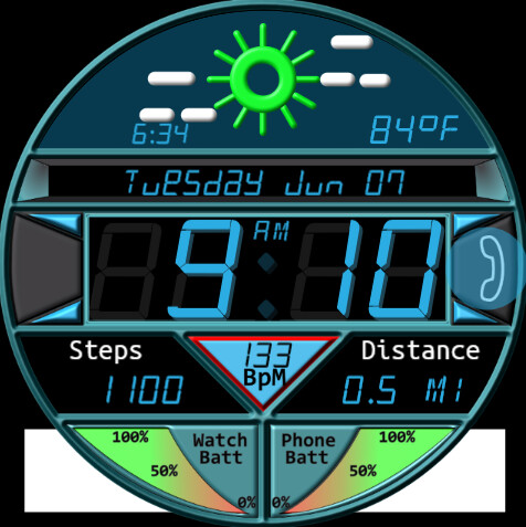
nice job @jlcash61. Quite like the weather icons you are using now, with the raised edges to them and the shadow. ![]() Might want to use yellow for the sun, rather than green though, just in case the hex numbers were mixed up again.
Might want to use yellow for the sun, rather than green though, just in case the hex numbers were mixed up again. ¯\_(ツ)_/¯
2 Likes
oh man I hope not ![]() I went through and fixed them but i am on the road and may have a cloud sync that didn’t sync.
I went through and fixed them but i am on the road and may have a cloud sync that didn’t sync.
Thanks for looking out.
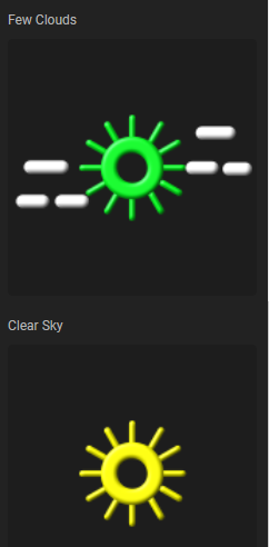
I will post the weather images then when I check their hex
2 Likes
Check the Few clouds condition image, the sun is green. The clear sky is ok.
3 Likes
Thanks. You guys are awesome. I will edit them in morning when I get home. Do you think I should make some “boxed” ones as well when I go to upload them to resources so if anyone does want to use them not full screen. Those are kinda arced and I don’t think they will scale down well to smaller form factor
3 Likes
@petruuccios . Sorry to come to this Party so late . I just wanted to say thanks for sharing your Font Peter . Great work .Spot On .