Again something a bit different for me …
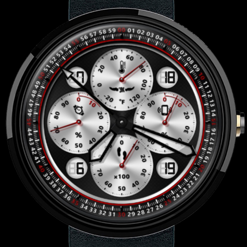
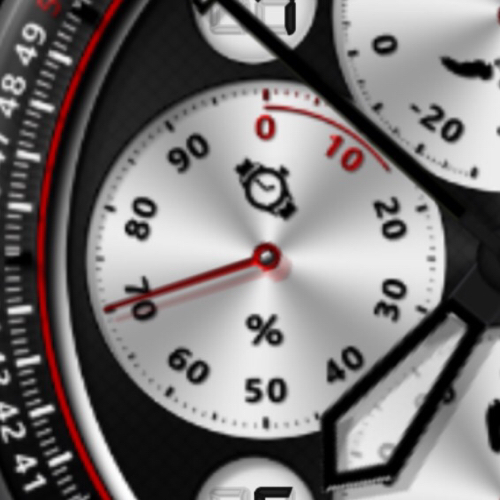
Bright silver sub-dials for current temperature, watch and phone battery charge and step counter.
High gloss black and semi-transparent main hands and high gloss red sub-dial hands.
3D high gloss sub-dial numbers and tick-marks.
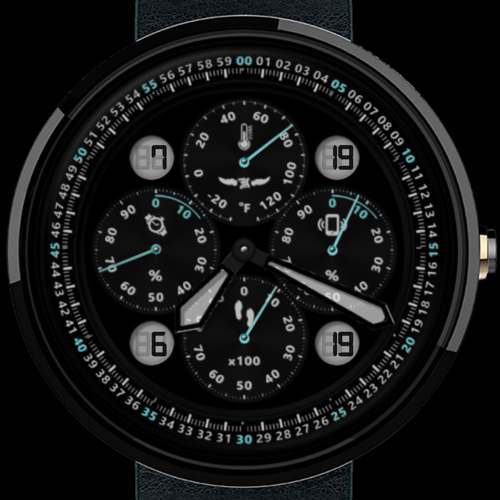
And “luminous” numbers, hands and tick-marks for the dim mode.


I would love to hear what you think.

2 Likes
I do like the semi-opaque hands, a nice touch indeed. Honestly, I prefer the dim mode on this one. I have cataracts (early stage) and have trouble seeing information on a small screen, so the dim mode elements on this stand out better for me. After seeing it on my Frontier, the sub-dial layout feels a bit cramped in normal mode. I am interested in seeing this in various color combos, if you have an inkling of doing that in the future.
1 Like
Thanks for the detailed feedback - it is much appreciated!
I’m with you actually; I prefer the dim mode as well 
I’ll have to do a face just based around that!
And colours? Yes I am planning that. One day if I ever make it to Creative Partner I will include the ability to choose between colour themes in a number of faces. In the mean time I will probably publish a couple of clones with colour variations.
Thanks again

1 Like
You are welcome. A face based around this model’s dim mode? Oh yeah, now we are talking my language.
1 Like
