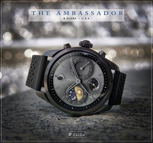
This design was divided into two versions from the start. v1 previously published had an outer ring date indicator which is a complication I like, and on a larger screened blank watch like the H1 or Galaxy Active2 it works very well. But on a watch that already has tics or numbers on the bezel like the Galaxy or Summit 2, I think this version with the date moved to the sub dial is a better match. However, It’s perfectly ok for you to disagree, and wear whichever you choose! 
enjoy! don’t forget to follow B Sharp here on Facer to never miss the next release, and on Instagram: https://www.instagram.com/bsharpwatches
4 Likes
Great. I’ve seen this design. But without the tick marks on the watch case. It didn’t seem complete to me. Now it’s a match. I also like all these stories, the way they were created 
The tick marks really finish it off nicely 
@lucky.andrei , @Batwolf. Thanks! Yeah we were talking about the tic marks in slack. This variation is definitely a direct result of the Summit 2 and trying to integrate its permanent tic marks into the design. I think I’ll end up doing more of that since I will probably want to wear the Summit more than my other watches 
1 Like
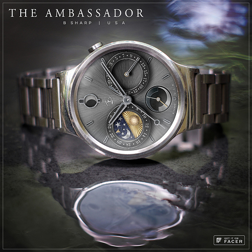
Here’s the other promo pic I made on the H1. I like it fine without tics, it’s clean and draws all the attention inward to the details. But…if all (or at least most) smart watches were unmarked like this perhaps I’d be inclined to put some tics in.
2 Likes
Nice one. I like this one better regardless of pre-tickmarked watch or not 
The best part in both these watches is the night/day wheel. A very nice colored accent to all the “silver”
Thanks @ThaMattie! If you had an H1 you’d like the other one better  the day/night wheel was the most fun! The night half uses the “painted” texture from my Stardust watch, and the moon/stars and sun half is trying to emulate metal engraving. So there’re a lot of “hand made” in that disc.


