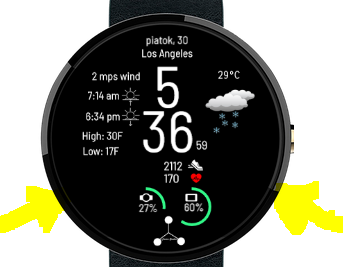
Just finished making this watch face. I put in a few more complications on it than what the Apple version had and the only thing that I took off was the analog clock. Please let me know what you think.
3 Likes
Nice, good weather icons. Yet I would put in use the empty lower “corners” to get some more room for little bigger info texts.

1 Like
Very good design and also the figures of the weather !!!
In general I share the same ideas as @petruuccios Use more spaces … for this type of design …
Cordially
Thank you @cardozo198013 and @petruuccios! I think I might do that in another version of this watch face.