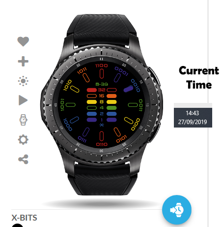
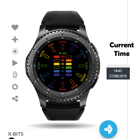
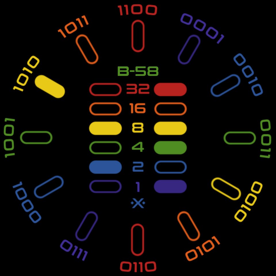
It is true…I create unconventional designs. This is my second attempt at a binary style watch presentation. I decided to go bold and colorize individual elements to make each piece stand out. The outer hub is the hour display that uses binary numbers but is conventional in time indexing. The left inner column is the minute display. The right side column represents seconds in active mode. The “B” followed by a number is the watch battery indicator. My concept is to keep it fairly minimal but make it visually striking. The specific color codes were chosen simply to represent the individual elements and have no political or social relevance.
It is perfectly fine if you are not binary literate. As a matter of fact, X-BITS makes it simple and easy for you to learn!
Update 1.2:
4 Likes
I Love it.
I had a binary watch quite a few years ago, looks amazing.
I would love to see the maths behind that, its a great job.
I would also fill the hours (around the clock) to make it easier to read.
@joedoughty, thanks!
I’m not sure what you mean by “fill the hours.” Will you please clarify?
Edit:/ I think I get what you mean.
Just to clarify, now here (Spain) its 16:17 (or 4:17 PM)
So you have 12 coloured markers for the hours on the outside.
I would fill in the number 4 (or 1,2,3 & 4)
Is it not filling in the appropriate indicator? Maybe I have made this layout too confusing. Take a look at this update:
Cool face - one for the nerd hiding in each of us 
1 Like
Hi @ircrotale
Maybe I can explain better with a screenshot

See how I have filled in the time tag with the hour (2PM / 14H)
Your watch currently looks like this:

Hope this helps 
1 Like
Okay, that is weird because on all my web devices and my watch, that hour indicator shows up. Is it not showing on the website or your watch? I need to determine which course of action to take.
Is anyone else having this issue with this face? I surely don’t want to publish a non-functional watchface.
I am using the #Db# tag for each hour indicator and all are turned on. This issue has me stumped. Just as a sanity check on my work, here is a link to the current version:
I also loaded the preview image straight from the Facer website, as the time shows 10:10:45.
Can you share your expressions? I’ll have a look and see if anything jumps out at me.
Thanks, Mike! I turned on inspection, but I want to throw a caution your way: there are a lot of layers.
1 Like
Hi @ircrotale
So the problem is after 13h in the 24h Format
00-12h everything is fine, once you reach 13h the tag no longer shows
1 Like
This baffles me. I used the #Db# tag so this would not happen. Per Facer’s documentation: #Db# Hour in day using user’s preferred format (12 hour or 24 hour clock).
I will wait to hear back from Mike. Maybe he will find something I am overlooking.
1 Like
Ok, I think @joedoughty has it …
#Db# returns 1 to 12 when the user has chosen 12hr mode but I think 1 to 24 in 24hr mode. So if a user has selected 24hr display as their preference then the face will only display hours for the first 12.
Also, just as an aside, I was reading something from a Facer official some time ago where they said that using “=” for an equivalence test works in Creator and Tizen but may not reliably work on Wear OS. The advice was to always use “==”.
@mikeoday: Okay, I see what I need to do. Seems the tag itself is counterproductive in how it is marketed, but nothing worthwhile is ever easy or simple.
I appreciate the heads up on the == sign, as I had not seen that noted beforehand.
Update 1/version 1.1 coming up…soon.
@joedoughty: Thanks for pointing this anomaly out. Since my watch follows the time format set by the face, I never get see these issues.
1 Like
Looking forward to wearing it 
1 Like
@mikeoday, thank you for the assist!
@joedoughty, Try this now.
1 Like
Know the 24h works.
Except 00:00-00:59 (not sure if it is intentional, but seems to me the 12 should be on here too)

