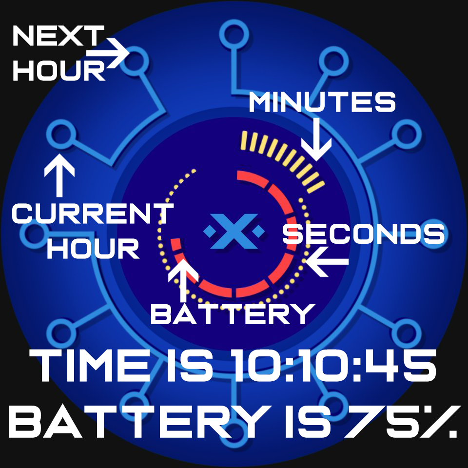
Hi all. I have been brainstorming on unique and quirky designs lately. I think I have one here that I like enough to show off. I want to say that it is finished, but are they ever? Anyhow, please take a gander if you will. This particular design theme has no hands, no numbers, and no letters; graphic shapes display the time. The outer shapes are the hour, with the separated indicator denoting the current hour and the next hour. The next inner shape set is the minute indicator. The third set indicates seconds and is timed off the minute position. The most internal ring is the watch battery level. Dim mode is the same as active but without that pesky second indicator.
@GAUSS, good question, so, what might help the design to “read” better? I think of the minimalist designs where there are hands only with no dials or minimal dials. This is in essence the same, just with a different take on the idea.
Well - the problem is - i have no idea at this special watch face. It´s always a problem with artistic and/or minimalistic designs to get them a good readability…
I love the color and the second hand but find that a quick glance for the time isn’t going to work. First I have to look for the open spaces and then figure out which numbers correspond. Not something that I feel could be both fun and useful. Sorry!
@le13219, please let me welcome you to our community!
I appreciate the feedback. Not all of my creations are conventional. I do pride myself in making highly visible and readable elements, but there are times where I take a detour to shake it up a bit. As one example, my X-BITS watchface is very much a complicated design from a user viewpoint. It is a binary clock that uses a partial conventional layout.