Hi there, as in this forum there is a lot of knowledge I fave some simple questions:
What is your favorite inverse font?
Is it freeware?
Where can I download it?
Thank you in advance for your answers.
Hi there, as in this forum there is a lot of knowledge I fave some simple questions:
What is your favorite inverse font?
Is it freeware?
Where can I download it?
Thank you in advance for your answers.
Peter @petruuccios has a couple on Fontstruct. If you can not find them I will post the link later. It is always important for us that it is Mono Spaced some are not. Some have tiny gaps between the Characters. So it is not just about the style. It was Peter that taught me that.
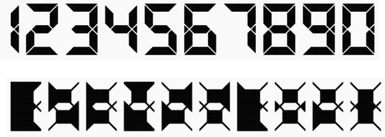
I created my own, based on my NeatLCD font, but I just did the numbers (it is a pain to make…):
I used it on this watch face (effect upon wake):
If you want it, let me know, I can publish it and work on the alphabet.
Amazing! Bravo ![]()
At the moment I’am dealing with this topic, not easy at all to find the right inverse font
I totally join your opinion, its a pain to make such font.
this is the difference between a master designer and an apprentice ![]()
@hippocampus.watches What sort of fonts are you looking for ? Look at Peters . There are a few on Fontstruct you will have to sign in . Search INVERSE .
.
What is the right one? What style are you after? Plenty out there, but we’ll need a bit more info. Tom’s or Peter’s seems perfect for an LED design
thx mate for your link, the links provides me already some good ideas
Finding the perfect font for a project is sometimes difficult. The link to Peters page helped me already a lot, but still looking for some good ideas ![]()
Very true. Good luck! Make sure to share the final result ![]()
It’s a very neat 9 seg font.
I might have to try an neg my LCD font but first need to re-proportion and get the diagonals correct. Most use cases it is fine for text/numbers but a negative would complete it.
I’ve seen some really good effects with a good norm/neg glow combo.
sure I will ![]()
And here an Apple watch version. Somehow it does not align in the preview but it does on the watch.
And a watch face using @petruuccios font “Tall (P) Blocky”
Tom . Is the Rainbow as animated on the watch as on the Preview ?
Yes, but on Apple, as we know, it updates only every 15min.
Nevertheless, the background it is different every 15min.
I wondered if it was Customisable . Like your Chrono .