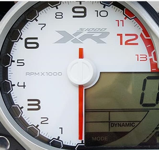
The second version will be with a display.
I wanted to do something light and clean after the mess with the Mayan dial.
Nice and clean.
I am a bit of a motorcycle junkie, used to race American style speedway (called Flattrack) all across Europe (UK, NL, D, CZ, I). So still have a few bikes in the garage…
You can find my motorcycle inspired watch faces here:
I enjoy your hands… They are great.
Great watch, however some proposals for amelioration:
- perhaps you would align the numbers to the same direction
- the hands are perhaps a bit too small
- great dial, perhaps you may bring some shade in it
I agree with the hands, I will definitely make them a little smaller. as for the numbers, I thought about how to build them, originally they were as you wrote in one direction, I also had them that way, but it disturbed the smooth roundness that I wanted to achieve. and I don’t like upside-down cisicles very much. if I don’t have to, I don’t use them.
What shades do you mean? the background of the dial is originally pure white, but it burned the eyes on the watch, so I chose this shade of gray.
What I mean with shading? see following example:
Here I have versions 2 with Daytimes
As always, a nice one.
Thank you.
