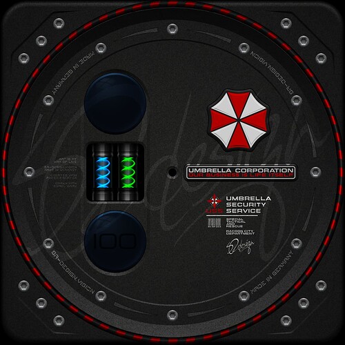
I would like to let you participate in the development process again.
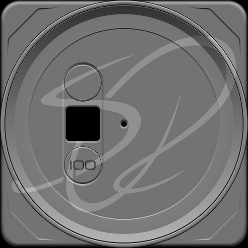
I had an idea for these simple forms that give a lot of freedom for decorative things.
I had considered using something technical in the middle field.
For example flickering tubes or the like
Then it occurred to me that another idea has been waiting for implementation for a long time.
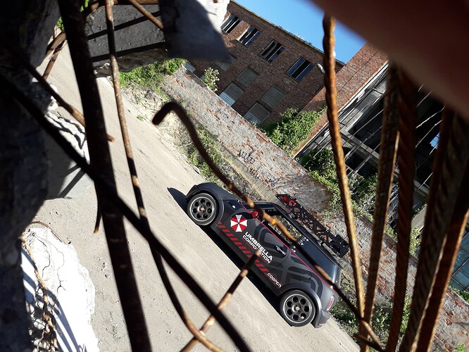
That was my Mini Cooper.
I planned and implemented the technical and optical tuning myself.
The eye-catching roof rack is also designed by me.
This offers many possibilities for a special graphic design.
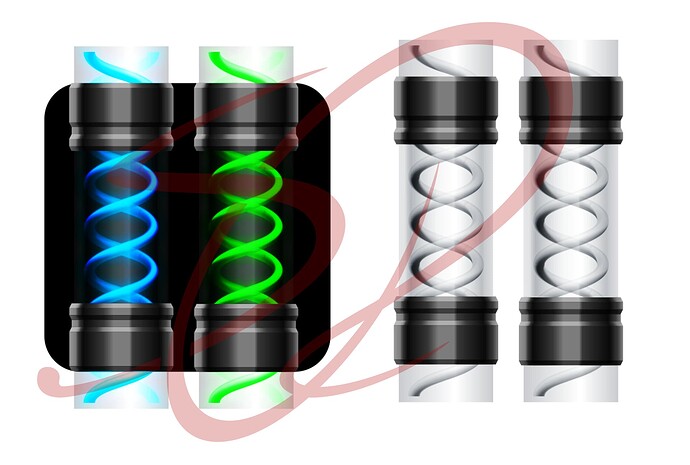
Since I couldn’t find a suitable double helix for the T virus ampoules, I drew them myself.
The mini’s special wrapping foil, with its extremely rough surface, was easy to trace.
I use this surface more often in different variants.
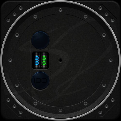
Now all the logos follow, the glossy black bezel and the optical effects that make it look more realistic.
The black bezel has to be, since all round fittings in the mini got black rings foiled.
5 Likes
I love it all but I would give a little more room to the special effect . It is going to be just over 1/8 inch tall on a big watch . Sock it to Them .
3 Likes
Coming along just great, you talents are evident, and I love those Ampoules, looking forward to seeing where this goes…
2 Likes
Actually, the helix ampoules should flicker like defective neon tubes.
But the random function quickly blocks the creator.
That’s why the lighting of the ampoules is currently flashing every second.
Oh … yes, the sec hand is a derivative of the speedometer hand of the Mini Cooper.
4 Likes
Love your design and the precise execution of your concepts. Great that you let us in the development phase. A challenge would be to let those ampoules come to live by adding some kind of particle in a slight lighter colour and moving from top to bottom. Small things can evoke greatness. And of course I would let the umbrella give a slight spinning. Beautiful. Patrick
Just to show what i mean…
1 Like
I thank you for the compliment.
Both ideas are good thoughts.
But, in my opinion, it doesn’t fit thematically.
The ampoules are closed containers, so not much moves.
With the many different glow effects that would be very difficult to implement.
As I wrote above, the thought was that the ampoules are illuminated and the lighting is not working correctly.
At the end of all the work I will try again.
If this were an actual merchandising watch, the umbrella corporation would probably want the logo to be in the right position as a logo.
At least that’s how I would want it as a client.
2 Likes
You can have the Real time clock devided by different numbers to give an out of sync look. Have a look at this from Mr Starr. If that is what you are after. The Flickering Neon is cool but a bit frantic and I suspect it is running of the Random which is runaway at best.
@Zieneth
3 Likes
thats correct
So I think it makes sense to have both flash every second.
It’s not so hectic and serves a useful purpose.
I think @Zieneth 's idea is great.
Maybe I’ll have a graphic work at some point that fits perfectly.
3 Likes
Fantastic graphics, I have to say. Thanks to @russellcresser for mention, otherwise I’d miss out 
@SR-Design.vision if you don’t mind, could you mention me when you have your working code? I’d really like to see it.
3 Likes
