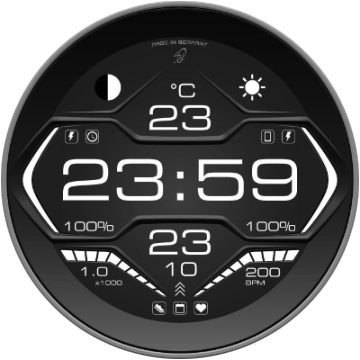
I had an idea to start with.
I thought everything comes from drawing.
Now I’m stuck…
Everything is still open.
Digital, analogue, hybrid or …
The two white bars are for battery display of mobile and watch.
I had an idea to start with.
I thought everything comes from drawing.
Now I’m stuck…
Everything is still open.
Digital, analogue, hybrid or …
The two white bars are for battery display of mobile and watch.
That kind of layout looks familiar, here’s what I did with it:
a beautiful interpretation of this theme.
Leave a little space between the writing and the frame.
it always seems so squashed.
I really like the abbreviation on the seconds hand.
Originally, my approach was design drawings for modern speedometers.
Definent potential. Analog cluster comes to mind for a layout. ???
I’m open to all ideas ![]()
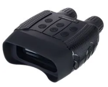
To me it resembles some night vision binocular

So maybe some digital “HUD” data above background image could fit in
Here’s a my modern speedo with 2 modes for inspiration (click on mode) ![]() :
:
I like the second from the bottom. I see a little Face again. ![]()
Here is my latest. Cluster theme. Couple finishing touchs yet to do.
I actually prefer designing more simple analog faces but it seems this is what people like. Digital with all the info. It’s more of a challenge although.
It is very pretty but some details (icons, descriptions) are too subtle for tiny watch displays. Now I don’t mean small for my aging eyes, but for the small resolution. This is screenshot from my watch:

I know that a lot is very small.
I will also adjust a few little things.
I don’t usually do such small things either because I don’t like it myself.
But here I make an exception.
When I look at the top 100, many seem to like it.
And my design idea works halfway … ![]()
I took another from the font family for the smaller fonts.
In this way, higher numbers fit into the design.
But I have a stupid question …
Does anyone have the code for the short number of steps?
1.0 (K) = 10,000 or 1.0 (x 1,000) = 10,000
I recently read that someone was looking for
Not sure what you want to do with the steps. Do you want to show 3.42 k rather than 3420. Or somrthing like that . There is a very exciting new expression toFixed(x, 2) where x would be the steps Tag.
Yeah just about
Steps / 1000 with a maximum of 2 places after the comma
Otherwise the space is not enough for me
edit:
(floor((#ZSC#*0.001)*100)/100)
not solved nicely, but works
This should work:
(toFixed((#ZSC#/10000),1))
problem is with 100000 steps, then you would have to use clamp as well if you want max 99999 steps. And I would change you text “x1000” to:
$#ZSC#<10000?x1000:x10000$
hope I got it right… seems a little odd though, at 99501 steps, the formula will give you 10.0
Yeah, was doing the math with % and division, when I saw the new expression!
you are great
With: (toFixed ((#ZSC#/1000), 1)) I have the perfect look
This is completely sufficient for max. 10,000 steps
The X1000 is an image element
So it is more difficult to change
The old way was fun. And good for Learning. Sorry If I have lead anyone up the garden path . I thought that new expression would sort it in one. I must go and Test TestTest.
Free:
Premium:
for now only with theme color
further functions will follow