This time I am inspired by modern art.
I want to play with special shapes and materials again.
Suggestions and criticism are always welcome.
This time I am inspired by modern art.
I want to play with special shapes and materials again.
Suggestions and criticism are always welcome.
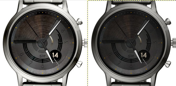
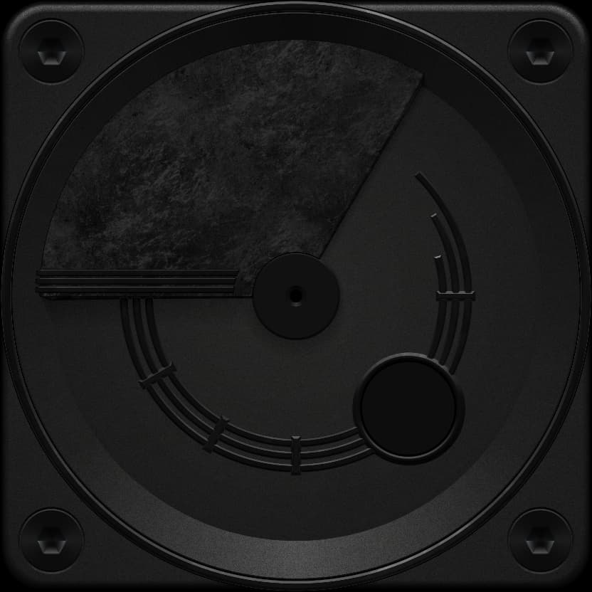
I like the feel of it . As an Analogue lover I wonder do I would tell the time on it . But that should never stop Art .
I’m looking for the most suitable solution for this. ![]()
In the early 70s I got the first affordable digital watches. But soon went back to Analogue. It is about the included angles of the two hands. But on a face like that a Jump hand would be appropriate. I know that some very up market Makers ( Real and Virtual ) are fond of them.
I considered drawing the min points in the outer ring.
Some of the hourly points are already integrated below.
I’m still trying…
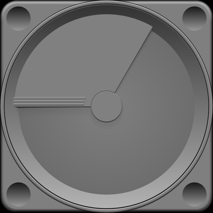
In my mind, that raised area in the first image screams to use it alone as the hands. That is the hour hand can be the side with 3 bars and the minute hand can be the side without, where the time would be 9:05 in the image. It would require some dynamic fill with the arc shape function, and some switching of hands depending upon where the other hand is and where the shadow is desired, but I think it would be cool.
That in and of itself is a very good idea.
The graphic design here is too complex to realize, but the idea is great.
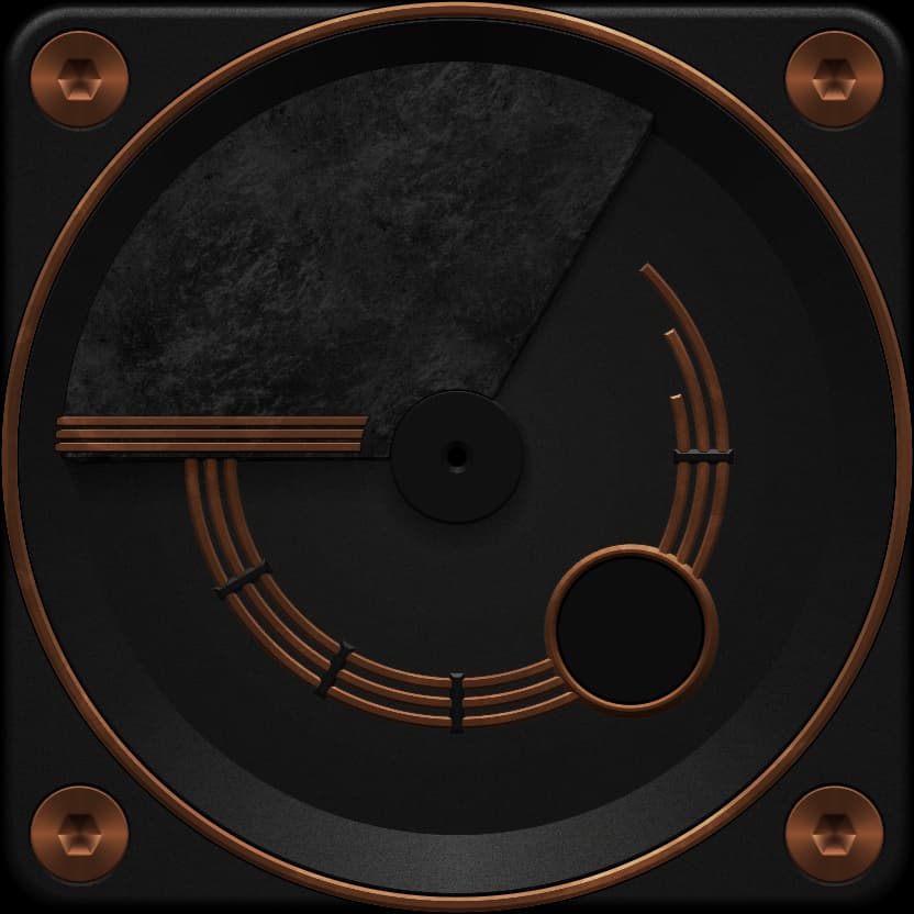
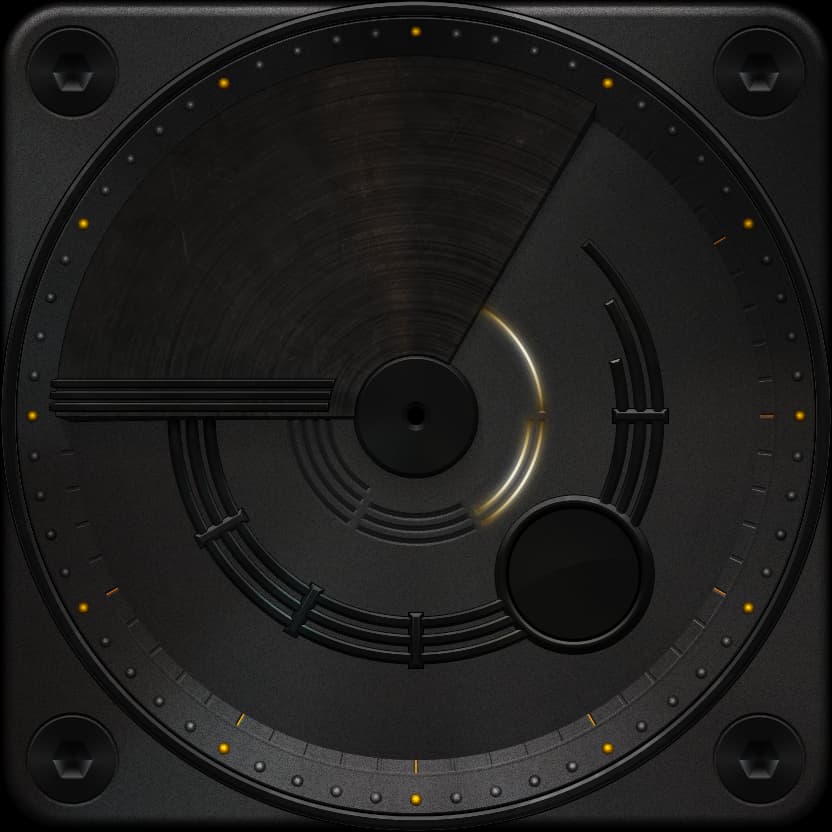
with steel rivets and engraving in the outer ring
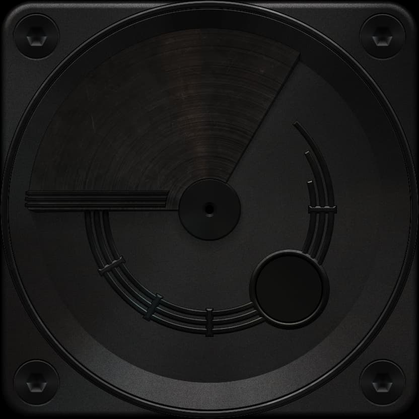
The battery display in the middle of the picture shows a 50% state of charge
That sounds like a challenge to me @SR-Design.vision! ![]()
I’ll see what I can come up with, but not using your graphics of course.
I’m curious about the coding. ![]()
It would be great if we later developed something good out of it.
Here’s a preliminary rough around the edges greyscalse implementation of what I had in mind, it’s open for inspection. Hit the fast forward button to see it in action.
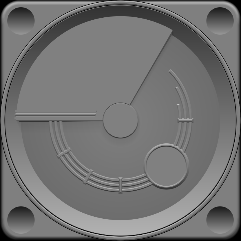
Please ignore the centre dot shadow, it’s a bit messed up at the moment. Also ignore the multiple locked hand layers with zero transparancey, as I think they may (or many not) get deleted in a future version, as they don’t currently do anything - they were a work in progress messing around with layers type of thing.
I think in a future implementation I will make sure that the top arc (plateau) between the hands is always at the smaller side of the distance betweent he hands, if you know what I mean. That way the lower level with the 3 circles will always be larger. Not sure if I explained that very well. To do this, I may go back to those hands layers noted above.
After I do that, I can implement that window you made to dynamically move about on the lower level, so it is always visible no matter where the upper plateau is.
I think it’s really cool that it works.
very cool
But I’d rather “cover” the past time.
this makes reading easier.
for example
then you can see the “I still have 5 minutes” better.
first class work ![]()
![]()
![]()
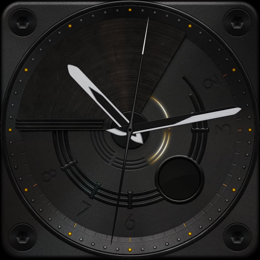
Looking interesting. Me, analog lover as well.
The first thing that comes to mind looking at this draft is an L.P. on a turn table. Lover of Progressive Rock also.
the nice thing about art is that everyone can bring their own interpretations. ![]()
![]()
now you can call it a clock.
Pointers for min and h are very special, but I think it fits quite well.
What do you say?
I’m considering designing a special font for the date…
Sweet
test run
The hands just don’t match.
too modern…
I decided on my arrowheads.
these still have to be color matched, but the look fits better.
It is really nice, just a bit dark. I would let some sunshine in to better see the details.