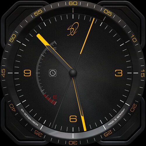
friends could someone help me with a battery model to put on the screen that I’m doing… I’m trying to put one that was colored but I don’t have applications that do that
I think a more detailed explanation would be needed…
do you have a picture for us?
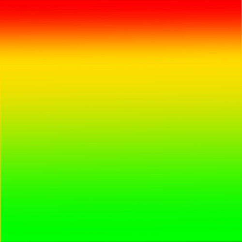
A model like this but I don’t know how to create one and make the load change vary colors with color variation or even a circle
Please show what you mean exactly.
Your ideas could be implemented in 1000 ways.
In the format like the one you put in your watch, only the load varied with colors
I’m sorry but I don’t understand what you mean.
However, the battery indicator here is a bit more complicated to draw and it also requires some code.
For starters, there are many ways to work with the progress bars in Facer.
Like some other designers, I use this option often.
you can also create very interesting shapes and use them as a cover over the progress bar.
If you have a specific idea, everyone here will be happy to help you implement it.
This…
this is probably a transparent cover with a gradient.
behind it is a progress circle in white.
Red and green Morphing sadly the two make a muddy colour when they are both 50% . That is why Peter came up with the yellow in the middle . Red and blue work Beautifully as a two colour morph . The alternative is to put one of these behind a mask and Cover it with the Progress / Shape .
I made the Mask on Facer Creator and Cut out the Arc with Autodesk Sketchbook . Changed the mask to white so we can make it any shade we like .
Also a way that works well.
Very well explained.
There are many ways to many good displays.
At least 24 ways to do anything on a Watch Face .
I’m about to go backwards.
I prefer simple analogue clocks.
That’s why I’m doing something simple on this basis.
I somehow lack the perfect idea for the date display.
Date Classicly at 3. Nice ECO Face.
Spectacular…congratulations
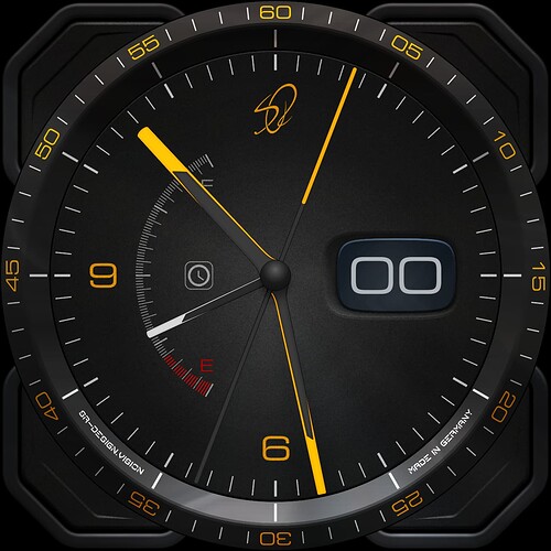
That number in the center of the screen? It can be erased or placed behind?
It is only a test . The number is useful . Hide it if you want to .
After 5 attempts, I decided on this form of date display.
4 good ideas that just didn’t fit that I can use in later projects.
Even failures help.
You just have to learn from it. ![]()
Big and Bold Leading Zero . What is there not to Like .


