(Work in Progress) 80s >>> 2022

Actually, I know what I want.
But I am very dissatisfied with the inside of the dial.
The date and the digital clock are also planned inside.

Various displays, such as battery, number of steps and the like, find their place on the outside.

Maybe someone has the right inspiration for me.

3 Likes

I like your seconds, that’s for sure. It’s kind of the focal point of the face. Otherswise I think you are just going through the creative process, and if you play around a bit, it will come. :+1::+1:

3 Likes

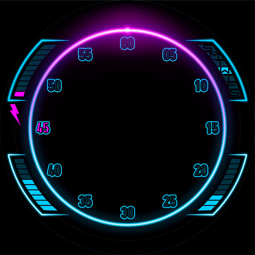
There are some nice Faces with inverted fonts . If hose second numerals were inverted as the light passed they would glow the same . A lot of work . I like the effect and it is popular with loads of people .

2 Likes

That’s true @russellcresser, and that effect would look really nice. Or instead of using an inverted font, blow up the creator window to the maximum, take a screen snapshot, then edit out the numbers with your favourite graphic program’s magic wand tool & the delete button, then reinsert the image into the face.

3 Likes

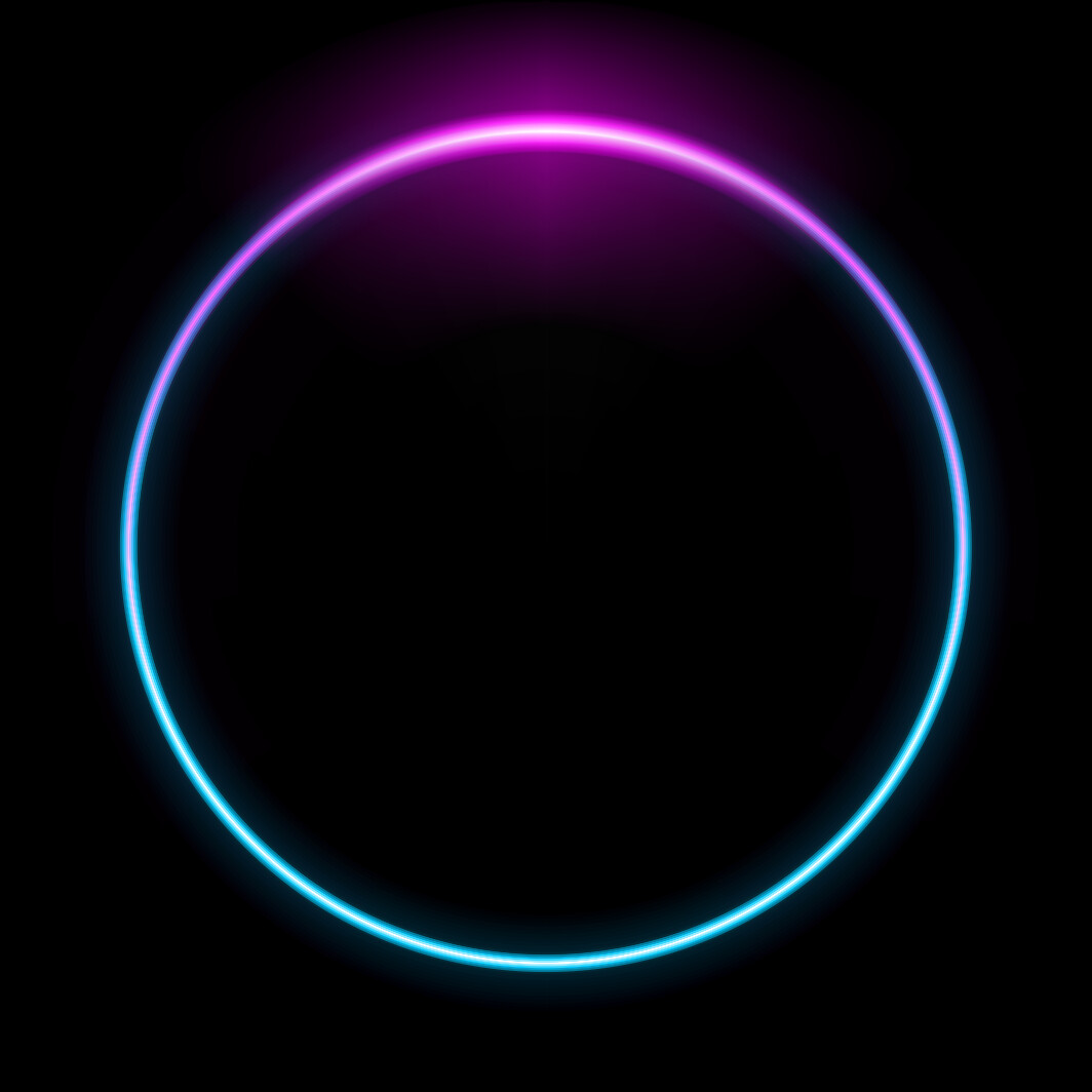
I wanted to create this effect for another model.
I didn´t want to ‘exaggerate’ that much here. :wink:
But I still have to think of something.
I´ll definitely think about it.

3 Likes

I have seen this neonica toolbox. Maybe it could be somewhat useful.

3 Likes


3 Likes

That´s a good inspiration.
It´s good that I can build effects like this myself. :wink:

3 Likes

This is just a font for testing.

The active minute area glows magenta.
For the rest, only the border glows blue.
Could that be interesting?

5 Likes

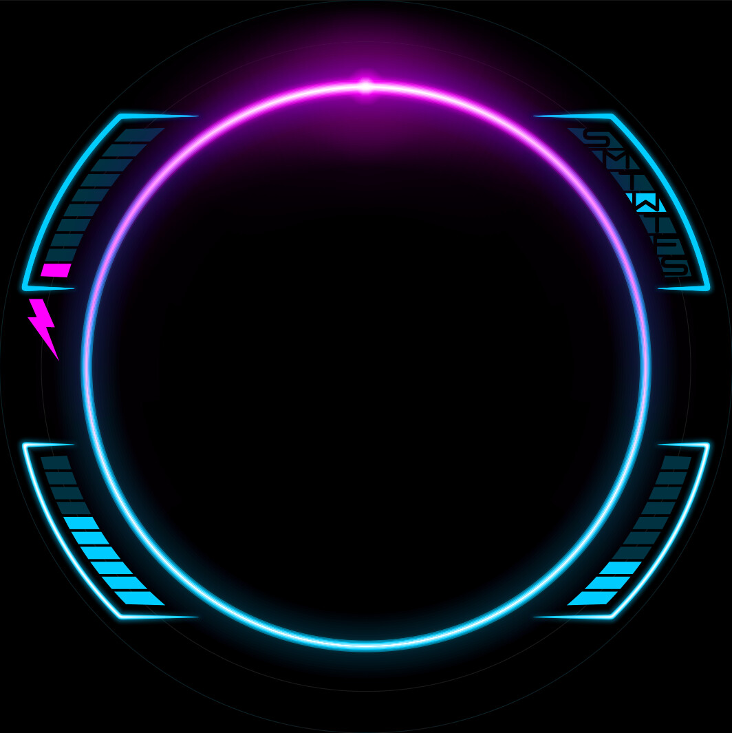
@SR-Design.vision You see because I could not inspect the Face I got it all wrong. I thought your neon ring was done with a slot and a glow behind it. That is the way I would have to do it. So I see you have got a beautiful graphic there. Very nice.

1 Like

love the sci fi ambient but those font doesn’t match it , imo obviously

2 Likes

I´m slowly getting where i wanted to be.

I´ve found a suitable font and layout.
It reflects this future vision of the 80s.
A mixture of Blade Runner, Back to the Future, Tron and and and…
For me at least.
There are still a few small things to be done, but progress is being made .

4 Likes

I like it when I can surprise people with my graphics.
If you don’t see how it’s done at first glance, you’re often more surprised when you see the trick.

I often do unnecessary work because of this. :wink:

2 Likes

I already wrote that this was only for testing.

I hope you like the SIFI theme even better than before.

3 Likes

No doubt , thaths the right way,polite clear fonts , dont like the unuseful minute hand ,you got place for an ecg animated that will fit the theme

2 Likes

I like the one hand.
It fits with my history with cars and motorcycles.
Also, I find it more recognizable that way.

But it´s nice that everyone has different tastes.
Otherwise it would be boring. :wink:

2 Likes

For me this project is finished.

I was able to implement the visual and technical gimmicks I wanted to my satisfaction.

I can’t find any mistakes myself.
If anything else comes up, I’ll have to do an update.

I hope one or the other enjoys it.

4 Likes

Turned out pretty awesome @SR-Design.vision :clap::clap:

2 Likes

I totally get it - love the 80s vibe you have going.
Kinda reminds me of Back To the Future… in the Delorian… I don’t know why.

2 Likes

There will definitely be more faces in the style.
You’re welcome to follow me.

1 Like