Some hiccups in the PS work seem to come through the screenshot.
In the program is as clean as desired.
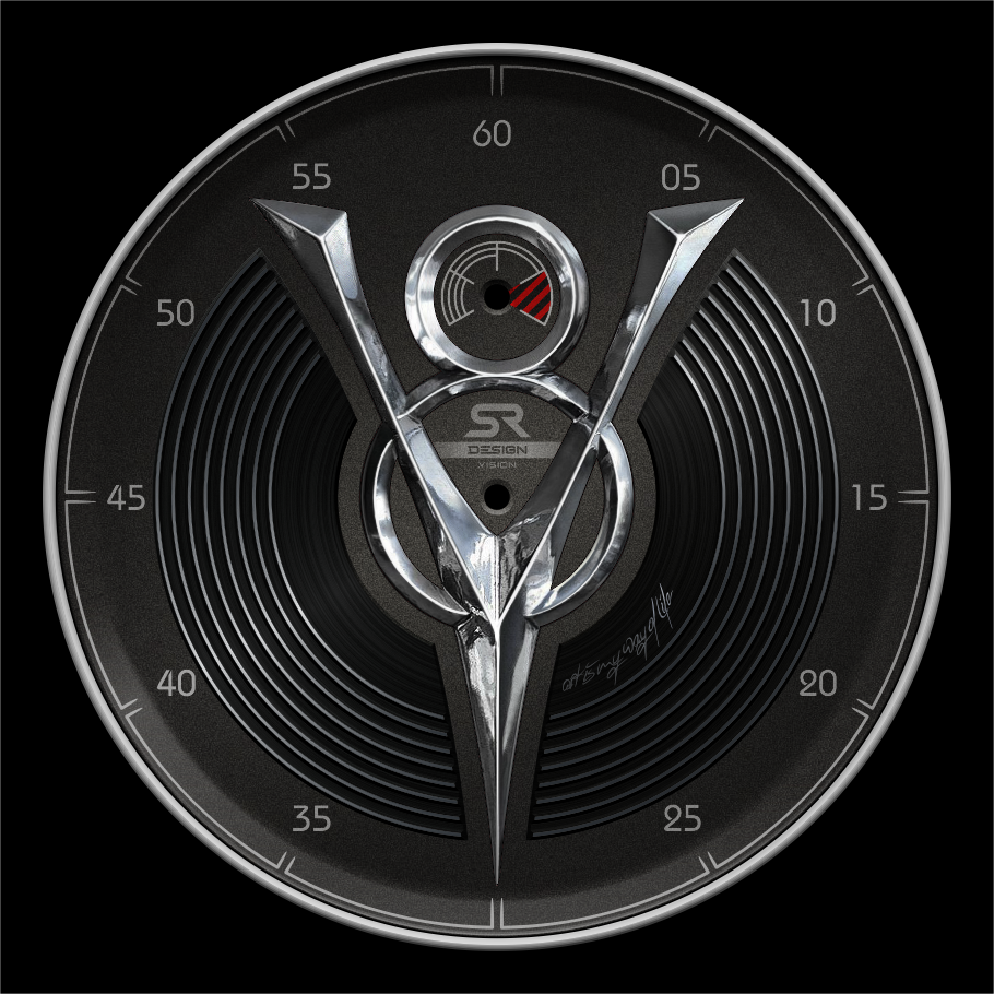
Oh yes, some spots in the chrome are intentional to add realism.
9 Likes
Wow! Amazing graphics skills! ![]()
![]()
![]()
![]()
![]()
3 Likes
Very cool, love that you are making a WIP post here.
I would like to do that too, but then you’d be waiting for a year to see it finished ![]()
4 Likes
I love it
3 Likes
I think I’ll declare it done.
I’m sure you could add a lot more details, but I think that’s enough for now.
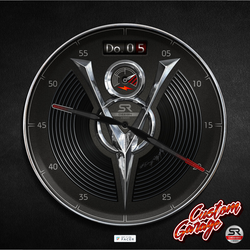
The KM/M display looked inappropriate in the planned position.
Therefore, the display is now rather discreet at the top.
I’m glad that so many people watched and commented.
7 Likes
Excellent graphic skills and very interesting WIP. I am impressed.
Clear and sharp, well balanced layout, very realistic chrome look. Every digital artist knows how hard it is to achieve in such a quality…
But i have some personal two cents you may find interesting.
The main logo is very dominant (which is good) but it isn‘t mirrored in the other parts.
The watch hands should resemble the logo look and the classic car aera. I would try chrome needles or instrument needles. This will also make the readability better
The small second numerals vanish (maybe brighter, a touch bigger or/and in red?) Alternatively you could spend them an embossed look with some slight shadows.
The Day of week in the date field should be all uppercase and it could be a cool effect to add a small light source like in a real instrument panel.
And if you add a decent, fine coarsed texture pattern to the background you can make it even more elegant.
Greetings, GAUSS.
5 Likes
I appreciate compliments and suggestions.
I chose the background because I wanted that strong contrast between the 3 materials. For me, the very rough surface reflects the original character of the car.
A workhorse that now has a beautiful new look.
The date field…
I’ve tried a lot.
I also had a light source in mind, but unfortunately didn’t want to succeed.
Everything seemed cheap and unrealistic.
How do I tell the Facer Creator to use only capital letters?
True, everything should be capitalized there.
I had the numbers in the background bigger and brighter.
But then they were so noticeable that the 3D look of the background didn’t really come into its own.
Red numbers were completely lost in the dark background.
I also planned the hands in a more classic way.
But here, too, my problem was that they simply went under.
You can’t see the thin instrument needles.
Now I look at the modern hands as a borrowing on the retromod theme.
Modern technology in the guise of an old car…
Following your tip, I add a classic second hand with a chrome tip.
Yes, the chrome logo really should be reflected on the edges of the brushed material.
Possibly also slightly bright spots at the edges of the background.
I will definitely change that.
Thank you for the suggestions.
That’s the only way you can get better.
3 Likes
It’s a font setting:
However, I would go for a image based date there.
Facer uses localization for those fields, some have a 2 character day, some a 3 character day, some have 2 characters and a dot (like yours and mine). Using images you can always have it in the same size/language.
3 Likes
Good suggestion
I prefer German abbreviation.
However, this would limit its use in other countries.
I will test different things.
Thanks
3 Likes
Amazing chrome work. Love the whole vibe.
4 Likes
This can be solved by using monospaced font aligned to left corner, placed under a mask that has window for 2 letters only (which is common minimum).
4 Likes
what was going on here?
who deleted what?
1 Like
It is is an Historical problem. A Community member chose to be abusive. What was posted was abusive and nothing to do with the Topic.
1 Like
I already thought so when I read the mail.
I just didn´t understand the meaning of the statement.
2 Likes
@SR-Design.vision. We are all sorry that you had to witness some Off Topic Behaviour. It is remarkably unusual. All those who have been Involved are extremely grateful to @Facer_Official Moderators for dealing with the problem so quickly. . The Community Spirit I upheld Wonerfully so it should in no way be Abused by Anybody.
something like this will happen again and again.
Unfortunately, this is normal.
1 Like
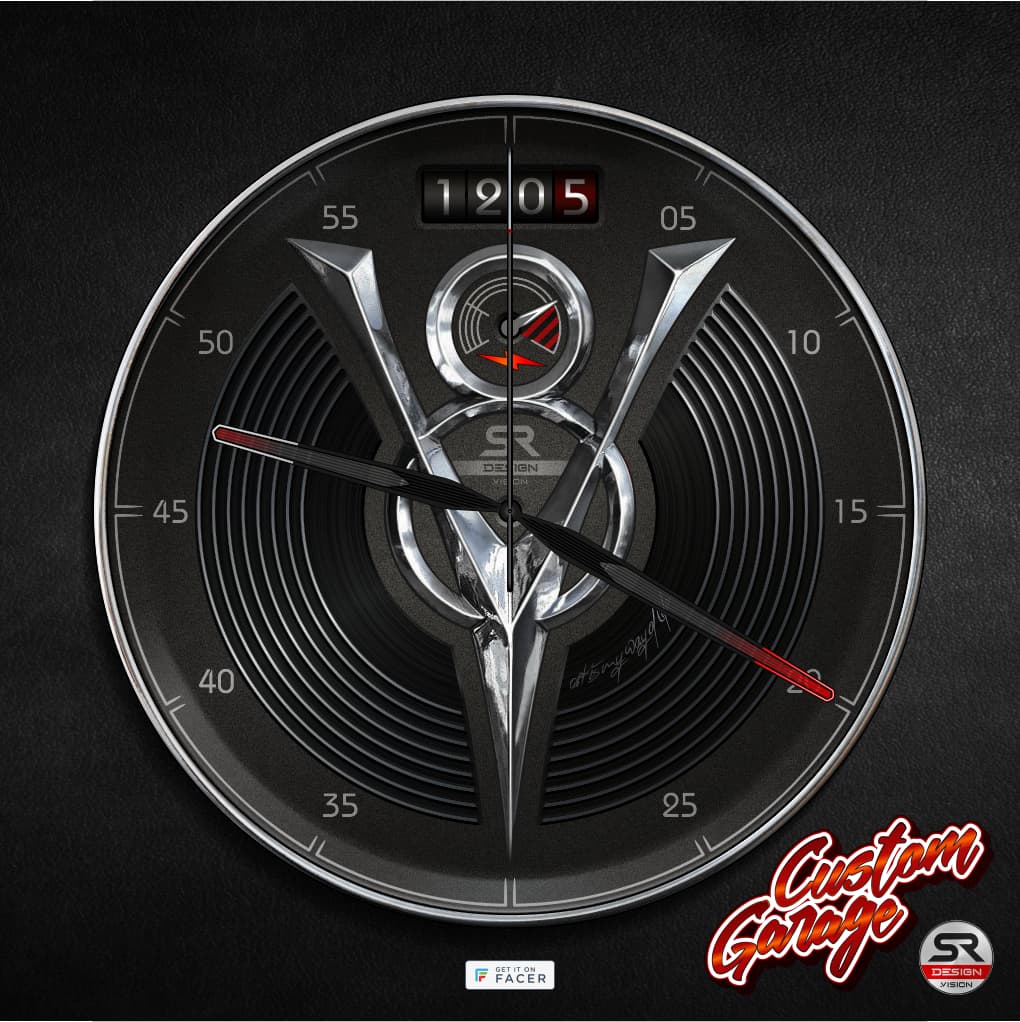
Hi @SR-Design.vision. Loving your v8 face. My guess is it eill be popular and be in the charts I have not checked. There are devices for showing hands brighter temporarily . With timing and motion detection. I did not guggest it before. As that is not a gimic watch. It would not go amiss if you chromed up your hands. People would still love what you have done. There are some that Park thier Hands.
1 Like
Unfortunately, you can´t see Chrome hands over the V8 either.
But the topic of hands isn´t over yet either.
The face is online for now, just as i had planned.
But there will definitely be a second version of it.
2 Likes
I just think there would be enough of the hands to indicate the angle even in chrome. That keeps the Spirit of the Piece. I am off to check the Charts.
3 Likes