Looking for feedback on a new set of watch faces. I’ve gone for a more realistic vibe this time (only the third one has animations and they are fairly subtle). Any comments would be greatly appreciated! 
5 Likes
Very clean! like them a lot!
1 Like
Thanks! That’s what I was going for
Beautiful, colorful, yet clean. I like them!
1 Like
Thanks! Enjoy
@roycaruso,
Definitely like first and third. good backing, good lighting / shadows. I like the slow undulating oscillation between the orange-to-red tick marks.
John
1 Like
Thanks! Really appreciate it. Sounds like it was worth the effort!
I believe it was worth the effort, they look great! I look forward to your next release.
~Orakix
1 Like
Thanks so much - Stay tuned!
@roycaruso,
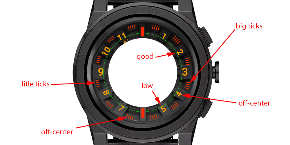
I really like the Firestorm a lot. You asked for some comments so I was hoping to expand your thinking to the next level. Take a closer look at your design. The design elements are awesome, the layout just needs a little tuning. You probably know most of this stuff already but I’ll just list some things that come to mind.
-
Your starting background has to be perfectly round and straight up 0-degrees at 12:00. If not, squeeze it, stretch it, and rotate it to make it so - even if the rotation is only 0.3 degrees. Should by exactly the same pixels width and height. 12:00 and 6:00 ticks (or numbers) dead-plumb on the vertical centerline. 3:00 and 9:00 ticks (or numbers) dead-level on the horizontal centerline. Once the background is completely perfect in dimension and level, then all other layout can be highly accurate from the center crosshairs.
-
Even dimensions: Don’t draw a line that’s 5 pixels wide. Make it either 4 pixels or 6 pixels. Don’t make a circle that’s 25 pixels in diameter. Make it 24 or 26. This will contribute greatly to symmetry. The Creator is going to compress all of your graphics to 320 x 320. If everything is even and symmetrical at the larger size, the scale-down will come out much neater - especially if you have tiny quarter-second ticks on a highly detailed chronograph (like the Firestorm).
-
Circle layout: Hour numbers are 30-degrees apart: 0, 30, 60, 90, 120, 150, 180 etc. That means your four-line ticks should be centered exactly in-between at 15-degrees, 45-degrees, 75, 105, 135, 165, etc.
-
Radial layout: Numbers are hard to get exactly the same distance from the center point. Draw yourself a circle as a guide from the center point. After the numbers are all at the right degrees, move them radially and place them on your circle guide. Then throw away the circle. I also make a star of straight lines at each hour-degree to ensure the numbers are the right degrees and the right distance from center.
I hope these help. If you need help or clarity on any of these measures or techniques just ask.
John
…aaaand I spelled “little” wrong lol
5 Likes
Hi John/ @jmorga106 ,
Thank you so much for the comments - I’ll definitely make those edits to bring the watches to that ‘next level’. Really appreciate it I wish Facer Creator had a ‘Zoom’ feature to make the fine edits easier…Admittedly, you can’t really identify minor imperfections on the actual watch face anyway, but it would be handy when making more realistic faces
Wow! What a great comment from @jmorga106! I feel bad right now too, thinking of some “approximations” I do in some of my watch faces. This is a wake up call also for me… THANK YOU John
(@roycaruso let’s make the things better  )
)
1 Like
For sure, that’s how we all progress and develop My first face got very few syncs - This face just hit 2,500 syncs in only 3 or 4 days. That is progress, largely attributable to hard work and great community here at Facer thanks @Tomas and @jmorga106 !!
2,500 syncs in 4 days (!) 
1 Like
Woohoo to 2500!
1 Like
@Tomas @jmorga106 Indeed! Thanks I’ve really been pushing to become a premium designer, so it’s definitely encouraging
Hi all, check out my latest series here (I’ve tried to take on the great advice presented in this thread):
@Tomas @jmorga106 @syntaxracing @linlay @Facer_Official @jdim1093
[quote=“roycaruso, post:16, topic:20720”]
I’ve really been pushing to become a premium designer
[/quote] I do not understand why members are having trouble with that. The requirements are posted. Once met, there shouldn’t be a problem. Maybe there are so many applications that Staff cannot get through all of them?
Well for me, I just haven’t met the requirements yet. Although I still am a fairly new designer and don’t have a large collection yet. I’m gaining traction with each line of faces I release but I do take awhile in between them. I view my faces as art and don’t publish them until I feel they are finished. I publish them in hopes that the world loves my artwork as much as I do. My style, method, knowledge, and skills are constantly evolving and with as much love and dedication that I put into them, making sure they are clean and every pixel is in its place, I know it’s only a matter of time.
Possibly. We’ll see how we go