There used to be a watch face available (not Facer), called time machine, with rotating 7-segments to display time. I found it inspiring and wondered how it could be done. From what I learned in moving elements, changing width, opacity, and using timers to initiated these things, this time I had to throw all that over board.
The idea is that the elements should be visible all the time and only change by rotation. No opacity is involved. To do this I used the interpAccel function. The reason being, you can set from when to when something should happen and for how long or till where.
Each segment has predefined positions for each number. Here the current WIP:
11 Likes
Now even the Rolex wearing unicorns with the moon on a stick are jealous.
Thankyou will never be enough… Like the world and I’ll not say it again (for the OG [ish] Bond fans)
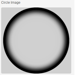
I’ll add sprinkles to the boundless thanks if you have a link to one of these, or a tutorial on making one. I have tried with radial gradients but just can’t get a fast enough edge decay.

Actually, I could probably use concentric, semi-opaque arcs of decending inner radius in Facer and export. Would have to figure out how to turn less black into more alpha but there’s a challenge I can work with.
3 Likes
That’s the puppy. Cheers.
3 Likes
Always love your font display.
A long while ago i too made some similar face.
What you think? I placed the minutes on the DIM side, hours at front.
Greetings
BC
3 Likes
Searche my database of now more than 2500 face, found this one too. Made it 2 years ago, time flies while we make faces…
3 Likes
Yes, Cool!
I remember it, I texted to say that I was working on something similar. Making progress…
3 Likes
@tom.vannes
You always get there Tom, i admire what you do and your interventions, comments, help so many. It all makes humans greater but not all do.
Curious what comes next.
Patrick
4 Likes
Finalising the watch face, still in test phase…
7 Likes
That’s pretty frickin` cool!! This is definitely waaaaaay beyond my ability!!!
4 Likes
The bee’s K, the dog’s B. but on the finalising, and I really hate to do this, but, constructive and all…
The 1 diag could really do with pivoting down from the TR pivot instead of across from LC so it doesn’t seem to float unattached on display. Alternatively just remain a top bar to maintain the mechanical H/V aspect. I’ve sat and watched it for half an hour and still undecided without seeing but the detached pivot does bug me.
The first option would also shorten and, maybe seem to make it seem not truly monospace in size but show me an LCD style that is.
Folks may disagree but when I see something this close to perfection the little things jar me
2 Likes
I agree that the 1 looks a little awkward, but I need 2 elements at left center to cover the vertical side of the numbers. I did not want to use opacity to hide them. This setup is mechanically possible, that was the aim. This setup would not be a monospace font because of the 1. I guess it is a compromise,
I had thought of using an element with 2 joints, but that is a whole different challenge …
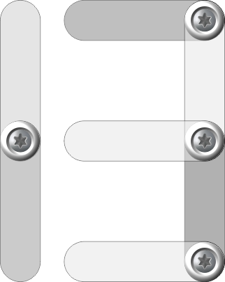
I used 4 pivot points with 7 segments:

2 Likes
why not? I see it as perfectly monospaced. The joints are in the same fixed distance for each digit, are they not?
3 Likes
yes, you are right, I was thinking of the classic 7-segment LCD:

3 Likes
Yes. If all 6 joints are always in the same place it is monospace.
Fold down from TR rather than fold right from LC should not change the need for opacity change but would preserve the mechanical integrity further in not having that extraneous pivot point that links to nothing on either end but still links at one.
2 Likes
Yeah. 99% of LCD fonts annoy me in their lack of symmetry.
2 Likes
