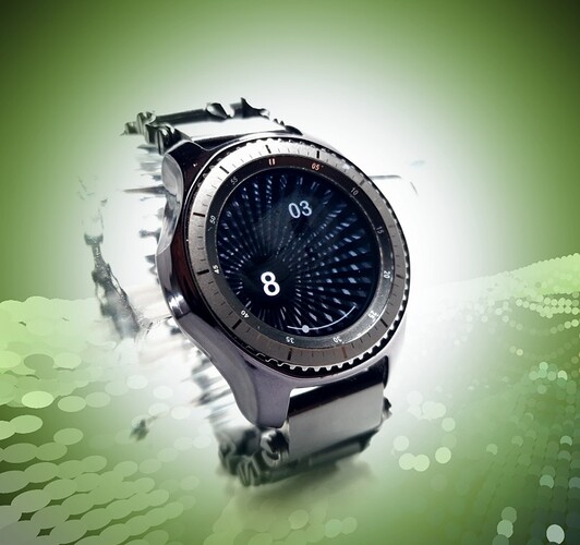
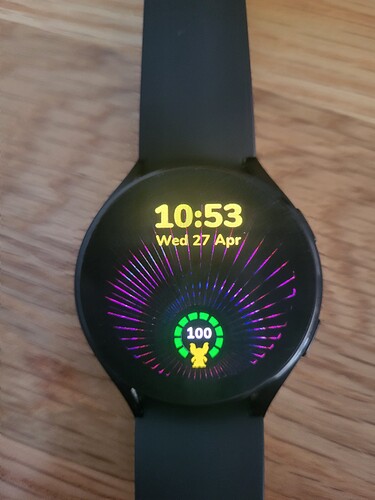
So when I first saw the pattern, moire was indeed my first thought, which I jumped on (as just a mechanical study, not a practical face). My second thought was about the circle at the bottom of the pattern, and (being vintage-minded) the classic vintage look with a seconds sub-dial at the bottom. So now I’m running with the second thought and trying to implement a practical Art Deco face-- 2 to be exact: a classic Art Deco octagonal, and a better fitting circular. Had to cut the digits down to only 3/9/12, so as to not clutter the pattern. I’m thinking the circular one might be the better of the two, the pattern doesn’t sit well with an octagon.
I would consider splitting the difference and make the round outer version with the octagon seconds. The octagon seconds gives it a 19 century feel.
Yes octagon… I was hung up on “hex” before!
(it is 3:30am, after all)
While the pattern does work better with a circular face design, I’m still a fan of the Art Deco octagon. One of my originals is just that:
A user called holyzeke sent me a nice wrist shot in a comment .
He has a nice collection of Monochrome faces if anyone is interested.
I hope he gets on here or may be already .
If any one knows this Maker pleas let us know.
Sorry @kourosh I did not mean this as a Reply to you . Sure you don’t mind me being a bit Thick .
Me Like.
Man you guys really ran with this shape. I knew you guys would love it so I had to give it up even though I wanted to hold onto this one myself and I’m very glad I did. It’s so cool to see how you guys can take the exact same object and have a completely different vision than I. Well done to you all! They are truly amazing. I’m gonna have to make my version now. Heh so many projects I’m working on, I need to hire an assistant! Haha
It’s funny how this shape tends to just make you want some kind of animation. Here is what I was thinking when I originally designed it. Naturally I would put a whole lot more work into designing the rest of the dial in 3d but just to show you guys where my mind was at when I made it… here is an example.
![]()
![]()
![]() its damned cool looking step by step growing project , thx for share
its damned cool looking step by step growing project , thx for share
this time i take an easy way , not much time to work on ,keeping a sun concept, i came with a bit churchy style with tweaked aod lights effects
will not be popular but it was a good exercise , thx again
Nicely done guys. ![]()
I was little lazy this time to derive right formulas to make the progress bar to jump on whole beams.
Maybe somebody can advice me please?
I think that’s really neat how you’ve done that, well done Peter.
As the beams are wide at the top and narrow at the bottom, I’ve no idea how to answer your question sorry, but how you’ve done it works really well regardless.
I feel the coast is clear for me to post my rendition here now, which 3 people have already seen. I’ve added my usual love of animations to this, and my little Gizmo Logo -
Just synced it and wow ![]()
I can not look at it just now but I did stuff like that by multiplying by 1.nn to get a fake log thing. But at the end of the day what you have is really nice. Black hole Peacock sort of thing.
Thx for appreciation ,love your#2b, funkadelik style ![]()
Thanks, credit given where credit due is a phrase that springs to mind my friend ![]()
Looks pretty neat my friend ![]()
i did some experiment on your inspection , to tick with one progress is hard beccause it still smoothing rotation in one side so i used 2 progress round bar . i know its a bit hard to explain but try my best:
i duplicated 2 time your progress to keep the x y pos than rotation field to 0 , one reverse fill and in both fill opacity i went with this formula ((round((1-#BLN#/100)*23)/23)/2) dont ask me what it mean i only mixed the tick per second formula of gauss , 23 rised after try various number to fit the empty space every jump but… since is too cool for to be real the damned thing is that when it was 100% it works like when you are at 0 the damned 0 facer bug. i hope you understand something

