I recently re-visited my Giant Time range in V14 to use a vertical font and make it 12/24h compattible.
It got me thinking, why not try and make my own font.
I used Fontstruct as this was shown in a previous topic on vertical fonts (Vertical Fonts to make your life better). I’ll add my vertical, and corresponding normal one to that thread.
The end result seems to work but should I try some alternate colours? I have in the past with the Giant Time range and some of the stranger colours seemed more popular than these which, I think complement each other nicely. It would be nice to hear from folks about that part.
Anyway, Here it is:
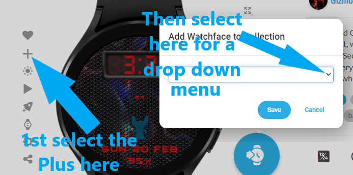
Also, thought I should acrually male an actual collection, though it has no ‘Show more’ option which is not do good @Facer_Official .
I think to that these colours complement each other nicely, me to did alot of try with bicolored faces but if you are not useing white those are the best combination , other colours works better as a monochromatic face, nice fonts btw
Yeah Nice Rob.Jolly good job with the Font. A complementary colour is always going to work. A Font that size could carry Pastel which is popular as you now know. Sorry I can not Help you with your collection problem. Only ever made a Favourites Folder.
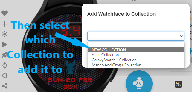
@rob.fisk To make a Collection, all you need to do is select to View the Face you want to add to a Collection (there is no “Show more” option to make a Collection). Then just simply…
Updated the vertical version of the font to make the lines go the same way as the standard.
Fits better and fixes issues where, as it was a 4 wide font construction the bottom of letters like the T were messed up as they were 2 adjascent blocks nudged halfway to center.