I do not know if i can share a Pic of a Watch Face i saw online but i would like to find someone who is willing and able to create something like this for me (as it would take me Years lol ) …If anything i could forward the Picture via Email or i dunno … SO let me try to explain .
The Background Color should be White … and the Time a nice Dark Purple …so far so good …
Now i would like the Progress to be Dark Purple as well and cover the whole watch screen Can you follow ?
Now when the Progress( as second count) runs and gets to the Time it should turn White so u can see it on the Purple … Does that make any sense with my poor English ??
If im able to upload the Image without getting in trouble let me know
hi there, a picture certainly would help. I don’t think it’s ever a problem to post a picture here. What would become a problem is if someone made a direct copy of someone else’s design. But there are plenty of creative designers here who could take a concept and make something of their own out of it. So, all that is to say… share the picture 
1 Like
3 Likes
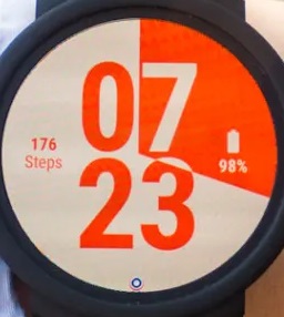
There is the face …
Hmm, I don’t think you can do this in Facer… It would need some sort of layer blending that Facer does not have…
1 Like
ah… cool. hmm… at first I thought maybe can’t be done on facer. but maybe with duplicate time layers above and below the progress it’s possible? The concept itself I think is universal enough that it’s not a party foul to make something out of it. And there’s plenty of room for adding your own thing to it. I don’t usually do digital designs, but I may tinker with the idea and see if I can B# it.
3 Likes
If the progress would jump every quarter, you could do it, but not smooth I think
2 Likes
I could not even tell you where its made . maybe i find it animated
after trying a little bit I’m back to thinking it can’t be done on Facer. Maybe someone can prove me wrong. There’s no getting around the need to mask partial numbers with the progress. Too bad, I had a great idea in mind if it worked!
1 Like
to bad … I thought it would have been a great Face
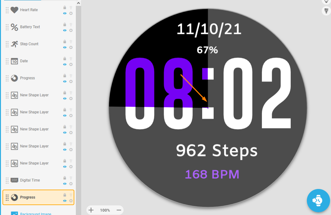
You can sort of do this with Facer, but I can’t get it to work with only 2 colours. I can almost get it to work with 3 colours though. Here’s a draft of what I got going:
The trick is to use a transparent font with a second progress bar underneath it, then another 50% transparent progress bar above it…
Inspection is enabled.
Edit… Actually, I guess that’s 4 colours…
6 Likes
Ah, transparent font! I didn’t think of that. I feel like 2 colors ought to maybe be possible then. But I say that without having looked at your layers yet. Well done!
3 Likes
Way to go Brad, nicely done mate 
3 Likes
Ohhh wow thats very nice … Great Job 
3 Likes
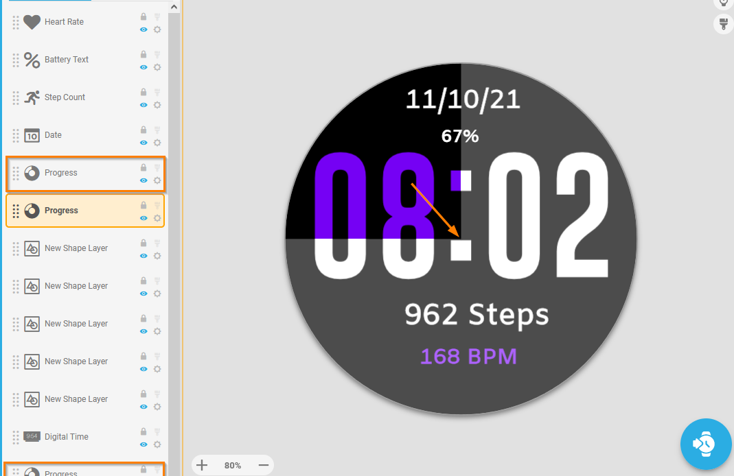
This is what i came up with … For me it does not run smoothly. And i have to fix the white lines
6 Likes
Well nice to be proven wrong here 
Progress/Arc does look weird when inner radius is 0.

You can try making inner radius 1 on both progress circles and the lines will be straight.
If the little purple hole bothers you, adding copies of both progress circles with inner radius 0 and outer radius 1.03 will fill that up (lowering the time 2 pixels also helps, the center will not be on the colon then)
5 Likes
I think she meant the white lines in between the numbers Matt mate
2 Likes
I know Giz, this is just extra feedback
I’ve noticed this in more faces that use arc or progress with inner radius 0.
Although I must say, when trying it on my watch it seems to work fine, so it could be it’s only a browser preview thing, and not worth putting in the effort to make it look good here as well.
4 Likes
Just moving the Time down sorted it . I see the font has no overlap on its mask . The aliasing gives it away. Shame as that is a nice Alternative to making your own .
1 Like
there’s also a bug with inner radius at 0, make it .1 and it behaves.
5 Likes