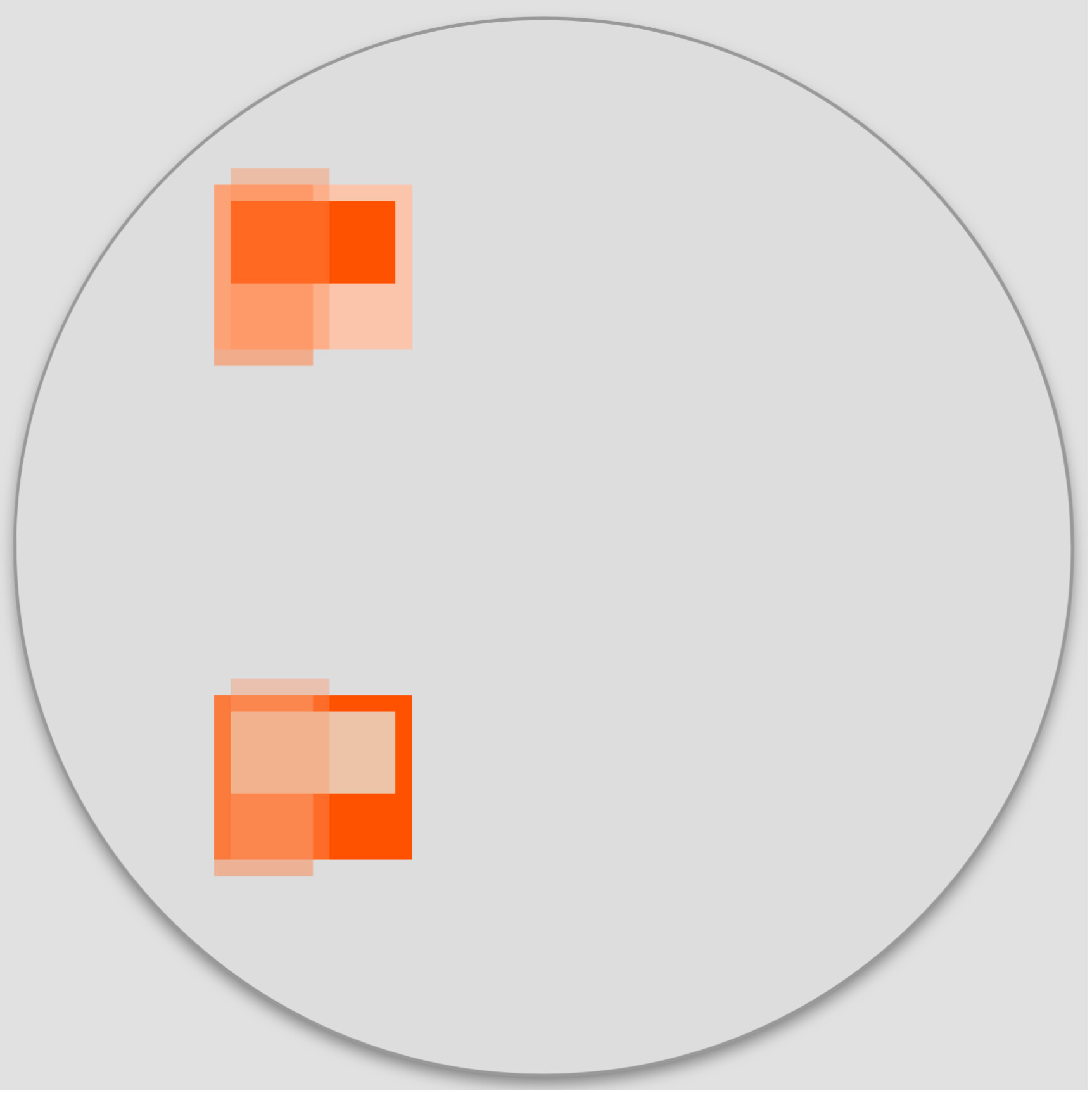
The 2 colours at left (for top group) are the sweep/progress (above and below), the smallest is text, leaving only the background. I currently use same colour, at 60 and 40%, for progress arc.
And, I was trying for two ‘colour sets’ that complement each other …
I’d been thinking on the idea of transparent text rather than arcs.
Once it clicked it made the design much simpler.
There are just 2 opposing orange arcs on a pale background.
All of the elements are duplicated with a strong solid colour under the arcs and white 40% opacity above. This comes a lot closer and the dim side just needs the translucent elements enabled.
bradtc Cheers. It took fiddling but once I used the first transparent yellow to get the orange background it fell into place and I just had to get the layers in the right order.
Big downside it is only works with complementary colours such as this or light blue on dark blue etc.
You can’t oppose orange and pale grey, for example.