Hi friends,
Just wondering if there is a way to ‘turn off’ the dim mode option so that the standard face is the one that shows during AOD? I’ve read Facer used to have a ‘classic’ and a ‘dim’ mode option to do this, but it doesn’t seem to be available anymore?
Thanks!
Check the Little Eye ICON to the right of the Layer Title . Switch to DIM mode and select all the things you want to show in DIM mode . Note Image layes have alternative slots and round or square . I do not use them myself . Also you can have a DIM Mode colour for Text .
Animations and Seconds will not operate in DIM mode .
I mean as a user, not the creator. Some watches I love the standard face and would like to have it as showing all the time rather than going to dim. There used to be an option by triple tapping the face and going all the right to the settings, but it doesn’t seem to be there anymore.
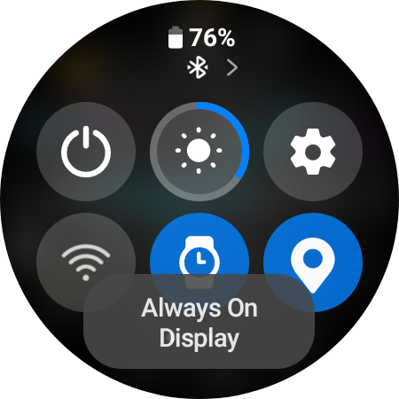
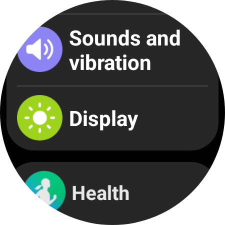
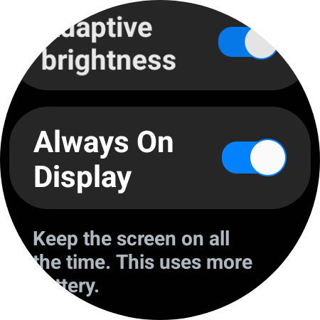
Hey Listen I am so sorry . Most of the Questions here are fom makers . If I swipe my Display Down I get this screen of Quick setting Icons . The Dim mode is the Watch one . it might not be on that screen on your watch . Swipe left to find it . Otherwise you will have to add it . You can also go to Settings .
This is for a Samsung GW4 Classic .
You can not have the Main Display on All the Time . The Battery would last about 2 hours and the watch would get Hot .
.
.
.

.
By the settings .
.


All good and thanks! My creations are still not worthy of releasing to the public ![]() it’s a shame they don’t allow AOD with the standard face. I understand the battery issue but sometimes I’d be willing to make the sacrifice
it’s a shame they don’t allow AOD with the standard face. I understand the battery issue but sometimes I’d be willing to make the sacrifice ![]()
You’re right, back when I first started on Facer (quite a few years ago now), you could indeed choose to turn off the dim display and just have the main face be AOD (so the dim mode never activated). No longer seems to be the case though! Likely for the reasons @russellcresser outlined. I agree that it is a shame though - I used to like the ‘classic’ and ‘dim’ options in the Facer settings. Having said that, I turn off AOD mostly now because it makes a huge difference to the battery haha
Yeah the DIM Classic thing was to Accommodate Tizen . The main Drive with the New WOS is to cut down on Power Drain . We are seeing all sorts of things getting trimmed in Favour of the Heart Rate Sensor being Active all the Time . Well that is a Demand from the FDA so we can Blame Neither Facer or Google for that .
True and true ![]()
@roycaruso & @RMC007
The switching between standard AOD and dim AOD was a Tizen exclusive option. All WearOS powered watches do not have that option. To have the same exact watchface in AOD as in active mode, the watchface maker has to have made it that way like @russellcresser was describing with the eye icon on the element. I have started doing that on some of my watchfaces lately.
If you like a certain watch face, just ask the creator to make an AOD version. I have had such requests.
I think this is okay for free faces ![]() May not be possible for premium faces where people want to keep distinct dim modes and avoid too many duplicate faces
May not be possible for premium faces where people want to keep distinct dim modes and avoid too many duplicate faces ![]()
Thanks for the info! Didn’t realise it was Tizen exclusive.
I’ve actually gone another way once, to offer different dim modes just for premium:
(click TX logo, or date)
Ooh that is genus! What a fantastic idea. Hats off to you my friend ![]()
Beautiful Idea Tom . Completely Unique :::)))
Raised a related question for me - How would you have elements that are always visible when the Face is active, but set them such that they could be toggled on or off for dim mode? For example, in the following design:
I quite like the very simple dim mode I have, but some people have requested an AOD display. Is there a way to tinker with VAR or expressions to make it so people could press a button that either turns on everything during dim mode or just the stripped back elements (without having to duplicate every element and VAR toggle code the duplicates)?
It is not always easy, depends if you want to change colors in dim mode and/or hide single elements. In this case, you most likely have to duplicate the elements.
Simple is putting a filter at a certain layer, something like:

You can rotate the dim options with a VAR Increment, one after the other, but interactive VARs can only be in active mode, not possible in dim mode.
In the picture I would use 5 circles:
- 1 opacity: $(#VAR_1#%5)=0?0:0$
- 2 opacity: $(#VAR_1#%5)=1?50:0$
- 3 opacity: $(#VAR_1#%5)=2?80:0$
- 4 opacity: $(#VAR_1#%5)=3?50:0$
- 5 opacity: $(#VAR_1#%5)=4?100:0$
You have to have 5 elements if using %, otherwise it will not work.
For a digital face, where the details to be covered are not overlapping the main parts, you can simply order the layers so, that they are in groups above and below a single mask, which can be toggled or adjusted by a variable.
You can also split in multiple groups divided by masks, for which you can even combine another variable for different opacity grades.
Perhaps - if battery saving is on your mind and you want to condition what is shown on the classic side of the face - one could use #BLP# or #BLN# to hide or show other pictures/layers or trigger less battery eating animations (without needing a AOD picture at all, depending on hardware settings and opportunities). You do not need a pro license or higher and its cheaper… ![]()
![]()