My workflow is primarily based on Photoshop and Illustrator, both excellent tools. However, when designing marks, the process is often slower and more tedious than it should be.
That’s why I started developing a custom tool specifically focused on creating marks and related elements for watch faces. The approach is somewhere between parametric design (like AutoCAD or SolidWorks) and creative tools: it leverages the benefits of parametric design, but without the overhead of defining too many entities that slow down the process.
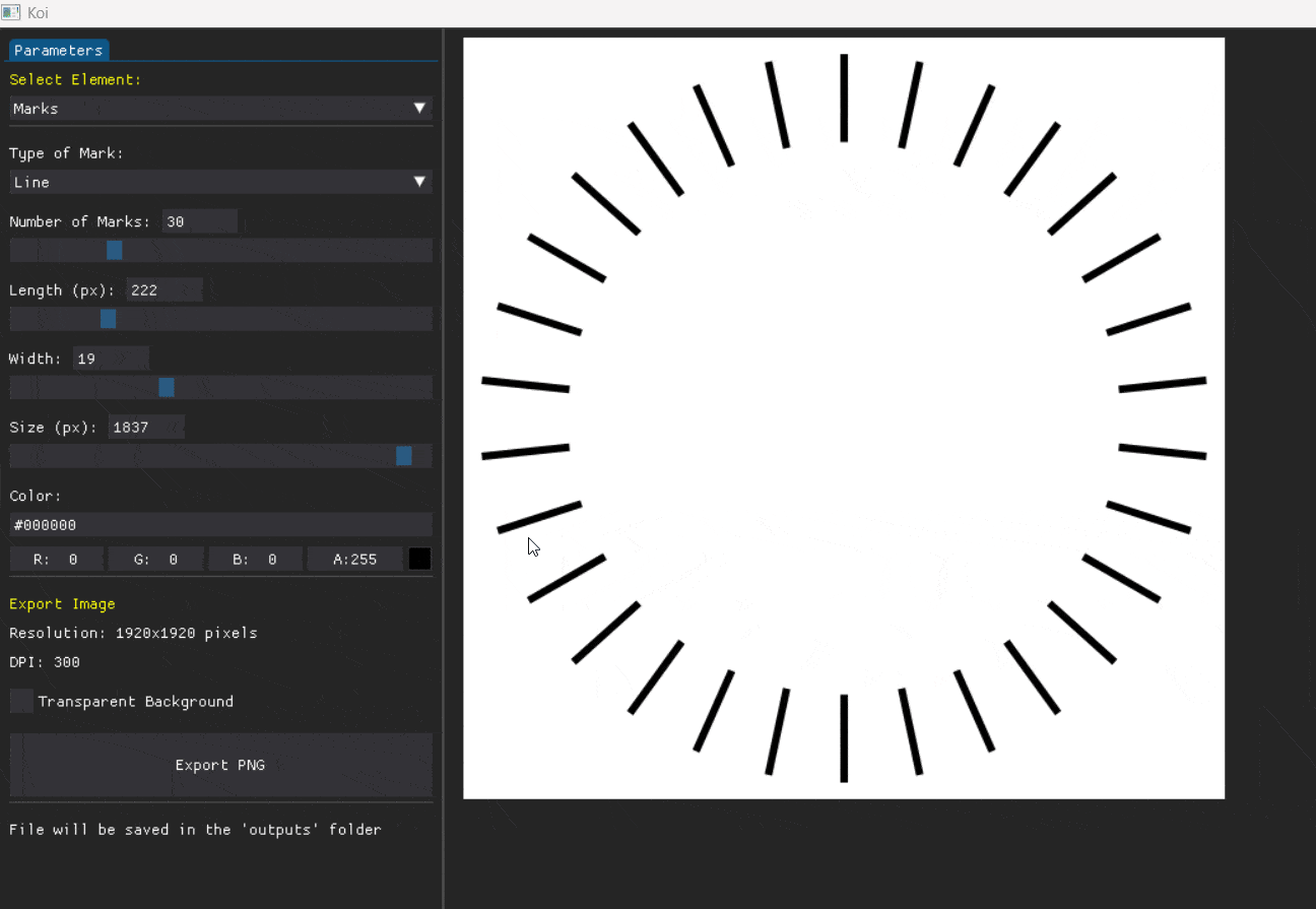
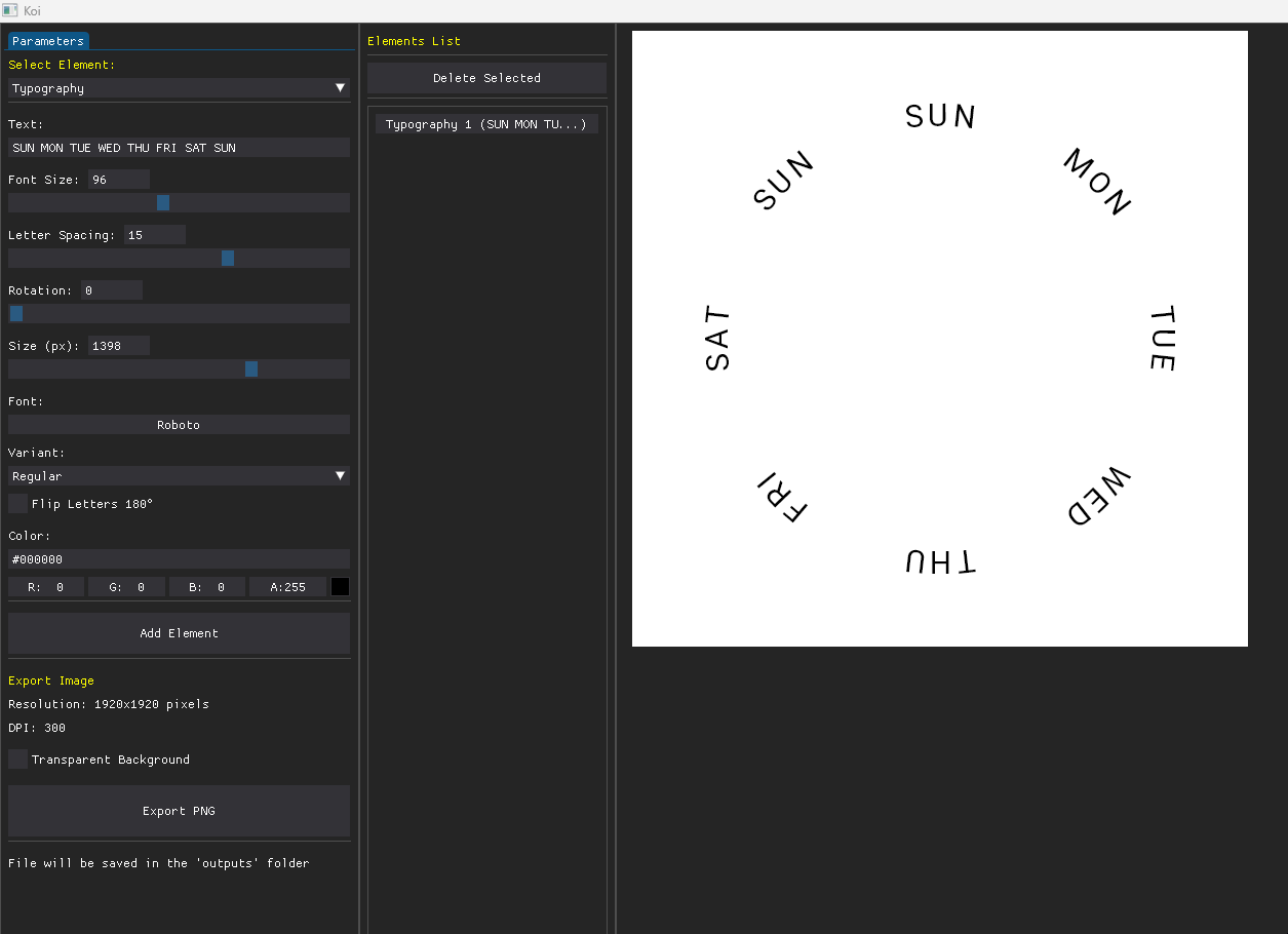
At this stage, the tool allows me to create and export three main types of graphics, which I then combine using PSD masks (I plan to implement native masking later):
Marks
Rings
Typography
In particular, for typography, it has been really easy and fast at distributing text evenly around a circle.
I’d like to know what you find most challenging when creating your marks, what you’d like to see in this tool, and your thoughts on it.
I will continue sharing the progress, gathering feedback along the way, and, once the project is more mature and robust, make it accessible to the community.
There’s a Paint.NET plugin that does this type of thing, but it’s pretty limited. I’m looking forward what you have created!!! The right tool for the job.
Most challenging it was to make tachymeter scale back then and playing with the different base numbers for the medic watch. But since I finished these and the WFF no longer supports #DWE# nor Stopwatch features, such marks are no longer needed, or would be just cosmetic on face supporting this dumbed-down format.
Recently I used Claude AI and it made me web page for creating such marks and numbers for gauges quickly, defined by custom parameters (similar to your tool).
maybe you could add the typography oriented perpendicular to the circle automatically turned and optionally another 180° for right part (or for bottom part when oriented radially) to be able to create evenly spread date or minute rings and such.
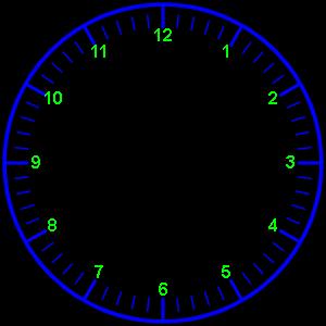
Thank you for the useful information. These tools can significantly improve workflow efficiency and also make the work more enjoyable. Up to now, I have mainly relied on this website: Online Analogue Clock Face Generator, in combination with Adobe PS and Illustrator.
Useful link . Not that I have ever used it . I am lucky to have a CAD package given to me by my X Boss . Always go straight there . I spend so much time on CAD .
Hey guys thanks for sharing your experiences, didn’t know about those tools, I will use them for reference. @petruuccios really nice job with your web page, I really liked it.
Thank you for your feedback. I’m taking it into account for development. In this case, taking advantage of the typography work, I started implementing some ideas suggested by Petruuccios and Bielitz, including kerning, font variant selection and improvements to the typography orientation.
I’m also working on a layering system that allows rendering multiple elements simultaneously (this still requires more work).
This is looking really really good . I see in the animation that you can invert the text around a circle - the icing on the cake for me would be that on a normal 12 hour dial that one could select the text to invert for example, only the numbers at 4, 5, 6, 7 and 8 and not the rest
You are making something special and you have my respect…
I’ve been looking for a face index design that I liked better than the ones that come with Samsung’s WFS designer, so I used the link provided above ( Online Analogue Clock Face Generator) to make one: