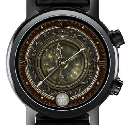
Working on this one, and still have a short to do list (changing out the aluminum/steel for brass mostly), but would like other opinions on it. The donor face will be obvious to some of you
Does it fit the genre? Does it work for you? Too dark? Anything you’d like to see on it (yes, @russellcresser I’ll include a battery indicator somehow. )
Amazing, very well crafted Rich Sir
Critique: maybe a more Gothic style of Font for the Date, and a darker central circle, the one in the very center under the rusty silver Seconds movement.
Verry good. Defininately go ahead with the brass replacemet to make everythig more visible. Please make it highly polished.
Only downside now is the darkness. The main fault with almost all Steampunk styles seems to be end product readability.
The simplicity of this breaks that and works well, just needs contrast.
I really like the gears running in the background, but as noted above, it’s a bit too dark, which makes it hard to read at a quick glance. If you can lighten it up, 5 stars!
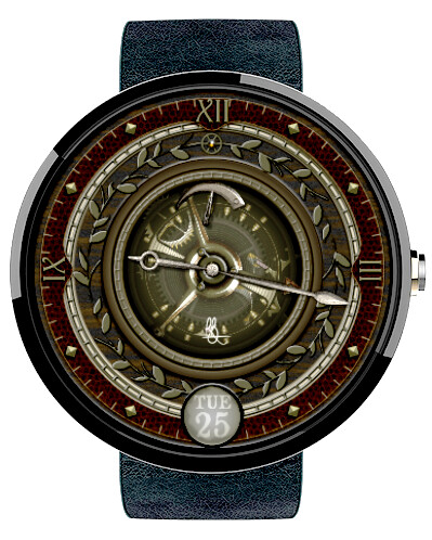
Thanks everyone. Made some changes - made it brighter, removed the rust from the hands to make them more legible, added a battery indicator (not sure about this yet - might move it up further). Changed the material on the gears. Changed the date font.
Wish I could change the design of the balance wheel, but I can’t find my original graphic, and it would be a ton of work to re-create from scratch so its staying as it is.
Yeah. I struggle to find stuff now. Should have organised more folders in the beginning. With no Inspection on I am going to gave to sync that again to check out the Battery Gauge.
Gone a bit too far the other way with the date. I will have to get some new glasses.
Hello, I thought what new I could say, but it is generally good looking. I can only agree with others on the overall darkness/low contrast. Maybe just the glass is too dusty
The big wheel below the balance I noticed only after some play with screenshot.
The battery indicator would better fit somewhere on the solid rim than on the glass.
I see the battery indicator now. Good screenshot. When I look at my watch that is the first thing I look for. On two charges a day at the moment. Best thing about Huawei GT2 is 5 day battery life.
I really like the Abstract look of the Gauge. I just need to see the Pin bit more and possibly a ball or dot to Denmark the Empty end.
You did ask for Feedback.
Release 1.1 out, with reduced opacity in the glass and a new battery indicator. The battery indicator is still not particularly legible, but kind of nature of the beast I think with these busy watches. It’s between 8 and 10 and there are two parts to it - the arrow, and the underlying white gauge. If you can’t see it now, this watch probably isn’t for you.
Darn it… v.1.1 is a separate face. Oh well, you get to choose the battery indicator you want now.
I personally Love an 8 to 10 Quadrant Gauge . I think its always best to design for yourself . Looks so good on the watch . This one goes in my Most Favourite collection which is filling up . Good Job Rich . Looking forward to the next . You are tempting me to go for a Flying Tourbillon . Just got to do some drawing .
Thanks. Lots of trial and error in the initial stages of working with the mechanics. @russellcresser helped me get through that. You can see all the layers and the expressions used in the watch below which uses the same mechanics. Inspection is open in that one, for you to be able to break down what’s going on.
Good luck with the flying tourbillon. Happy to help with some graphics things if I can. I think the 3D nature of a flying tourbillon is probably too much for my abilities, but if you want some help with the non-mathematical parts of it, give me a shout.

 )
)


 for a gauge solution