Personally, I like my vintage faces looking like their vintage design, not busy: hands, markers, digits, and the occasional vintage complication(s).
But sometimes a vintage face is just too barren, so I throw in some modern complications, which then makes it look (to me) too busy and pulls away from the “vintage look” concept I have in mind.
So, I make these added complications fade out in 4 seconds. You get to see what you need within 4 seconds of activating the screen, but then they fade out to 30% where they’re still somewhat visible but faded so as to unclutter the face.
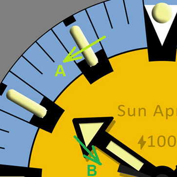
This is a 40-something year old vintage diver watch. Very plain. Take away the logo and other original text, it’s a barren desert. The colors make it looks like it belongs to Bob the Minion from the movie! Add the fading complications, it’s more functional and not a desert. But now the hands are in the way of seeing the added complications in that initial 4 seconds. So… I fade-out the hands during that 4 second transition time?
Flip in and out of dim mode to see the fading-- I think I like the fading to my taste. But, how bad is it to your tastes?

5 Likes
First discovery: the fading hands work well in creator and when viewing in a browser. But in the app or on an actual watch, the shadow of the hands kills it. I’m surprised/disappointed the shadow’s opacity doesn’t follow that of the hand. 
2 Likes
I think the fading is a pretty cool effect & nicely done. I worry that when someone takes a look at their watch for the time, they will have stopped looking by the time the fading starts to take effect, or the watch will have gone back to sleep. Maybe start the fading after only 1 second, will that do?
2 Likes
@kourosh. You could make your own shadows for elements then you have complete control over them. Offset oppacity etc. Have you conciderd dismissing the A La Mode Complications with wrist motion. Or conversely wakening them by lifting the wrist. If and when you go for Pro you have several options for having them appear on the screen. You could put several classics on the same Face. Yippee.
2 Likes
I think I have the shadow fixed-- another layer for each hand, at 25% opacity (in Photoshop, at least), positioned offset at +3 on the face (163/163).
3 Likes
I’ve been wondering about that too. But I’m thinking it has to be short enough to see the time, but long enough to see the complications under the hands.
3 Likes
And… can’t stop thinking this is Bob’s watch!
5 Likes
I like my faces to have phosphorescence just like vintage watches!
4 Likes
@kourosh . Very Nice . Get some Glow on those Lumes . How about Tritium Vials ?
2 Likes
Very nice. It distantly reminds me of old Mortima diver watches. I like your attention to detail and would have one small suggestion to consider. Check the directions of light casting shadows on hands and dial. I would flip the marks horizontally.

2 Likes
Yep, I know the shading is… well… shady.
Facer’s light seems to be from -45°, and is unfortunately fixed. So adjusting Photoshop’s to match seems to fix this.
4 Likes
I’ve been tinkering with the timing. I think I have a decent combination now: hands and complications start to fade in 2 seconds, and the hands shadow start to fade in 3 seconds. How does that look?
2 Likes
Ha Ha . Cool flickering a bit on here , I suppose it is smoother on your watch . I am sorry but your complication numerals need to be much bigger for me but it is your watch . Nice to get Yellow and Blue Out .
Not sure why the flicker, it’s not intended to. In the browser it flickers 5 out of 5 times, on my GW1 it flickers 2 out of 5 times, and on my GW4 it flickers 1 out of 5 times.
I’ve been trying to keep complications small (and fading) on purpose as an attempt to stay true to the actual vintage watch, complications tend to take away from the design…
1 Like
Yeah I completely understand about the complications no taking over the Aesthetic. The Flickering is obviously a Timing Issue . I understand you do not want to make your work inspectable . Send us the code that is causing the flickering and Highlight it and put it in </> That protects the format so I could just copy and paste it into a test . I think it is just a Syntax issue .
@kourosh Is your fading code something like this .
1 Like


