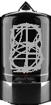
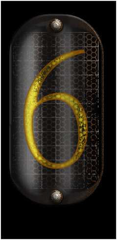
I am tempted to make my own version of nixie tube powered watch. I managed to find and adjust a set of images to cover individual digits. Though despite being from real photos, the images lack depth and probably also a glare (they seem to be taken in dark). I could use advice from a designer view point, is there some “easy” way to simply add some depth/glare, or would it be easier to make them anew from scratch?

3 Likes
Hi,
maby a solution will be to find that kind of tube not turned on… then find a proper font and make a lume effect by yourself. You could control cube and lighting with flicker effect… that would be a great watch.
Depth effect will be more easy to make ![]()
2 Likes
Hi @petruuccios, I’ve only done one nixie tube face a couple of years ago, and @adrianrogalski’s approach is similar to the way I did it. I took a blank nixie, overlaid it with a time digit in “Kiye_Sans” font (sorry I don’t recal where I got that font from) with the text set to glow in creator, and then added a foil on top. Here is some layer images used:
Result doesn’t look too dim IMHO:
3 Likes
you could just duplicate the set of numbers and make one set dark and one set bright, then layer mask out one half of each tube to get some dimension at the least. Ex:
2 Likes
I went searching for fonts and images a while ago when I was curious about these. I found a lot of interesting resources, but almost all of it was of poor quality and eventually I gave up.
In any case, this was the best image I had found, but even then its background is an issue:
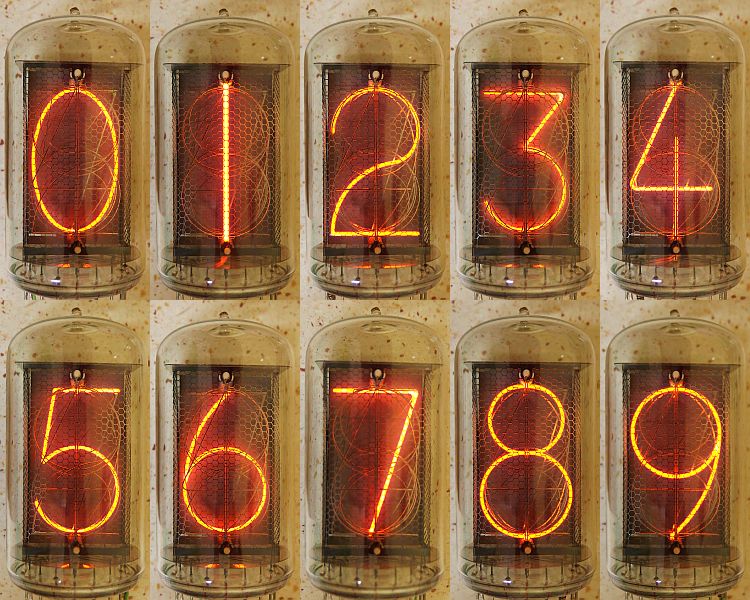
It’s attached to this very interesting article about these tubes: Nixie tubes
3 Likes
Thank you guys, I value your thoughts.
These examples encouraged me to do some more experiments ![]()
2 Likes
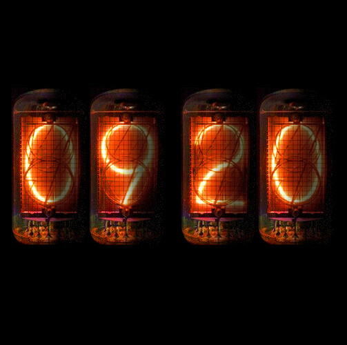
Cough, cough, Gauss, cough, inspection open, cough, cough… Facer - Thousands of FREE watch faces for Apple Watch, Samsung Gear S3, Huawei Watch, and more
2 Likes
I started working on one (in Affinity Designer) that I’d be happy to donate when its done (but might be a while… got visitors in), but I can’t figure out what the right font is. I saw some nerdy discussion on it, but the ultimate link was a paid for font. I don’t want to pay, so if anyone knows a really good substitute that’s free, I’m all ears. ![]()
I haven’t done any of the number framework yet, but here’s where I am with it so far.
2 Likes
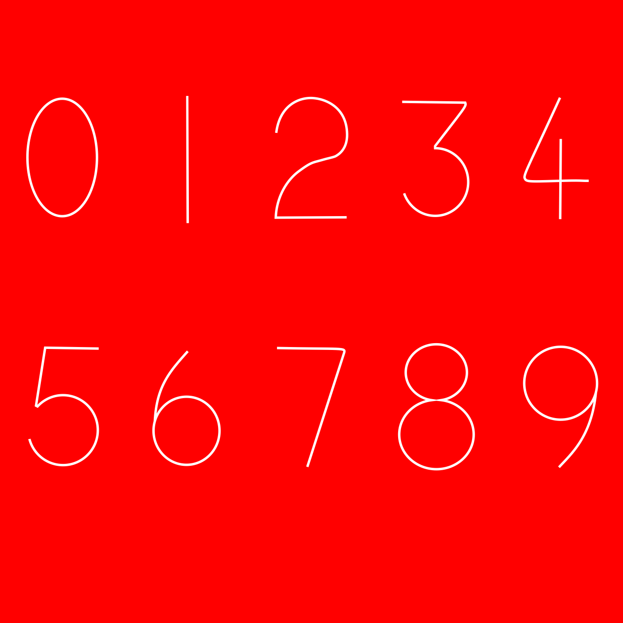
I think you could use the thin variant of the Quicksand font (on those thicker are the rounded ends too visible) and just substitute I for 1
2 Likes
Ohhhh. Nice font. Little flavour of Apple to it. Very tasty .
It is intresting to me. In those Nixie Tubes the Numerals were made with chemicaly etched Metal . Point being they coud have been any Font on the Planet at the time. The Font style is so strong now. Additionaly if they were flickering tey were on the way out or really badly made. Looking forward to the publication. Does anyone remember the Flickering Candel Flame Bulbs ?
Definitely close. The four bothers me a little - I feel like it should be an open 4. Not sure why. Not even I was around when these were popular first time round ![]()
I actually decided to go with Dolce Vita Light (extra light). Its not quite right, but it’ll do for now. I feel that a typewriter font would be the way to go, but I can’t find one that’s clean, and “traditional”.
Sort of getting there. Can’t decide whether to make it like a tube as you typically see, or more like it’s lying flat like Gauss did, which is what I would expect to be more likely to see on a watch. If you were ever likely to see one on a watch that is. I’m thinking kind of domed as a tube would have to be, but not completely round. Not sure.

2 Likes
I imagine they modeled it after typewriter typeface at the time. It would presumably need to be a font that used a single line, so no gaps anywhere that would break the current. Right?
On a related note, not sure what its like where you folks are, but “edison” bulbs are pretty popular here at the mo. I must say, I have a couple, and while they’re not very bright, and they’re overpriced for what they are, they’re really nice to look at. ![]()
2 Likes
I think the problem is the Nixie fonts were Designed by engineers using a 6 inch rule and a compass. That one has a nice thirties look to it .
1 Like
even this one is nice font but I do not like the open 4 and 1
and from this one I would take the 2
1 Like
Hej guys, why are you looking for identical fonts for tube ?
Just take pic from @kourosh and try to rewrite them, thats only 10 digits. Building this watch and try to make this lume effect you have to use a GFX format anyway, instead of real fonts ![]()
2 Likes
I still did not abandon the idea of making it using font and glow effect, if facer would eventually fix it one day. Putting dozens of images layers makes the face resource heavy and some watches may freeze too I can see it even in the creator. When moving new layer into right order, its getting there choppy ![]()
2 Likes
It is surprising how quickly a Face loads if it is not Top Heavy. I am sure the heavy memory ones make my watch crash. Not every one is that good on a graphics package to draw Numerals and thier lumes. Some one who could might make them a Resource gift here.
I don’t mean to be a Nit Picking Twit, but for me a little Bolder please. I would love to see the ghost of the other Numerals and the Anode / Cathode Mesh in front. I think if they are in the orange spectrum they could be Bolder to read. Jolly nice, I like the Radi in the sharp corners. I was at Design School in the 70s. We loved a Radius in those days and Designers Orange.