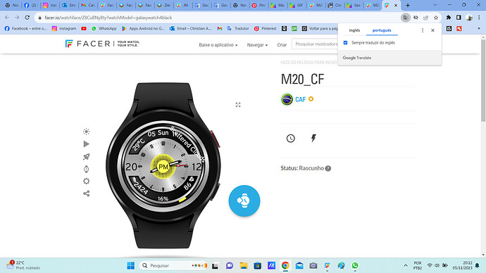
Hey friend,
All good?
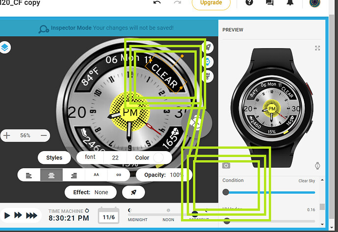
I’m making this screen and I’d like your opinion and, especially regarding the weather, it doesn’t change when it’s raining…
That’s pretty good, well done ![]()
To display the Weather correctly, you need to make sure you have all Permissions granted for any Weather Apps you use, but it looks like it works to me, moderate rain right now is correct.
You used #WCCT# which gives you the weather in long written text format.
If you want to use text, but a lot shorter, you use WCCI and create your own text. For example:
$#WCCI#==01?CLEAR:$$#WCCI#==02?CLOUDS:$$#WCCI#==03?CLOUDY:$$#WCCI#==04?CLOUDY:$$#WCCI#==09?SHOWER:$$#WCCI#==10?RAIN:$$#WCCI#==11?STORM:$$#WCCI#==13?SNOW:$$#WCCI#==50?MIST:$
In this case, I should put a description per sequence, right?
I love the idea of the face, the design is awesome! The only thing about the heart rate is that the picture and numbers touch a little, maybe move it a bit further from each other but that is a detail. I dont work with WEAR OS but for me the text for the weather seems like too long, I agree with tom and I would maybe try to use it either shortened or I would use images instead of text ![]() . But again, I dont work with WEAR OS much so I dont exactly know how it works. Love the idea of digital and analog in one face tho, well done!!!
. But again, I dont work with WEAR OS much so I dont exactly know how it works. Love the idea of digital and analog in one face tho, well done!!! ![]()
Muito obrigado amigo por sua opinião, vou alterar agora mesmo e, por favor fico ainda mais grato se permanecer sempre auxiliando!!!
Tenha uma excelente semana!!!
Thank you very much friend for your opinion, I’m going to change it right now and, please, I’ll be even more grateful if you continue to help!!!Have a great week!!!
I must probably be doing something wrong, but I started using the formula you gave as an example, but nothing appears on the screen.
Provavelmente eu devo estar fazendo algo errado mas, começei a fazer com a fórmula que mandou de exemplo porém, na tela não aparecem nada.
You see the Formula that @tom.vannes gave you will go in the Text Box of a Single Layer . You angle it an size it to suit . It will show the cognition correctly when you slide the Weather Condition slider . What you have at the moment is working but only for the first two conditions .
.
.
.
Você vê que a fórmula que @tom.vannes lhe deu irá para a caixa de texto de uma única camada. Você inclina o tamanho para se adequar. Ele mostrará a cognição corretamente quando você deslizar o controle deslizante Condições climáticas. O que você tem no momento está funcionando, mas apenas nas duas primeiras condições.
I put it in the text but nothing appears…
Eu coloco no texto mas não aparece nada…
$#WCCI#==01?CLEAR:$
I made the change but the description does not translate into Portuguese and size 20 does not fit in the screen space
Fiz a alteração mas, a descrição não traduz para Português e, o tamanho 20 não cabe no espaço da tela
It will not be translated for you you have to put a short version in Portuguese for yourself in each part of the formula .
CLOUDY = NUBLA for example .
I understand, but in Brazil they don’t even download much, so I’ll see if I can make one for each language, but anyway, the climaxes don’t appear completely, they’re still incomplete and it’s size 22.
I thought about putting it in the date location because there seems to be more space there, what do you think?
Entendi mas, no Brasil nem baixam muito então vou ver se consigo fazer uma pra cada língua mas, de qualquer forma, mas mesmo assim os clímas não aparecem completamente, continuam incompletos e está no tamanho 22.
Pensei em colocar no local das datas pois, lá parece ter mais espaço o que acha?
Yes . If you are going to use the text description of the Weather you must plan a face that it fits into first step . On that one I would just put in the simple Icons . Like the ones I have shown you before . Those Icons do not cause a Language barrier .
.
.
.
Sim . Se você for usar o texto de descrição do Clima você deve planejar uma face que se encaixe no primeiro passo. Nesse eu colocaria apenas o simples Icons . Como os que eu mostrei antes. Esses ícones não causam barreira de idioma.
Yes, I agree.
There are text elements, such as the location, where you may not know how long the text will be.
So your watch face should have the space for the elements you are using.
Sometimes a narrow font may help, but should be readable and not too small.
Good morning friends,
What do you think ? Is it good that way?
Bom dia amigos,
O que acham ? Está bom dessa forma?
I like the overal layout, I just would not turn the weather icon. The rain pointing sideway does not look intuitive, even if it could have same logic as other info oriented around the circular “window”.
Another thing, for the steps I would try to make the font smaller for 10k+ steps, for example like this
Or I would shorten the text in such case, with formula like this in steps text field
$#ZSC#>9999?(toFixed(#ZSC#/1000,1))k:#ZSC#$
Yes, agree with Peter. You could also slit the text apart. For example #HR# and “BPM” split those two and rotate each a bit so that the whole digital information looks more round.
Sorry for my question, but I don’t understand how to change the steps? If so, could you explain it to me a little more?
Desculpe a minha pergunta mas, não entendi como fazer a alteração dos passos? Se, puderem me explicar uma pouco mais?


