Re #08.1 Looking Good. Well Done .
RE #12 Well done . Coming allong . I can not understand what @petruuccios means by adding “B” to the following layers .
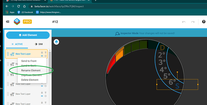
I must encorage you to name your Layers . This is not for my Benifit . You will find it less confusing if you can find the Layer you want to work on Easily . ![]()
![]()
In your opinion can I publish?
It works Looks good . You could just Update the one that is published already unless you Deleted it .
I meant to continue in changing from #DOW# to #DOWB#, but it seems it has been deleted meanwhile…
Hey listen Peter. Sorry to be so thick. Good call. #DOWB# ![]()
![]()
It’s very rare who apologizes nowadays…Congratulations
Could you give me any suggestions to improve??
Make the Battery power percen cyan like yhe Icon. So it is not confused with te weather. You font nerx 2023 in you date. Dump tat an make the date bigger. Do not have a White Bavkground it sucks the Battery. Some Platforms willl not let you use white for the Background.
Much Better . You need a different seconds hand the Centre is not scaling properly I use a Plain Bar and a separate dot . Here you are .
Did I get everything right now?
What Changed ???
I put the battery charge in the same color to avoid it being confused with the weather, I think I centered the clock hands, I increased the date by increasing the font
This is what I said at the Time.
Much Better . You need a different seconds hand the Centre is not scaling properly I use a Plain Bar and a separate dot . Here you are .
And I posted some bits for you.
Well done.
Sorry the bits I posted earlier were to big . see these
Hello everyone, I published this model, could you give me your opinion?
Cool . Well Done . No day of the week stuff then . Next one hey . Try get some other colours in . That makes this kind of Face popular with Users.


