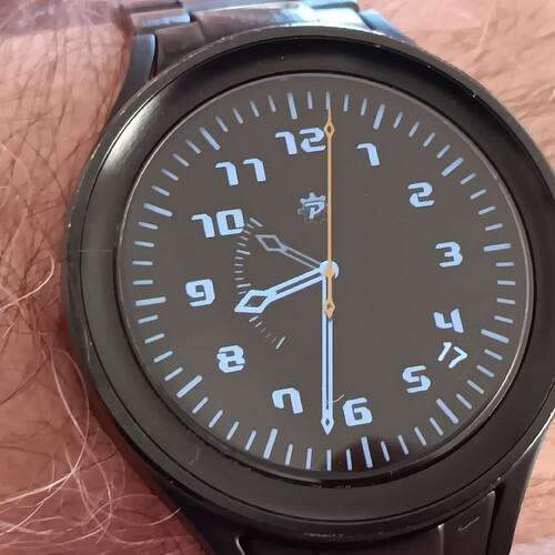
I would have a challenge.
Since facer is rearranging the size of inserted images and watches come in various native resolutions, the pixels and canvas sizes do not match most of times.
I though scaling of vector graphics would cause less image distortion.
To prove me wrong I made me a font with tick marks and another with simple watch hands.
In facer preview everything seems nice and crisp, but on my gear S3 the second hands seems to flicker a bit.
I dare anybody adventurous to try this face and report back whether it causes trouble or not.
I’ll take that. Fossil Gen 6. Just give me a while to work out what is going on with sync from designer
I am a little curious about some of your character choices, such as B for ticks.
Edit: DOH. The font contains watch elements.
Also the wee 16 and blank circle, left, occluding the numbers a bit.
Did give me an idea about date and month as there are 12 hours and 12 months. It’s not what you are going for though because the 16 is not between the 11 and 12 to denote November.
Yes, there are two fonts with only A, B and A, B, C letters for the basic watch elements, ticks and hands.
As fonts are described in vector form, they should be rendered with best clarity independent from resolution (depending on algorithm, might be worse than bitmap graphics, that is why I asked for tests on various devices).
Sorry I did not describe the face more, because its so minimal. To time there is only date between 4 and 5h and small hand for battery charge with ticks each 5% on the left side.
No issues on my Samsung Galaxy Watch6
Thought I’d watch it over time and no issues on mine, even under a Fresnel lens.
Web search is coming up blank for “font” “watch hands” and similar
I also loaded it on my ticwatch ultra pro 3, the seconds hand moves like DWFS and not DWFSS.
That is strange. Do other faces run the second hand smooth on it?
And thanks for taking look guys
Looks Great Peter . Second hand is smooth on my Watch . Over on WFS we can use Bit mapped fonts for moon phase. I wonder if it is possible to make a font with 28 images for the Phases . I am not sure if the images numbered 10 to 27 can be Custom as in WFS .
.
Do you read my mind? I am at making such font currently ![]() Maybe not 28, but more than 8
Maybe not 28, but more than 8
Ha Ha. Yes sometimes I feel that some are joined with the Golden Thread of Creativity.
Yes, strange indeed.
I can confirm, on other watch faces it is smooth.
Maybe its not always sunny in paradise. Now on Russell’s photo I can see some minor alignment issue. the center of the hand character might not be perfectly matched with the virtual pivot point vertically.
btw. I was kidding with the moon phase font. I explored the idea early this morning and seems my favorite font making tool is too crude for such fine work. It could be done somehow, but it would take long for my limited patience and probably I would not be proud of the result anyway ![]()
Hehe, my perspective brain put that down to the angle of the watch.
So, I rechecked my Fossil Gen 6 and there is a slight tick (3 per second) on the second hand. I ran up a quick one with a stock second hand and it wasn’t there.
The alignment matches with @russellcresser
Seems its too much computing for the watches. On my old gear S3 it looks fine the first second then it becomes pretty irregular, jumping between like 2 to 5 ticks per second. Ok, this excitement lasted way too short. Maybe I try a hand shape with fewer vertexes…
Have you tried (6*((#DNOW#%60000)/1000)) over #DWFSS#?
I know this is Off topic but there is a fontmaker called Caligraph for making hand drawn CHRS into fonts . You got me going now . I guess that 10 to 27 is an issue . But I am thinking 4 fonts covering 0 to 6 .
Just tried (6*((#DNOW#/1000)%60)) on my text face with 5 | characters to make the second hand. It is much smoother.
How does that compare with a Full Load Facer Face .

