Here’s another question for you Facer gurus.
Lately, I’ve started looking at my older designs to see to which ones I can add information like steps and battery. That seems to be very popular among users. I’ve also started creating a version of each watch face that can accommodate those items with steps & battery.
So now to the issue:
I added information to this lovely watch face
And it’s just fine. But then I decided to change the gold footprints to footprints that matched the other items in this watch face
They look the same in Facer creator except for the minimal difference in the appearance of the footprints, but on my watch (Samsung Gear S3) the beautiful intense colors of the sunset image on the original version look completely faded & washed out on the lighter footprint version.
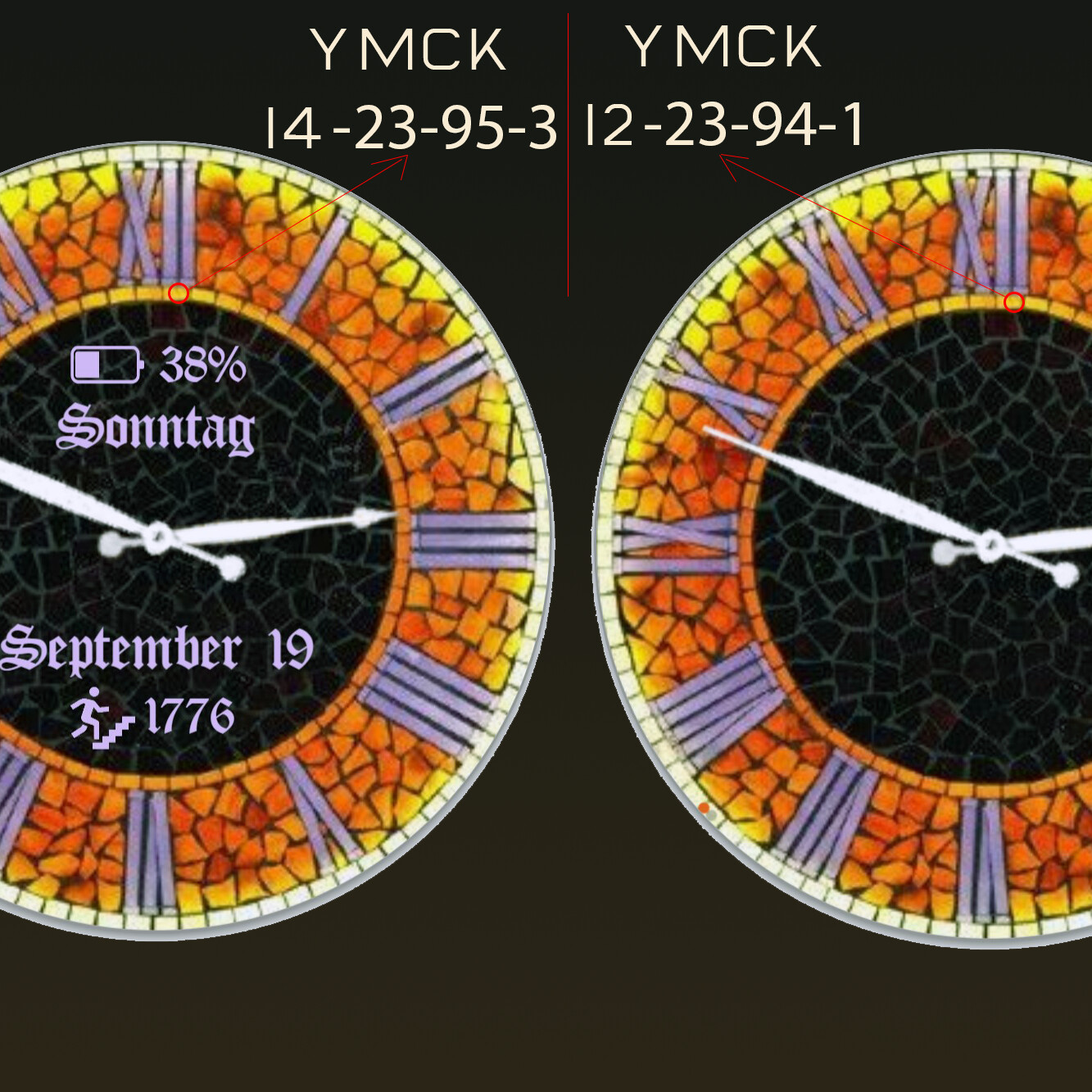
That’s not the only situation where I saw that effect. Check out this watch face.
and the version with information added to the face
Both watch faces look the same in Facer creator except for the obvious difference of the added information to the second, but on my watch, the face with the information doesn’t have the vibrant colors of the face without the information.
So why is that happening and how can I avoid the loss of vibrancy on these watch faces?
Thanks for any input.
Warren
No, they don’t look the same, not even in Creator. Maybe you just don’t see the difference because your monitor is not calibrated and / or it can’t show it qualitatively,
On my EIZO monitor I see clear differences in Creator.
OK, so my monitor is not showing clearly what’s on my watch, but I still don’t understand why the addition of items affects the vibrancy of the faces, especially in the first example where he color of the footprints icon affects the vibrancy of the entire image
JPG or JPEG stands for “Joint Photographic Experts Group”, the term PNG for “Portable Network Graphics”. … PNG, on the other hand, is the only image format that is compressed without loss. The image quality therefore does not decrease
NOTE: first choice is always PNG
UND…PNG reads transparent backgrounds.
JPG does not allow this!
Thanks everyone for your thoughts on this matter, yet I still don’t understand what’s going on.
In the original watch face at the top of the discussion I presented 2 watch faces which only differed in the footprint icons added to the watch face. True, the background image is a JPG, and I understand the limitations of JPGs; however, the same JPG is used in both watch faces. That JPG has not been edited or resaved since the original design. The footprint icon is not part of the background. It is a PNG added to the face. The only difference between the faces is the color of the footprint icons, yet the face with the gold footprints looks significantly more vibrant and saturated than the face with the lighter footprints which looks dull on my watch.
Why?
And how best to deal with this aberration in future designs?