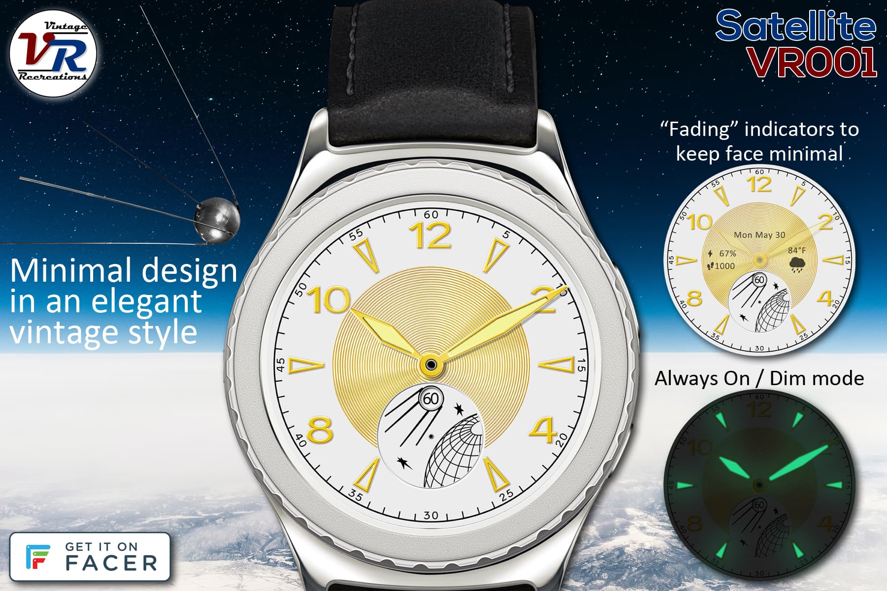
What started me with custom faces 8 months ago and brought me to Facer: becoming VERY curious about how that seconds disk (with a well-known Soviet satellite on it) would work on a smartwatch, before I knew anything about any of this, which started me on this trek and led me to the recreation of this vintage gem. Simple minimal design, it could be a dress watch or it could be a geek watch.
My biggest issue is the lume. The recessed lume on the hands is obvious, but none of the vintage photos show lume anywhere on the dial. I improvised with the center of the markers, but there are only 6 out of 12 of those.
YouTube videos appear to show 4 ticks/sec. I’m torn between 1/sec versus anything higher than 1/sec, since the seconds hand here is so unique. Currently at 2 ticks/sec.
For functionality’s sake, I also added date and battery (fades after 4 seconds out of dim mode).
9 Likes
I’m impressed. I personally would not use it myself because it’s not my style, but the shear artwork is fabulous!
3 Likes
I’ve been going through all my existing faces to add a standard set of complications, and update AOD with a dimmed dial plus the usual green lume. This one started to get busy…
Not sure how most users would feel, but for my “uncluttered” principle, I’m glad for the fading elements. I’ve also cut the fading transition time down to 2 seconds, it seems to be long enough to see the complications but not too long to wait for the hands to solidify.
2 Likes
I must say, I definitely liked this better without the complications. Even when faded it seems like there are smudges on the gold.
I don’t believe in “standard complications”. Each watch is different, and complications should be added in the style of the face. They either fit, or they don’t (from a design perspective).
I would recommend publishing copies of the original with the extra complications, instead of overwriting existing watch faces.
Keep in mind though, these are my opinions, and you should always do what you yourself feel happiest about 
2 Likes
I agree, it looked better before when date is all it had-- but with any given face, I’m also concerned that it be functional enough for those who want/need basic complications (which I would say, at a minimum, are date and battery). If interactive controls were not a Pro feature, I’d use a button to toggle them on/off.
I’m not sure if it’s a good idea to publish 2 or more versions of each watch (eg, one with complications and one without), a published watch list can start to get crowded, if not repetitiously messy. But then on the other hand, it gives users options…
In any case, I wanted to try a second version, with complications that fade to zero. Looks clean 2 seconds after activation.
1 Like
Much better for such a nice watch face 
1 Like
I’m going to have to reassess the complications of all my other faces, but for this one you have me convinced. Clean and clear looks better, fading indicators give you what you need then they go away. Should be easy to illustrate in promotional cards, hopefully users will find it useful.
3 Likes
I do like the AOD mode “glow”!
1 Like