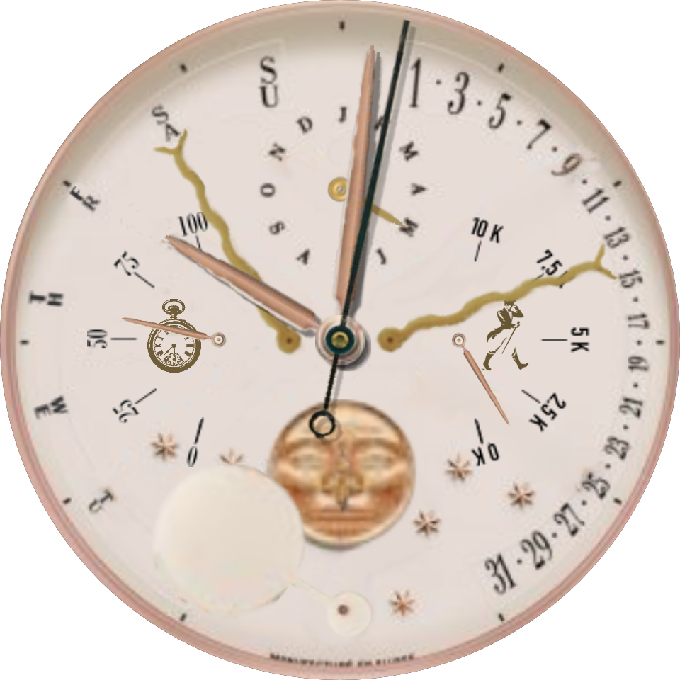
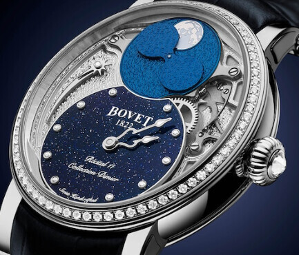
This was fun and a challenge to create. Rather than a moon window, a wand moves over an image of a moon face to show the phase. I took a lot of trial and error with comparison to moon phase data to get the wand movement right. In fact, I’m not sure it’s right, but I think it’s close enough. I was pleasantly surprised to see the wand move correctly through its arc since I started with the formula I had devised for the moon disk which has 2 moon images to move correctly through 360 degrees.
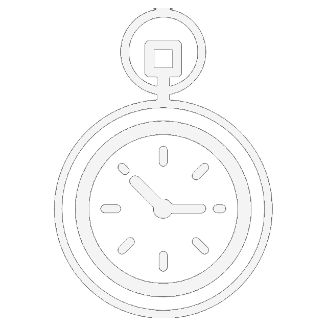
As on all my watch faces, inspection is open.
-Warren
4 Likes
That is a very nice idea, looking good. Also like the dark dim mode.
2 Likes
Sir I find the face delightful . Well done coming up with another way to represent the Moon Phase . I have checked it out for this year . This May just gone was a Good month for moon phase stuff. It is perfect from what I have seen . If you want me to check it out for the next 200 years I will . I love the way the Wand flips over on the full moon . Worth looking out for. I know what you are going to say but I am going to will say I do not like the animated Icon for steps . For me it spoils the Antique look . I better duck in case you throw some thing . Nice Job Sir .
1 Like
No need to duck. I value your advice and opinions too much to hurt you 
I never thought of the watch as having an antique look.
What about the icons for phone & watch? I don’t know why, but I’m not a fan of words on faces. My own idiosyncrasy. Is it the icons, or the animation? Since I’m kind of attached to my icons, do you think there’s enough interest to make a version 2 with an antique looking font in place of the icons?
-Warren
2 Likes
Ha Ha . Yeah it is difficult . I know that things evolve in front of you . I just think the Wavy Hands and your Unique Moon have a Mad Inventors feel about it . I like the Old Phone . If you could find a Pocket watch Icon . May be something like the Johnnie Walker Icon for the walks . Apple watches have a special counter that actually counts Steps in Height .
Personally I would lose the Step count and give more space to that beautiful moon . A lot of watches do not report the Phone Battery power . Put an analogue step counter on the right . Now you really are going to throw something . On thing I have Learnt . Do not take a face down do a #02# version .
Excuse me I am certain you are capable of making your own resources .
BTW I have checked your Moon Phase formula out to 2100 on the app I use on my phone. You calculation is perfect. Good job.

1 Like
Nice you really are going to throw something now .
1 Like
@wsilbers Just read your reply to my Comment . Pleas forgive me I have the same Eyesight as you . I am not that much fan of Icons but I believe they are there to educate . Once we Have learnt that the gauge on the Left is watch Battery power we Know . I just felt the Icons so Dark and at that size jumped out a bit .
1 Like
I like the v2 better for overal look. I played with it a bit in inspector mode.
The situation around full moon, when the background marks have to be above the wand which is above background, is little unfortunate.
I would also check few other things, but those are cosmetic.
2 Likes
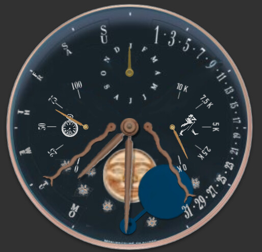
I love the look of the Dim display 
1 Like
If I’m feeling adventurous some day I could play with having the wand change shape in those positions
2 Likes
I’ve been more attentive to the dim display recently as I’ve figured out some techniques to do so, but I never use/see them on my watch
2 Likes
I adjusted the icons. Hopefully more appealing now
2 Likes
Yeah. Love that Pocket Watch Icon. I might have to Steal that.
1 Like
This is unpublished pending recommendations.
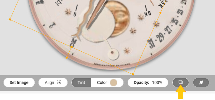
How’s this for solving the wand moving over text?
-Warren
2 Likes
Its better, but I was more thinking about scaling the moon down a bit, until I just noticed the moon disc was part of background image. (note the step mark is also above the wand)
But when you are at recommendations, you may consider playing with these:
- adding a bit of shade to some elements like wand and snake hands
- changing tint on the dim wand rather to bluish tone than brass
- changing tint on snake hands to more rose gold than yellow
- leaving out second hand from the dim mode. on most watches it wont move anyway
2 Likes
I appreciate the suggestions, but regrettably lack the skills and software. Shading is out of reach for me. My graphics program is Photoimpact. It meets most of my needs for photo editing which is what I use it for primarily. I’m able to do a fair amount of image editing for creating watch faces, but it’s not a powerhouse like Photoshop.
I do like the bluish tone for the dim wand and can easily make that change. If you have a color swatch for the rose gold, I may be able to change the tint on the hands.
The version 1 of the face had a smaller moon. I enlarged it as suggested by Rusty. I could certainly try to find a size in between that is larger than the original but small enough to avoid the wand overlapping text.
3 Likes
If you ask 3 Makers how to make something you will get 3 different answers . Some Makers make the moon Half the size of the Face and some so small you hardly see it .
Well done with the Package you use . I am like yourself I struggle to get into new ways of doing things . I will say some of your elements look a little Fuzzy . However it suits the kind of Face you are making very well .
Ok, lets see the options then. Without external graphic tool you can still achieve some “depth”.
a) On the image used as week day hand you can turn on the shade as it is default on the hands.
That does not look very pleasing, the shade is too far, as if the hand was high above dial.
b) Make a duplicate of the hand image, on the bottom one turn the tint to fully black, set the opacity to 40%. Shift it one or two pixels down and to right. Pull it below the dim mode layer and make it visible in both modes. I did the same for the wand.
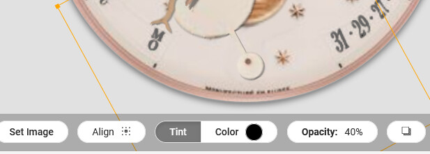
For the tint, check the #d8c0a2 (#9d8670 in dim mode) for weekday/date
and for example #1d354c for the dim wand.
3 Likes