here is a draft of a face for my wife’s new watch. Any ideas on how to clean it up a bit? I’m having a not so creative day it seems.
2 Likes
Personally, I would eliminate either the butterfly seconds or the digital seconds. Both together are distracting. If you get rid of the digital version you could make the main time display larger and place it in the center above Eeyore’s head. IF you do that set your time in the time machine at 8 pm and the set it for 24 hour display. That way it will read 20:00 and you will then know just how large you can make it for that space. That will allow more vertical space above the date and health displays to increase their size also. Especially if you put the day on one line and the month and date below it on another line. Lastly I would change the butterfly to be smooth movement instead of “tics” by changing the rotation to #DWFSS#.
ok i will see what it looks like in both of those ways i might get rid of the butterfly second hand was trying to add to the overall design with that however it is bugging me a bit . Thanks for the input.
Hello and welcome,
I’m not sure at what point I entered the editing process. I don’t see anything moving as referred to above. This is just my taste, but if you are going to use a cartoon type of image, I would use a more casual font - perhaps one of the comic types. It might look more balanced if the space next to Eeyone is filled better. I’m not sure what the two numbers are. Steps? Heart Rate? Distance? Calories? An icon or simply text next to each would be helpful.
Thanks for the thoughts on the face, the numbers are heart rate and steps I’m trying to figure out how to put an image next to those numbers, (noob here) lol. I will put some different fonts on it and with a couple others changes and put it back up in about 40 minutes
1 Like
By the way, since you are a self admitted noob. We ALL were at some time.  Here is the proper way to add a link in the forum to show just the watch face and it’s information. I am “fixing” it so the example won’t work. Then I’ll put the real link in so you can see how it shows. BTW the watch face I’m linking to is the second one I ever made. It’s a hot mess and after 2 years only has 1 single sync.
https:/ /www. facer. io/watchface/hlKHnOkQvQ
Just don’t put spaces in it or the ? and anything to it’s right. If you are in the creator working on the watch you want to link just click the share button to the left of the “Publish” button. In that case do not include the /showcase at the end.
Thanks I will try linking / sharing it tomorrow after I do some editing on the face. I am taking some self taught / youtube videos to learn more about graphic design hopefully that will help me in the watch face creations.
Thanks again for the link info
1 Like
Ok whew , I finally got a few moments to work on this I have changed a few things let me know what you think.
Thanks
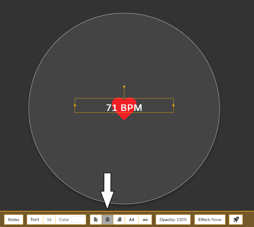
That’s a lot more organized than it was before. I would do two more things to it though. #1 you need to center justify the heart rate to keep it centered over the heart icon.
#2 I would put the battery level on the same Y axis as the day and date and centered betwee Eeyore’s head and the edge of the watch face. Plus maybe make it a little larger font size, but not any larger than the day & date.
Something like this.
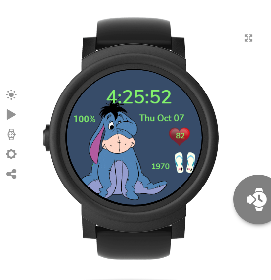
ok thanks for the input there, I got the battery % moved however I’m not sure how to center justify the heart rate to the heart icon as I just put the heart on it as a sequence.
1 Like
It’s all looking good Andrew, well done.
The only thing I’d alter is maybe change your Font to one that stands out a little better.
If you look at the picture of the heart rate I posted above you will see an arrow pointing to the area that needs clicked to center justify the text. If you click the one on the left everything starts on the left and goes right. If you click on the right one everything ends at the right and goes left. Just open up your heart rate element and you should see this tool bar at the bottom of the editor.
There are not many fonts in there to choose from where can I get some other fonts?
dafont.com is one source. Just make sure that you have a True Type font the OTF style fonts won’t work in Facer
2 Likes
He ought to be able to find it now that we both posted the same link at almost the same time. 
2 Likes
Ok thanks, I think I might have gotten it. This stuff is a bit confusing, but a lot of fun 
1 Like
awesome thanks a ton to you both for the font link. I’m sure I can find some good ones in there
1 Like
so now I have to publish the face for my wife to use it correct?
1 Like

1 Like