Here’s my latest watch - it’s old and damaged, the radon luminescent is worn away from the numbers and dials, bits are falling off the hour hand and the rest of the fingers are bent or broken. It’s a bit scruffy and tatty but it still keeps good time!
9 Likes
Nice work, all a little too faint for my sad eyes though ![]()
2 Likes
I understand that the face is not very legible but my intention was to practise with paint3D and inkscape and to be honest only the hour and minute hands were important for me to be able to read the time. I’m actually quite proud of this one even if I have to use a magnifying glass to read the complications,!
2 Likes
Great work! Keep it up ![]()
1 Like
Nice Grunge . Clean and neat is easy , Character takes some work . If you put 1000 hours into Facer and the same to your Graphics Package you will be one of the experts . I have spent that on my very old CAD package that is why it is all 2D . I have to beg others for Grunge Filters :::)))
Very nice wear effects you made here. Maybe some chipping or patina to the background or namely the sub second marks would underline that.
1 Like
Old chap still works through, what a warrior ![]()
1 Like
okay - I’ve oldified the ticks and scruffified the face a little more and I think it looks better now…but I’m not happy with the scratch I added. I also spent some time trying to make some glass for it but failed miserably! If some one has some good glass I could use could they please post it.
2 Likes
I have one image, that I made just for demonstration. I borrowed it and tweaked form a face here on forum. If @mreatini agreed, I would share it here, but it might be extreme for your purpose.
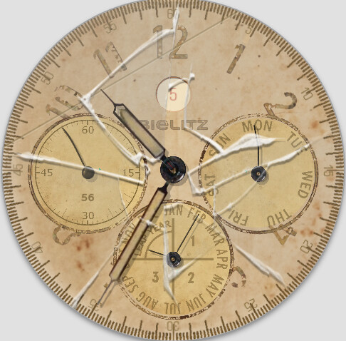
Thanks for that - but it’s a bit extreme for me as you suggest. I’m thinking that the scratch mark between the 4 and 5 would be good - I don’t know if my graphical skills are good enough to make something similar but I’ll give it a try.
1 Like
I added a small crack between 4 and 5 but I don’t think my drawing skills are upto it yet, but eventhough I think I will stick with it!
1 Like
Its not bad, but I would have few small suggestions.
I would make the crack without tint to give it more contrast and lift it above all other elements.
To that I would place it 90° ahead, or back of its current position, so that the automatic shade could be visible and gain some “depth”.
2 Likes
For those who read this later this is a really good tip.
I must admit that I didn’t understand at first but once I did it became logical and something to think about when designing a watch face - let me explain…
The light source in creator is from the 11 o’clock direction which means that anything that is placed in line with the light source (like the crack I made) its shadow is more or less hidden by the object and there is no illusion of depth. By placing the crack at 90 degrees to the light source as @petruuccios shows above, the object has maximum shadow and gains the illusion of depth.
I will make the changes and publish.
3 Likes
I have tried a few things with cracked glass, but it does not look good.
This glas is not so white, so it might better to use. Maybe also reduce opacity to 60%:
1 Like
I tried the link you posted but decided to go with my original because it sort of looked like it wouldn’t work after such damage. Thanks for your help and that of @petruuccios.
I’m hoping that some of the greats here will do a masterclass on making realistic glass with and without cracks - dare I make it a challenge?
4 Likes