Hello!
So, I have this watch and for some reason, the WYSIWYG in the build interface, isn’t actually what I’m getting. I’ve turned Inspector mode on … can someone help me with the hours, colon, and minutes bit, please?
Thanks, eh! ![]()
Hello!
So, I have this watch and for some reason, the WYSIWYG in the build interface, isn’t actually what I’m getting. I’ve turned Inspector mode on … can someone help me with the hours, colon, and minutes bit, please?
Thanks, eh! ![]()
Hello,
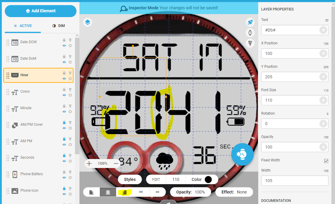
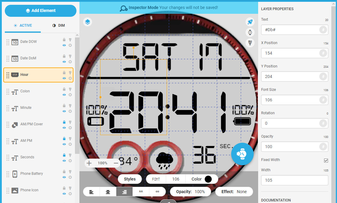
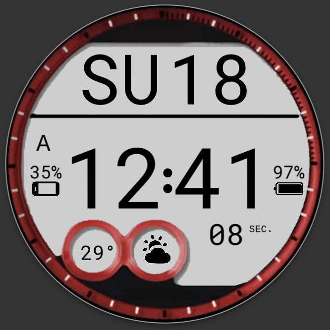
I think I would not even want to get what I see in the creator. You used the tag #Db# for hour, which is good, it handles the 12/24 format settings automatically, but there is not enough space left for the 24h format, even if the alignment would be correct like @thomasfmal pointed out. If you want the separator in center, let it centered, the adjacent text field should be aligned to the inner boundary closer to the separator. The left field for hours to the right and right field for minutes to the left. There seems to be enough space around the battery indicators, you can shift them a bit to the borders
If you plan not to use the 24h format to save some space, you can use the tag #Dh# instead #Db#, otherwise you might want to make the font tiny bit smaller to better fit between the battery fields.
thomasfmal and petruccios, thank you both for the replies.
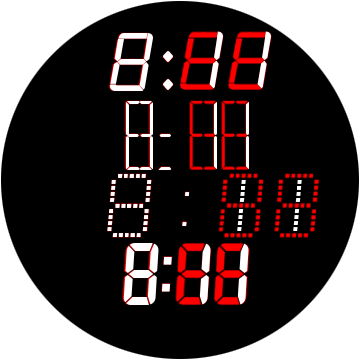
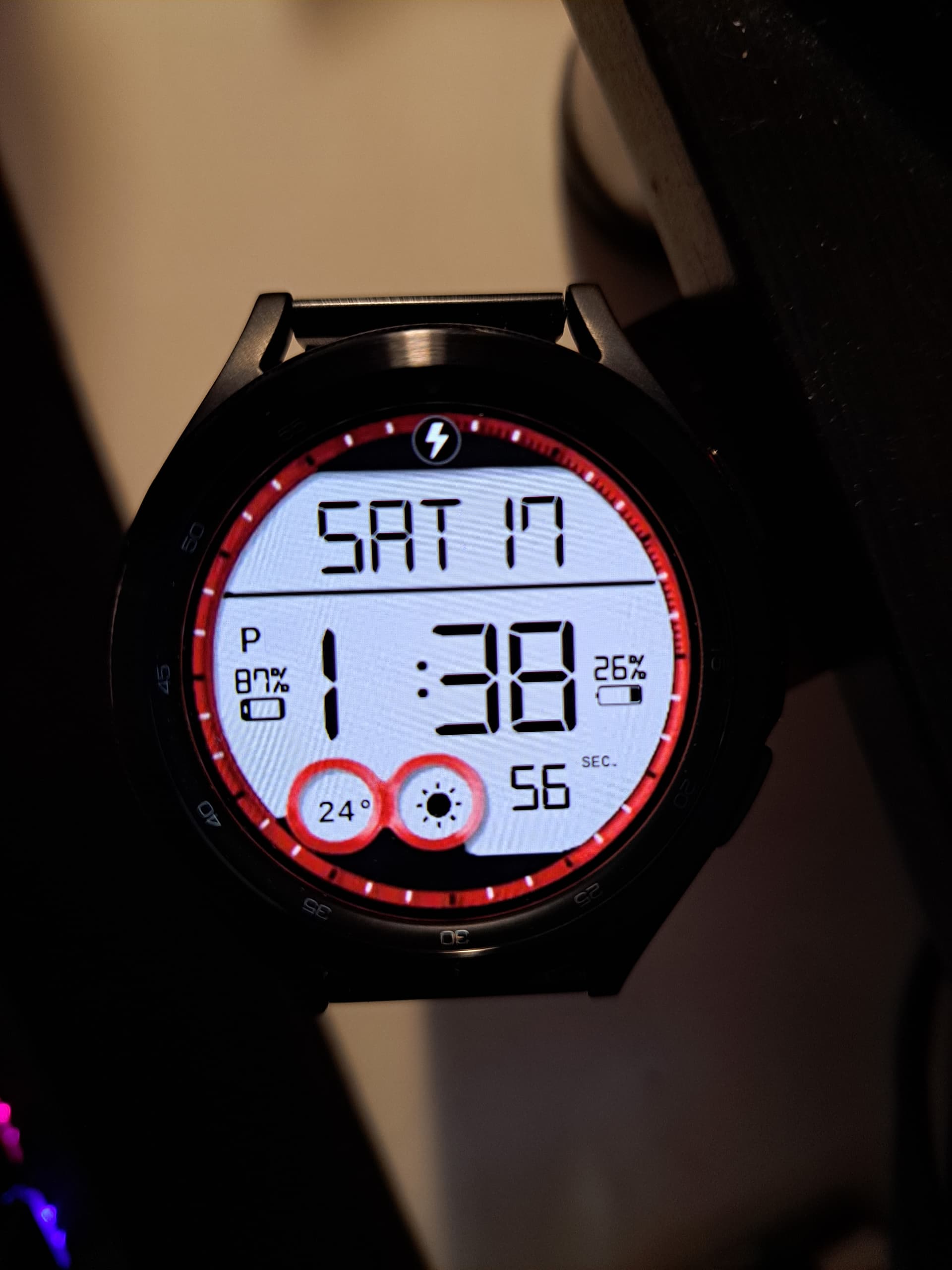
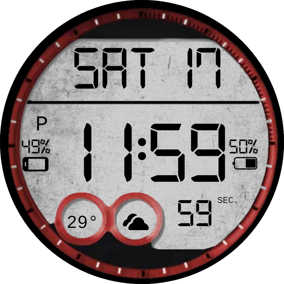
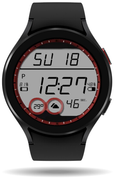
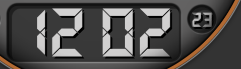
SO I did set (today) the hours to right, and minutes to left… this is the result on my Galaxy Watch 4 Classic.
Now … I’m trying to emulate a favourite watch of mine, hence why the font size is as it is …
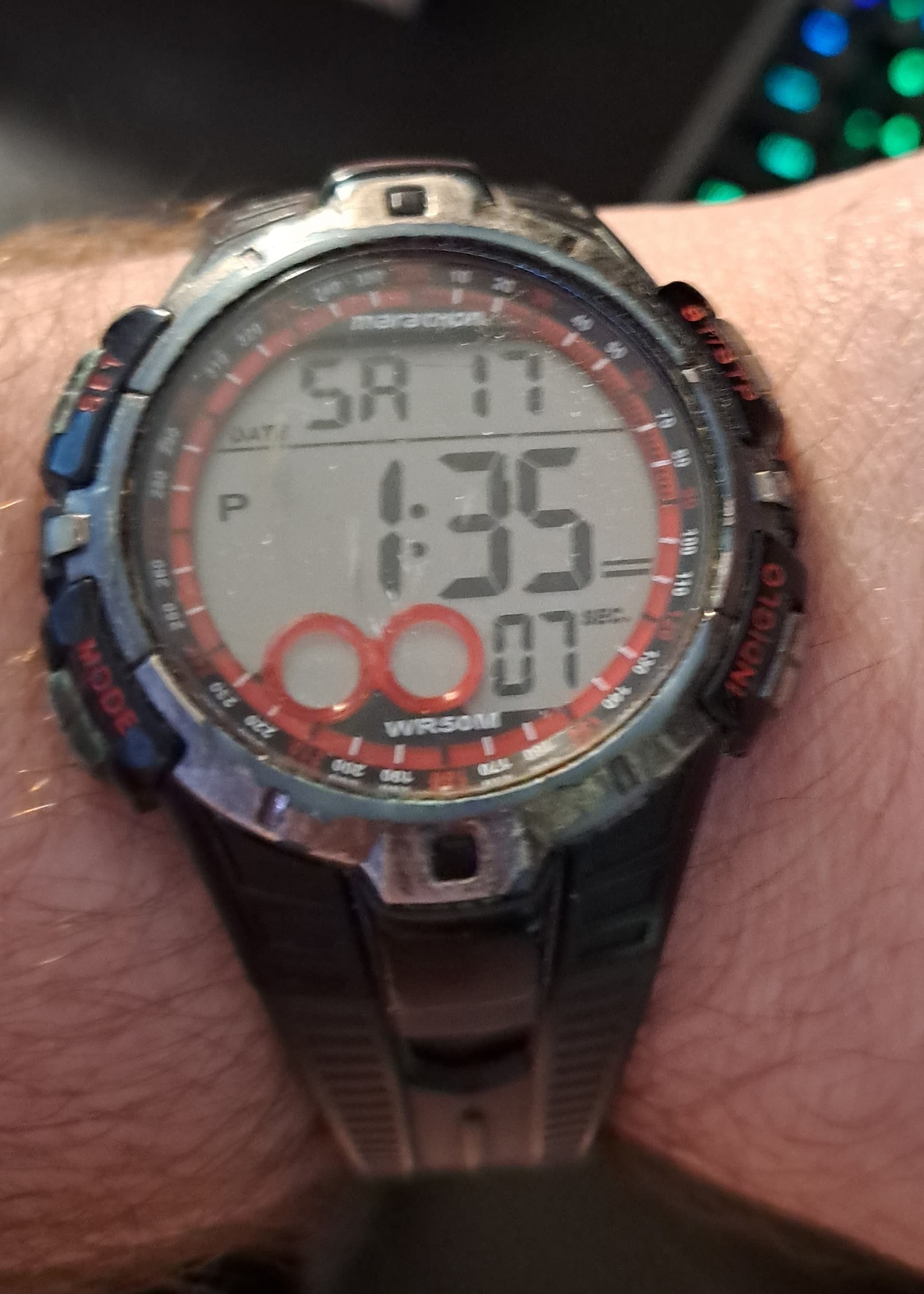
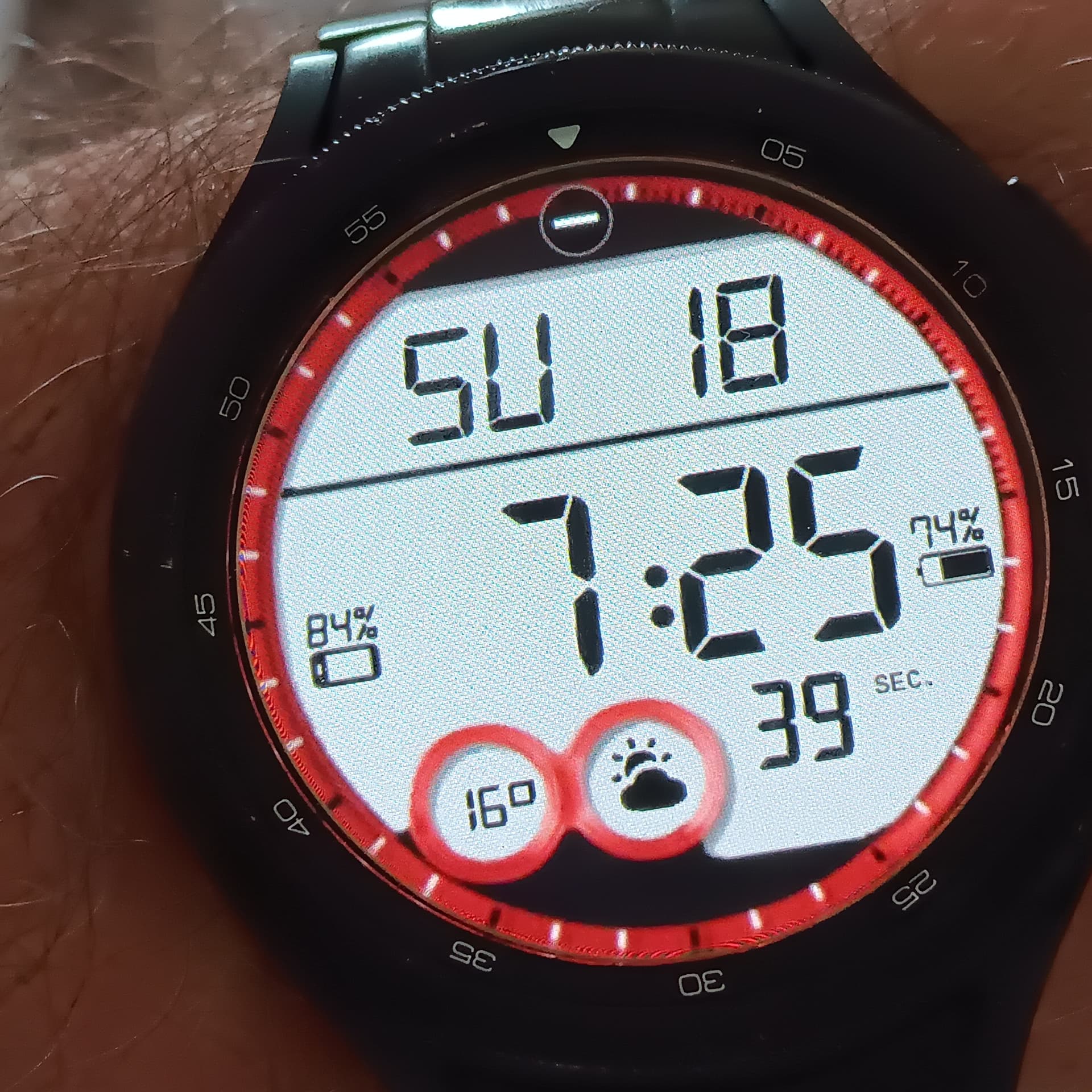
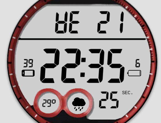
Maybe I’m parking up the wrong tree … but on the dumb watch version, well, here.
The 1 is touching the colon… and the time is as tall as the blank space. Maybe I’m fighting a losing battle here… and should be happy(ish) with what I got.
I said “forget it”, shrunk the font face down a bit, and it fits well, with “digital_7_mono” font. It’s not perfect, but, probably less likely to get copy right claim, as well. ![]()
(A few weeks back, my Android Recovery face got Copy Right Claimed, because the 2nd line was showing “FOSSIL” as that was the watch I had chosen to show it on. Staff here at Facer still haven’t replied, and it’s been nearly 3 weeks. So, I rebuilt the face, put it on a Samsung watch, and will never use Fossil again.)
As @thomasfmal has shown . Justify your hours to the right . Bad luck with the Fossil thing . That is very Petty . Sadly It is a Bot ( Marvin ) that does most of the Take Down He is a Bit Paranoid .
They are. ![]()
Maybe I just need to scrap it … and start from the beginning.
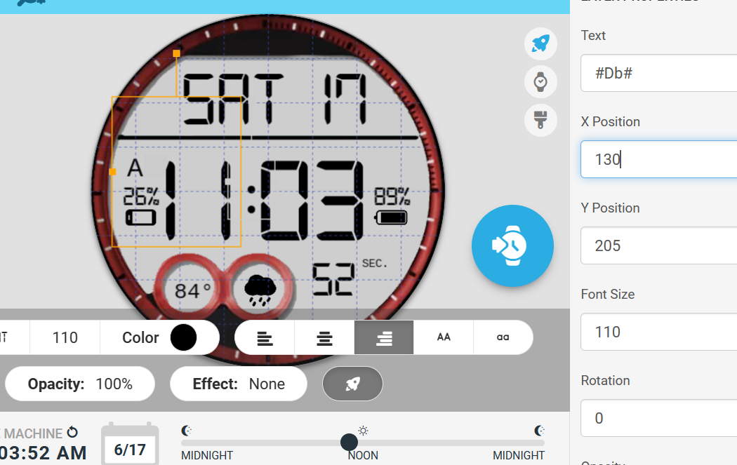
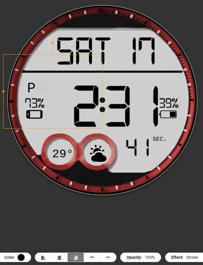
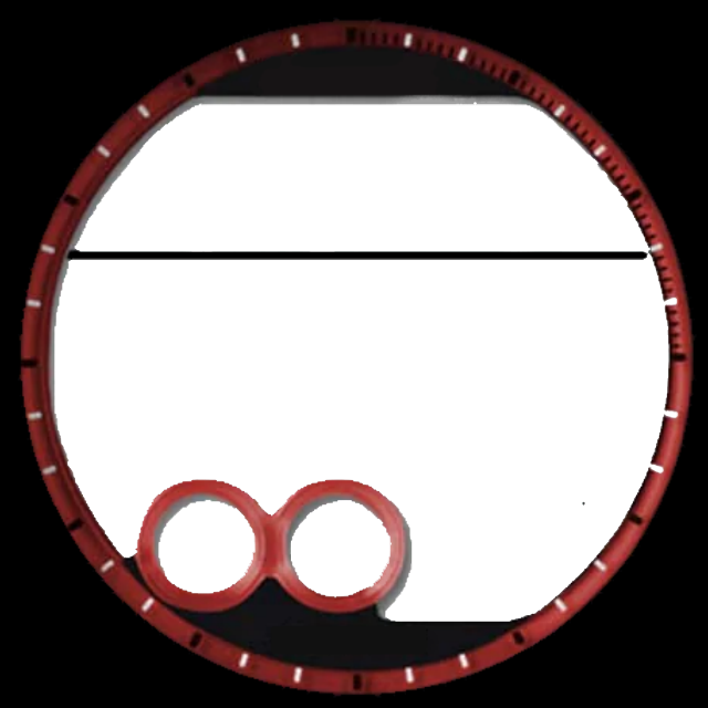
Inspector mode is still on, if you’d like to look Russell.
I see nothing wrong with the Face . I would reduce the hrs mins to 100px. give a little more room for them . I offer you a grunge filter and your bezel opened up . I do not use the Facer default Background use an Image then you can put stuff behind it .
I see what you are doing with the AM PM . Very Creative . However you could have this in the Text Field.
$#DH#<12?A:P$
.
.
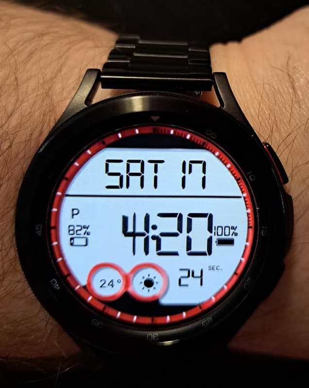
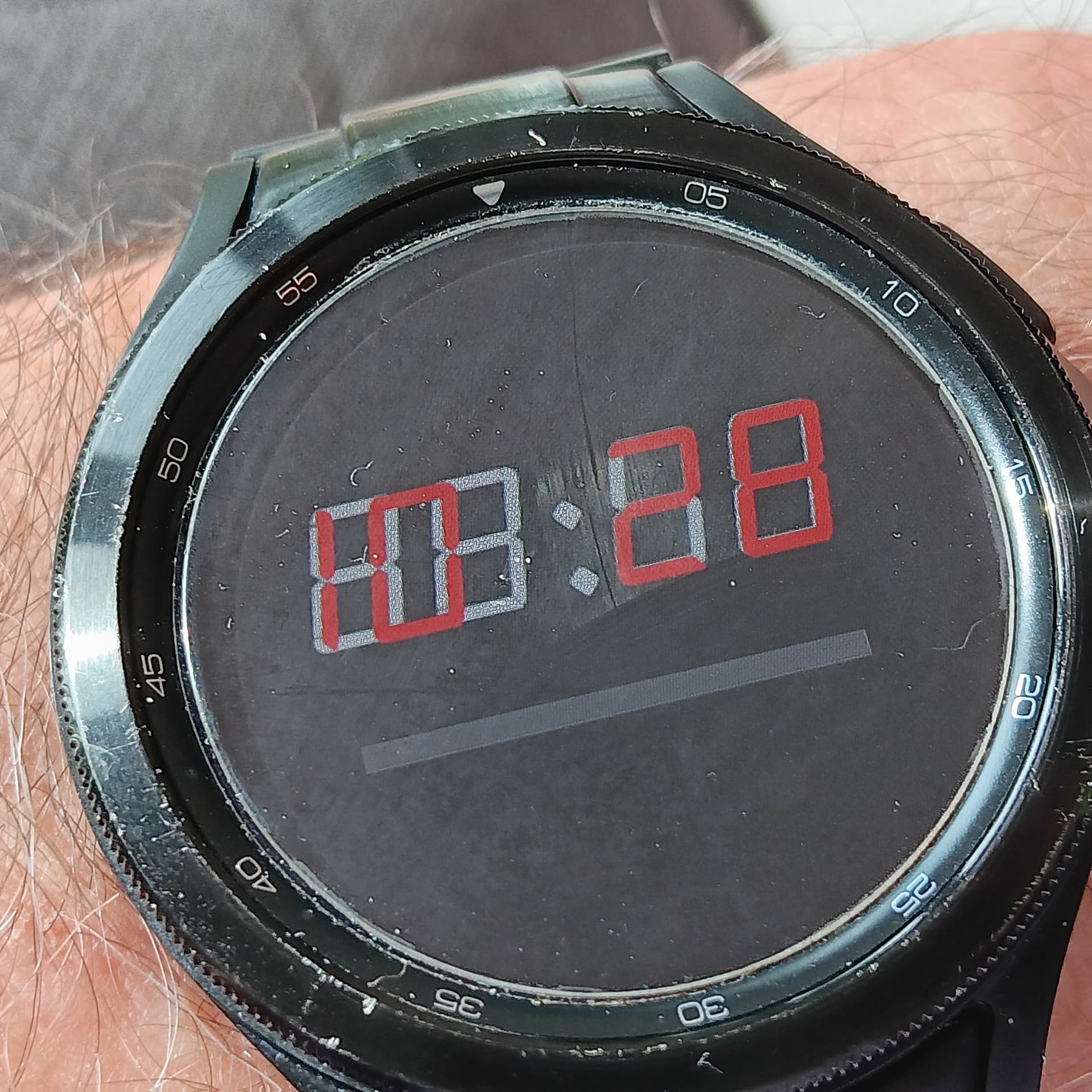
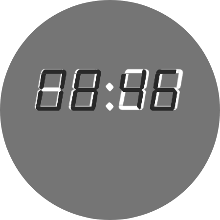
This is what I have with the current settings … ugh. I’m about to give up on it, and rebuild it, from the ground up. It only takes 10 or so minutes.
I appreciate the code for the AM/PM I’ll put that in play now.
What I need … is to spend a bit of time, and find a better mono 7 seg font… that works better than the one I’m using. ![]() Though I’ve spent about an hour already. LOL
Though I’ve spent about an hour already. LOL
I would suggest to try this one, it is more narrow and slightly slanted, maybe better matching your intention:
https://torinak.com/font/7-segment
only trouble would be some day letters
but you could reduce them with text like this $#DOW#==0?SU:$$#DOW#==1?MO:$$#DOW#==2?TU:$$#DOW#==3?WE:$$#DOW#==4?TH:$$#DOW#==5?Fr:$$#DOW#==6?Sa:$
That works well. I wonder if I’m just cursed?
Because I tried Roboto Mono and see this:
Yet, my watch looks slightly different.
I am wearing a Galaxy Watch4 Classic. So I don’t know. LOL
I’ll probably reset it after sleeping on it.
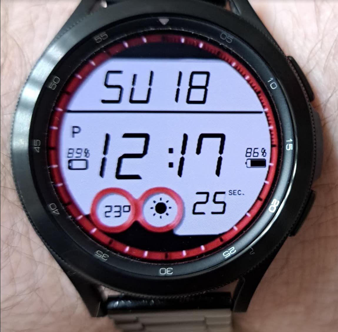
Not looking too bad. The Numbers have grown a little bit. We should put a screenshot from Creator in as a background an then see the diffrence. When synced.
.
.
.
Here is a drift Test with the Facer standard font .I think it is a good Idea to chose something that is not too exotic .
.
.
.
.
.
.
Justification on the watch GW4 Classic is off a bit.
.
.
.
.
.
.
Well it is not the image drifting.
.
.
.
.
.
.
Ha Ha. Chose a Fixed Width Font. I hope @Facer_Official @Facer-Staff are having a good look at this .
.
.
.
.
.
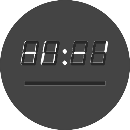
That’s what I am faced with. I raised a ticket with @Facer_Official, and they did get back to me in the mean time. I guess they are working on it. So currently, I’m thinking of doing a type of shadow. Duplicate the time and make it black and shift by 2 to the right and by 2 down. Gives you the effect below. If you are using a black font, make the shadow one about 25% opacity.
I switched to Patopian 1986 Regular, which is one of the fonts from Facer …
Did that fix the Problem. My tests above were done with that.
Nope. Not at all. ![]()
![]()
Oh well, it’s not ugly… I wish others with different watches, would share with me what it looks like.
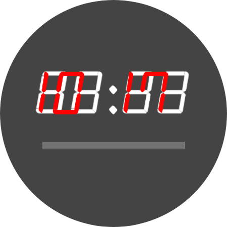
Actual vs display
It is not going to be sorted here but more Feedback would be useful . I suspect Watches not running WOS3 will not have the same problem .
On my Gear S3 Frontier (Tizen2.3.2.3) all those fonts align same as on the creator page
(this is screenshot from the watch. the red is screenshot from creator added as background image)