I’m currently working on a new series.
I want to show you this before it’s available for download.
A few colors are planned.
A few little things bother me about the graphics.
But the rough works and looks the way I want it to.
I’m currently working on a new series.
I want to show you this before it’s available for download.
A few colors are planned.
A few little things bother me about the graphics.
But the rough works and looks the way I want it to.
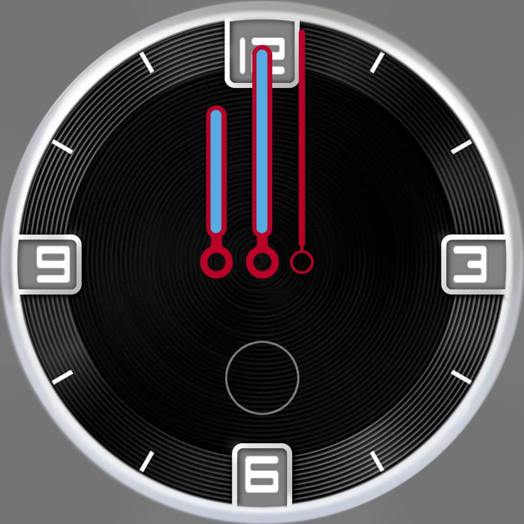
That’s interesting SR because I was having the same thing going on with me. I am working now on my first analog-style face and I’m a bit hung up on something about it too that I can’t point out. Let me post an image of what I got so far. Don’t mind the color of the watch hands. Let me look at yours for a few minutes and I will reply back with anything suggestion I may think of.
I’m also wanting to have an analog battery meter just above the number “6” but have no clue how to do that. Any advice on that from anyone would be much appreciated!
I love the background.
I like these grooves/circles.
I’m also relatively new to the subject.
But I’m trying to help.
Look at this clock.
There is inspection on.
Here is the code I used.
(120-(#BLN#/100*240))
That’s how I understood it.
(angle start(#function#/100*angle function range)
You have to try until it fits.
The white one
Ok SR,
I have some ideas and/or suggestions. Take them with a grain of salt and no worries if they are useless.
I think the Orange needs some sort of way to break it up, maybe a silver bezel around it or darker burnt orange but not too dark that it makes the face seem smaller and faded into the black of the watch case inner diameter.
Not sure I like where the battery meter is on this one. I think the logo in the center seems a bit big BUT in a way why not scale it up a bit and make the Hands thicker so they can bee seen better at a glance. Also try a different color to them so they pop-out more to the eye? I would not use any battery icon or text for the meter as it takes away from it looking so minimalist. I’d personally as a former layout artist would not use any imagery or text in one place and not another. If you want to keep the icon or change it to the word Battery then I think the face should have numbers around the face as well. The logo is an exception as it is the signature part of the watch. What about implementing the batter meter around the logo itself rather than under it?
The date does not look right to me. The font is modern but in this case it bugs me to see the number “1” that has an angled top left tip. In many cases this would not bother me but then again there would be other lettering or numbers in a design. It also seems a bit too big which is something I would normally say because I don’t like busy watch faces personally and what stats I want to see I do like large for my aging eyes to see. Is that suppose to look like a analog/mechanical flip or slide mechanic for the date numbers? If so maybe make that more prominent?
Lastly the starburst embossing effect is too subtle. It should be bigger in the effect of it maybe? I love the color Orange for some reason in watches. But this seems a big much to me. Not sure if it’s reaching your goal or what you’re looking for because of that? Maybe the more and bigger the embossing effect it then it will help with that? What if the battery meter was around the logo and in orange but behind it have a larger circle that looks like it’s been a bit lowered into the watch with some slight shading and have it be a silver’ish carbon texture?
Hmmm.
Oh I see your reply.
So I was looking at your watch, this is cool. I see it’s an element? Must I be a member to use that element as I’ve not seen it in my options. I see what you have done with the Code. I think I can see how to make it have a 340 degree of range. Very cool man, Thanks!!
Oh now the white looks better kinda, but the same goes for it. A bit hard to see the hands other than the thin red lines. But this is maybe my own personal issue with aging eyes. The battery meter still confuses me a bit. I like it better with the cool red stripes and analog hand.
A lot of white!
What do you think might be stumping on on publishing these?
This basic design is inspired by watches from the 70s by a well-known German designer.
Everything was very clean there and in one color.
The logo is so big in the middle because I don’t want to be too close to the original from the 70s.
On one alarm clock from the series, the alarm clock hand was similar to the battery indicator shown here.
My wife likes the date as folding numbers because grandma’s kitchen clock from the 70s had it.
The font was chosen because it is typically German for that time.
I need date and battery display for me.
Only that’s why it’s both in it ![]()
I am planning an advertisement with 4 colors in pop art style.
When I’ve finished the 4 I’ll post those.
ok I gotcha!
I also like the folding clock too! I think it is hard to tell that’s what it is to me. if I look close I guessed it.
The various color versions would be good! I should do the same.
P.S. OMG I just realized that the face I am working on looks like an old 50s’ style car dashboard gauge!! lol
“Ten Principles for Good Design: Dieter Rams”
I can only recommend the book to everyone.
This is available worldwide at amazon (even if I don’t like this company)
Hey SR, did you sue a watch hand fo your battery meter and how so did you change it to know to pull data from the battery rather than the time?
Oh gosh don’t get me started on how many instructors and books I’ve read on various principles of design… Most of them were junk but I took away what I felt was good and not trash. One class I actually got up and walked out of and never went back. His teaching was basically any good designer should be aware of the target demographic and that any good designer would choose to target what I call in my own word “The White Kracker Boys”, because they apparently spend more than any other demographic so thus a good designer would design for their appeal blah blah blah. You see this in a lot of teachings in Marketing too, but my how the world has changed and left their pea brains behind!
the # # specify the function
there is a list at facer in the fags
You can do a lot of stupid things with these functions ![]()
#BLN#
Gotcha!!! aha!! =)
People have become very stupid and are getting even more stupid.
I do my design for myself. target group blah…
I do not care
Take a look at my other faces too.
You will see that everyone brings something of their own.
Topics that inspire me.
The book talks about a great designer from Germany.
World famous today…
Even Apple copies its ideas.
I like his work, his opinion and his style.
Right on man! I could not have said it better!
Blockquote
(Hmm not sure how to Quote but oh well.)
SR, say I was to use the Battery Circle Bar, how would I make it to show only the shape of about a smiley face? Rather than the entire 360?
(clamp(#BLN#, 0, 100)/200)
so you get a semicircle
(clamp(#BLN#, 0, 100)/100)
such a full circle
Interesting. The default when you use the “Progress” icon element has this “(#BLN#/100)”
So I was playing with the only number assuming 100=360 which did not really work right I don’t think. er wait I think that did work when I put it to “5” it was a half-circle.
I’ve never liked coding or tagging. I did take a look at the TAGS help page:
But have not read much further in tagging or codes to rescript elements.
Thanks SR! Hey, how is your design coming? May I see what ya got so far?
@wolfkazack . Sorry I have not read through everything . You were looking for a Battery Gauge earlier . This Inspectable Draft includes one of my Favourites .
Just trying to help out here:
Here’s a Face I threw together some time ago, with Inspection On, so anyone can see how to use Battery Gauges. It has 2 different Battery Gauge styles, and a Day Wheel too -
Here’s one that has “Smiley” sized Gauges that @russellcresser and myself worked on -