You could always save each individual hour number as a transparent background image, edit them so you have 1-31, and then use them for the Date setting the Opacity so the right number shows on the right day ![]()
3 Likes
Oh yeah, that’s a way. Just need to buckle down and do it. Thx
2 Likes
Looking a bit Dark to me now. I am sure you can find a Font that is near the Numeral one. Use Three text / Date layers. The middle lighter offset - 1 px x and y and the bottom one offset + 1 darker. That gives a little fake Dimension. It can look really cool.
You should be able to use the Numeral Font in Creator as a Custom Font. I copy Fonts to a folder where I keep all my hands and stuff. Facer will not use the fonts in the Windows folder.
3 Likes
thanks for the tips. I’ve found some ttf fonts at Google Fonts with wooded and rustic looks. Gotta get back to it.
2 Likes
Well Done Plenty of Fonts out there . Surprised you found .ttf that look like wood i thought they were all Black . I suppose you mean they showed a Gain . Will you please share a link .
1 Like
Google TTF Font, RYE. Looks pretty good. Gonna wait to publish after Halloween. The site is flooded with Halloween themes right now.
2 Likes
From what I can See it looks Brilliant . I presume you have adjusted the light level to your watch . I set my watch to light level Three . Gives me a Bit of Free board . If you feel Inclined open your work for Inspection then We can Check / Copy what you have Done . ![]()
2 Likes
The image on the facer site definitely looks a little dark but it shows up great on my Galaxy Watch4. It is do to the image I laid over the face to show the LED bleed through.
2 Likes
Don’t worry about copying anything. You’ve been a great help to me. ![]()
1 Like
Well done switching on Inspection . Great Work . That Font you Found is Perfect . I might get that for the steam punk I have been working on for a year . I can see you have put in a ;lot of work . I do not mean to be critical but you need some Nice Hands . Those Facer Jobbies are a bit of a let down to what you have done .You may be working on some but there are a Ton of beautiful hands on here .
For example . Some times they are difficult to hunt down .
My Bookmarks are not working properly at the moment .
2 Likes
you’re right about hand choices on the creator. I changed the aspect ratio of the hands to help make them look better. I’ve checked out quite a few hands here. A lot of choices but the retro look I am going for. I would like to stay with an older style to go with the wood work. Online is really frustrating. The online hand images are usually pictured with all 3 hand in a tight image so you can’t configure individually to sit in the middle of the final image so they rotate correctly. Hope that wasn’t to confusing to understand, ![]() . I could work it out but haven’t taken the time yet.
. I could work it out but haven’t taken the time yet.
1 Like
If you can post here something you like I will split them up for you . Or Explain how to do it . The secret is a grid .
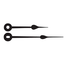
I haven’t tested them yet but looking at maybe switch to this style.


I can work out the color.
2 Likes

Never liked PowerPoint, but I seem to underestimate its capabilities ![]() and of course your skills, Peter!
and of course your skills, Peter!
2 Likes
Very Nice Sir.
Nice job.
Hey…what ever works. I’ve dabbled in Power Point myself.
Since 2016 it can do some nice tricks with merging shapes. I was not aware myself, found out here
on forum
2 Likes
It’s live.
2 Likes