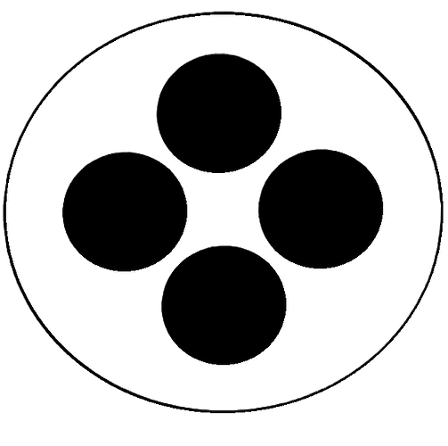
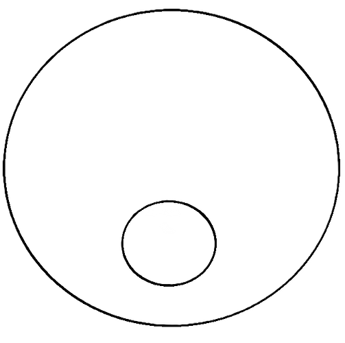
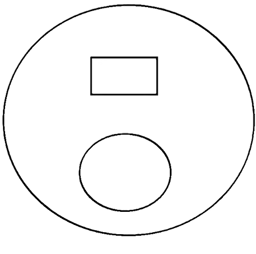
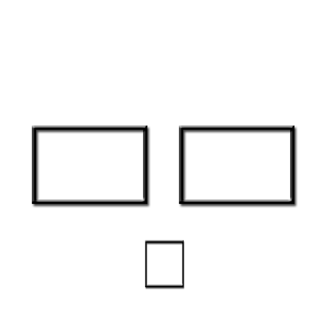
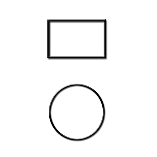
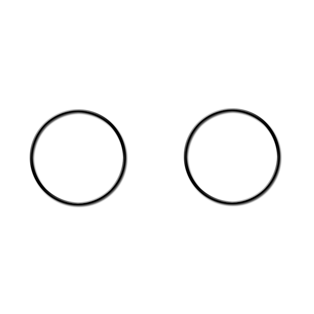
Ok here’s the deal. I put together a few subdial templates (because there’s never enough).
The problem is they suck and they need some fine tuning.
So if anyone might be interested and or willing to take and make them actually look good, then by all means please do.
Ok, first of all, why are they all eliptical?
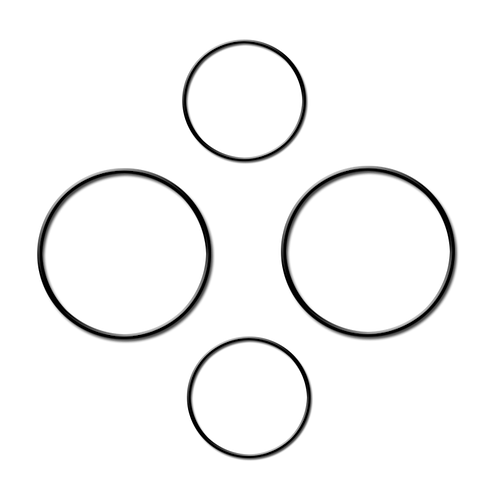
What about this? Made in few minutes in Powerpoint
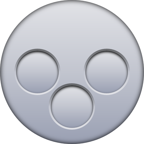
I did mine with basic old school paint.
Which leads me to interpret what I am hearing here is Paint sucks?
Lets say MSpaint is the most basic rudimentary tool.
In newer windows 10 it has 3D variant, which can also make 2D shapes. And if you choose to make circle there, holding shift while dragging one corner, it maintains the shape proportional.
I think you have convinced me - which version of PowerPoint are using and, if you know, if the tools used are available in older versions
I am using v 2016. v 2010 (that I have on other PC) has most of the tools, but it lacks the shape merging for example (that was not needed in this case).
Edit: it has that feature, just not in the ribbon menu. Look further down I attached link to video how to add it.
Yep I need to think about a different program. These one’s you guys did are much more shall we say clean and uniform.
The one thing I’ll say with all the ones I’ve been able to find on here so far is, That it would be nice if they could be a little more white. Because one would assume that would make any color you add on here stand out more.
But hey that’s just a minor nitpick.
I have just discovered that when you add an item such as one of these templates by attaching an image in the elements tab and not by adding it as a back ground. It comes out so much better!
It actually keeps its color and doesn’t show up greyed out.
And that’s info that’s nice to know.
I love 3D Paint purely because of its simplicity plus it has options for adding Outlines, Bevels, Shading, and much more ![]()
I always insert dial background as a separate shapes or image.
The background image layer is not mandatory to use.
It has limited setting options and does not show up in dim mode anyway.
I just briefly checked out that 3D Paint. And you’re right it does have more better features.
I think I will have to practice with that one now.
Nice ![]()
I love 3D Paint purely because of its simplicity plus it has options for adding Outlines, Drop Shadows, Glow, and Bevelled Edges. I use it a lot for selecting a circular part of images as well.
Ha Ha . To add to what Peter said . Lesson #47 . Don’t use the default background . Many do not realise it is default 47% opacity . It is left there like that so we can Play Spot the Newbie . Put your own Blank Square ( See Below ) in there it is more versatile and you can hide stuff behind it . Like hidden complications .
Also bonus Vignettes in white so as you said it can be any colour you like even black .
Creator is good like that .
.
.
.
@icrltd4 Quick question for you.
I’ve been checking out that 3D Paint program.
And maybe I’m over looking it, But does it not have an option to remove the background?
Because if it does I can’t seem to find it.
I do not use it. But a basic way of removing colours areas is with the Fill Button . Usually a paint pot Icon . You select transparency as the colour and play with the Tolerance . If you go to YouTube you will find Tutorials for the Popular platforms .
I’ve never it for that sorry Tom, I always use remove.bg/upload for that my friend.
Man, this is great, I like it very much, can I get help on how to do it?

