A new design for my styles !!! 

These styles are new paths for me …
And I would like to know what my colleagues think … their opinions are very important to me …
Which one do you like?
Cordially 
These styles are new paths for me …
And I would like to know what my colleagues think … their opinions are very important to me …
Which one do you like?
Cordially
Bonito! Creo que ha encontrado que el diseño de la esfera de su reloj le llama.
Nice! I think you have found your watch face design calling.
Thank you very much @mrantisocialguy
You are always very kind with your comments and way of thinking …
Thank you again so much !!!
Cordially
Muchisimas gracias @mrantisocialguy
Tu siempre eres muy amable con tus comentarios y forma de pensar…
Nuevamente Muchisimas gracias!!!
Cordialmente
These are very nice! Love the blue ones, and the orange/silver one!
Thank you very much for your comment @ThaMattie
Your opinion is very nice and important to me
Cordially
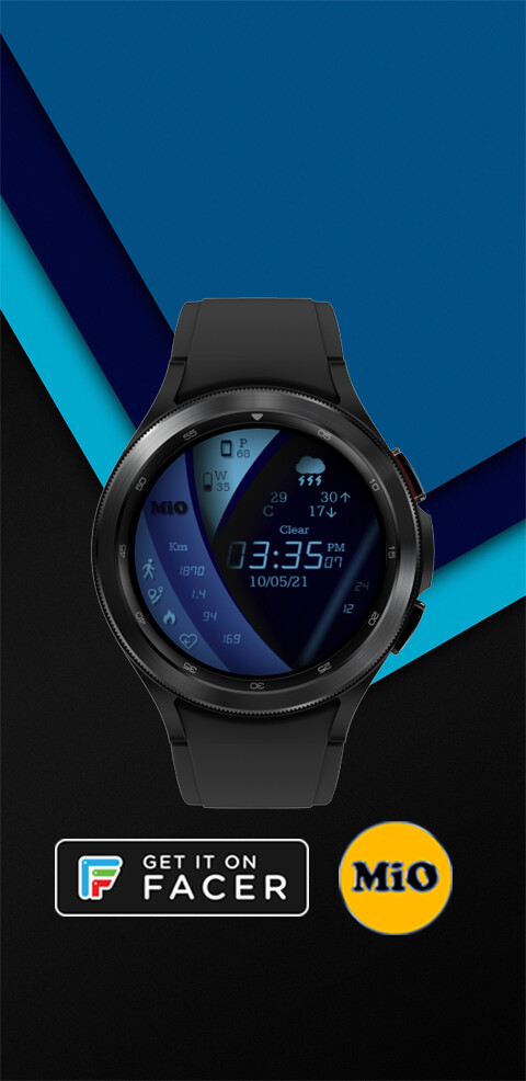
I like the first blue one best, then the other blue and the hearts one.
Nice design Cardozo my friend, and good work with the shading as well 
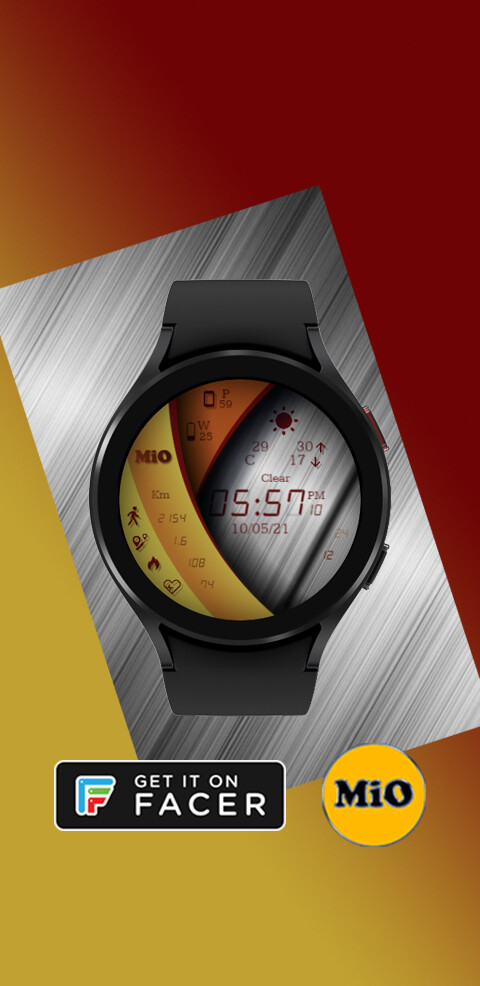
1JDC and 3JYC are the best looking 2 in my opinion
Great concept / idea, and very well executed. Bravo! (MACH-1)
Interesting your choice @petruuccios … I’ll keep it in mind …
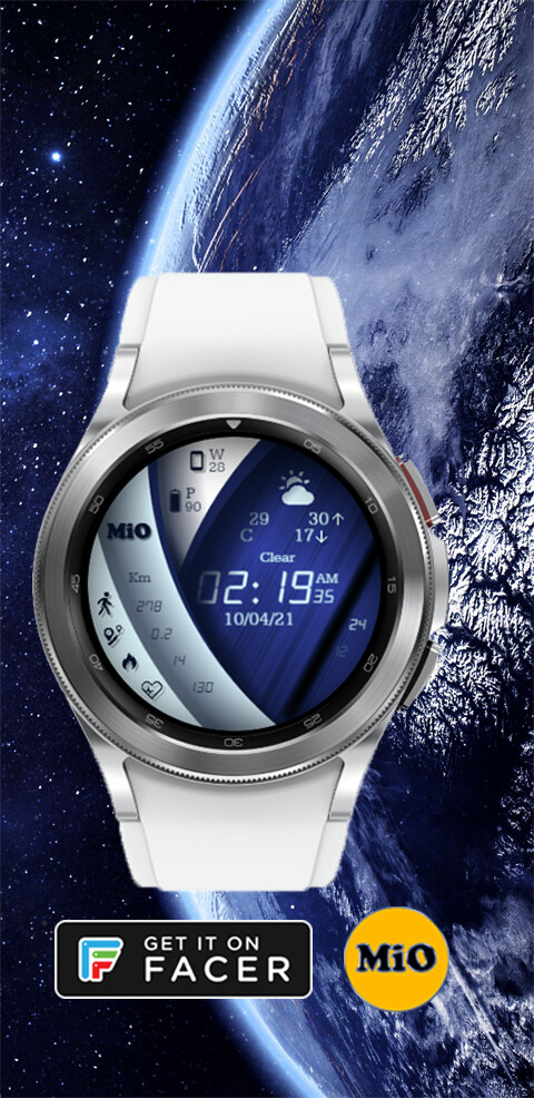
I also like blue colors …
And also red … 
My friend @icrltd4 … as always, thank you very much for your vote, good words and support 


Your opinion is very interesting
@akar.zaephyr Thank you for your vote and information …
For me at this moment it is very pleasant and interesting, knowing your way of thinking … for future designs …
Thank you very much again
Thank you, Thank you very much @ richard2 
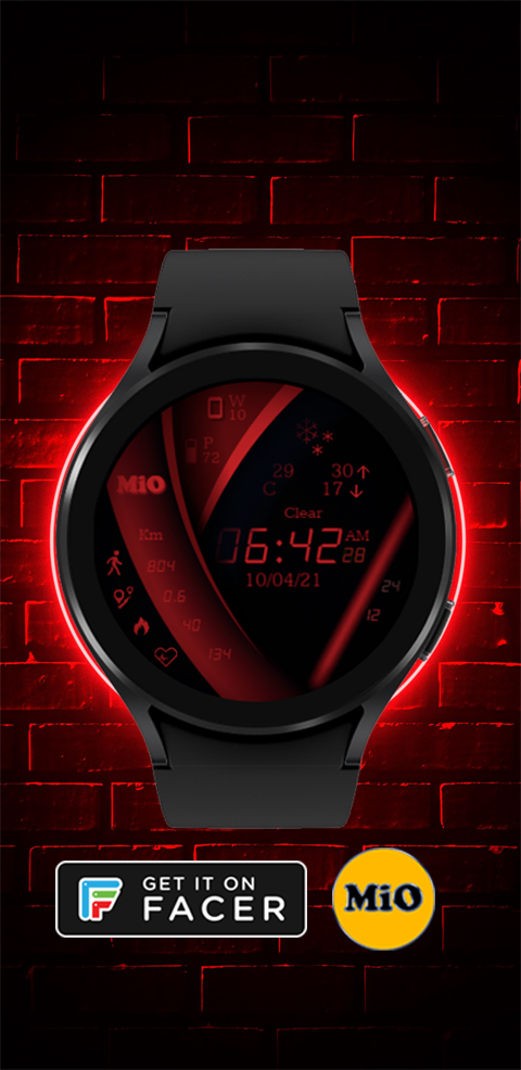
In these moments I realized … that the color blue … is very attractive to most people …
And thanks to your vote and that of your colleagues, @mrantisocialguy , @ThaMattie , @petruuccios, @icrltd4 @akar.zaephyr and you …helped me to have a better idea about the colors and which one to use for most of my designs …
Again thank you very much !!! 
Hello Cardozo,
first of all:
this is a very unusual, very cool design.
I like it extremely well.
You asked for our opinion, I’ll start in the opposite direction:
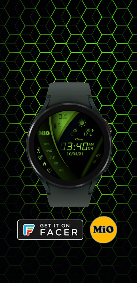
Although ALL are very nice, I find the green a bit too reminiscent of MATRIX, probably just because of the colors. The theme has just been too heavily loaded, I could very well imagine a different color with the same design being much more effective.
The lighter blue is preferable to the darker blue from my side just because of the higher contrast.
In the yellow-red-silver variant, I find the drop shadow on the curved central surface a little bit too hard, it goes too start to the disadvantage of the legibility of the digits. A little less would be “more” here.
The variant with the hearts on dm banner is very nice, I actually like the contrast of the materials in the hearts. Unfortunately, this contrast does not quite occur in the dial, here I am missing, inspired by your banner image, a few highlights such as white reflections or the like. As I said, only through the banner image I realized what I am missing on the dial.
Funnily enough, it’s the same with my favorite, the red design.
And here it is again the banner image, which I like extremely well. On reflection, I realized that it is the red glowing neon border on the brick wall, which gives a very nice overall effect.
Only as a minimal suggestion: try to get a similar luminous and light effect IN your dial. I mean, what would it look like if you pulled the round neon effect INSIDE, so that it glows inward at the edge of the dial? But these are just tiny comments on my part. Again, very nice design.
Many greetings
Ralf
Thank you very much @os-1 … for your great comment, and for the details that you have found in the designs, from your point of view … (your way of thinking is very interesting)
It is very important to know how people think, to have a destined effect …
Thank you very much again for your interest in my designs …
Cordially
Very nice designs, but one tweak I’d make personally, and that would be to either lighten up the shadows as they seem a bit dark, or make them smaller. BUT, loving the designs!

And welcome to the group! for us it is a pleasure that you are with us
Cordially
These are cool I will have to try them out
Again thank you very much !!!
For this weekend I publish it …
Cordially
i dont know why im the only one here that thinks this and i know we should encourage each other, but i personally think you should step outside your comfort zone and create something different each time instead of spending so much time on color changes. I hope this doesnt offend.