Edit: I should have saved the old one but below is the current iteration.
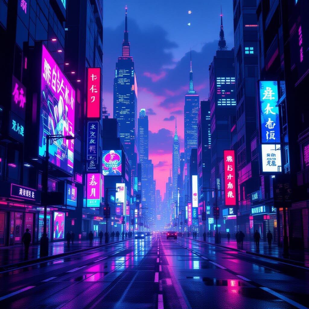
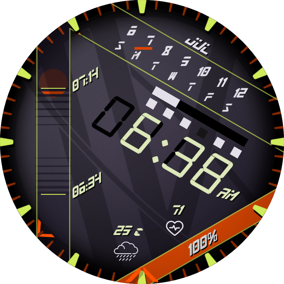
I made this watch face with the intent on making it a cyberpunk theme. I pulled most of the colors from a screenshot from the cyberpunk game hacking screen.
I really like it but it’s not giving me the cyberpunk vibe I’m looking for.
When I ask Night Cafe AI to make me a picture of a Cyber Punk City this is what I get . Fair enough . For me the elements on your face are too small . You can make them quite large and do not be scared of letting them overlap . Use a font like Venus Rising on some of it . Get some more of these colours in . But you angles and over all style are great . Enjoy .
.
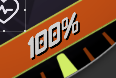
I like you binary counter for me it should work the other way , no problem but the flashing seconds progress is a bit annoying . I will have a look at your inspectable . You might have come up to our Time bug in facer .
Sorry I am more engineer than designer, so I cant suggest anything valid for the “vibe”.
Even before looking into it, I warn you. If you plan on publishing that face, reconsider the description without mentioning any brand names like “Calendar week style inspired by the Nomos Glashütte Tangente neomatik watch”.
For the seconds progress bar better running in preview, I would suggest using (((#DNOW#/1000)%1)*120), or (((#DWFSS#/6)%1)*120), rather than anything with #Dsm# (which has been broken in preview for more than year now).
Nice one Peter . I was trying to work out how to use #DWFSS# for the scrolling . @CosmoIV I would loop your Background Glitchy animation . Users might miss it in the first 2 seconds .
Bigger features and more red and blue, love it. That font is very similar to the font I’ve used on a lot of my faces and I was trying to get away from it for this one.
Yeah, I was trying out left to right but it doesn’t look right. The second bar is a little much, I have a couple ideas on something more subtle.
That description is from an old face that I used as a base, it will not be the description when I publish this one.
I didn’t know it was broken, thanks.
I would like to don’t his but I don’t want it going constantly. How can I add a delay?
I usually try to keep it simple to not kill the battery, but I’ll try to add more to keep it interesting.
@CosmoIV The only thing you can do with a Gif Sequence when you no longer want to see it looping is to send it off screen X pos or Y pos with a wake time conditional . Opacity does not work on a Sequence.
So you could send it away after 6 seconds .
Here’s a template file you can use to create the neon effect in photoshop. Just copy the layer style and paste it onto the layer you want the effect on. NeonEffect.psd (706.1 KB)