Back again with the latest experiments 
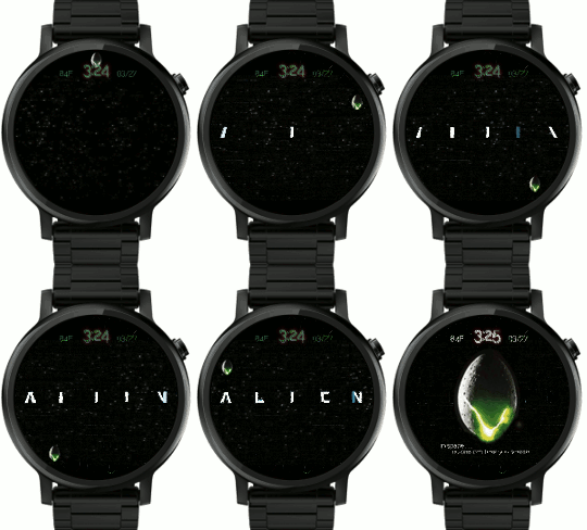
For this one, I wanted to experiment with longer animation without making the watch bloated.
I’m pretty happy with how it turned out. Rather than mess with frame animation, I used the following tricks:
- 2 frame scrolling animation for the space background (Moving/Looping Background)
- Letters sliced up in photoshop, layered in such a way that the blue tinted letter parts fade and reveal the white version on a higher layer.
Eventually I’d like to add a fade in text that moves left to right and fades (like movie trailers) but for now I’ve added that to the dim page. (“In space… no one, etc”)
I’m including a short animation and a larger one.

